Wooow!!
Very energetic and pressured ..
Beautiful song by Avicii, perfect to chill with !
|
Saturday, April 5, 2014
Avicii - Speed

Option play in gold
| Gold (COMEX:GCK14) prices are right were I want them now and this article will explain why I like to sell call options in downward trending markets on up days. Fundamentally, every time the economy here in the U.S. starts to take strides forward it seems as though gold prices start to move lower. Does that explain why the market has fallen about $115/ounce in about 14 trading days? Consumer confidence is getting better. Housing numbers are on the rise. Janet Yellen says she will continue to taper claiming in a roundabout way that the economy no longer needs help from the FED. Payrolls have risen. Service industries have expanded and finally the stock market has reached record levels recently. This coupled with the rapid fall in gold prices tells me that traders don't have too much fear and the "risk trade" is on, while safe havens are not needed. Technically, I have placed my favorite technical indicators on this daily June gold chart. Why are these my favorite? For the simple fact that by placing a handful of indicators on a chart, I can learn 10 or 15 important specifics. These technical indicators are the 9-, 20-, and 50-period Simple Moving Averages (SMA's), the Bollinger Bands (light blue shaded area), Candlesticks (red and green bars where each bar represents a day), and Volume (bottom graph). The first element that grabs my attention on this daily June gold chart below is the phenomenal collapse over the last 14 trading days. This is a perfect example of a market on a chart that looks like it took the staircase up and then jumped straight out of the window to the ground. This is how a "Super-Trend" down happens, which is where gold is now on this June daily chart below. The term I have coined "Super-Trend" or in this case, a "Super-Trend" down, occurs when first, the 9 day SMA (red line) falls quickly and crosses down and under the 20 day SMA (green line) and this happened on around March 25th as you can see on the chart below. Next, I look for both the 9 and 20 day SMA's to point lower, the sharper, the better. Finally, I need the market price itself to trade below the 9 day SMA (red line). At first, this occurred immediately putting gold in a "Super-Trend" down right off the bat. At that point for the "Super-Trend" down to stay in play the 9-day SMA must act as solid and consistent resistance. It started that why on March 25 and has continued until today, April 3. Also the bottom line of the BB's (light blue shaded area) has acted as great support. It is my opinion that this will continue for some time, this "Super-Trend" down. Clearly, there is some serious downside momentum to this market, to the point that some would say we are oversold. I'm not so sure of that, in fact it looks like the market is about to test the 9 day SMA (red line) to see if it is real resistance and if this "Super-Trend" down will continue. I say it will hold as resistance. Remember no technical indicators work 100% of the time and this is just my opinion based on my favorite technical indicators on this daily gold chart. Only time will tell where we go from here.
Option Play Since, I am now bearish on this market there could be several ways to play this market with options and one could be to buy straight put options or bear put spreads in a 3 to 1 ratio with a call for a hedge or "insurance" in case the trend changes on a dime and the market rallies. Another potential play could be to sell naked, deep out of the money June options or option spreads with very clear cut exit strategies upon entering the trade for risk management. Remember, when you sell naked options you have unlimited risk and should have a "well-funded" account of risk capital also. The reason this gold market is right where I want it for this strategy is because markets can only do 1 of 3 things over any given period of time and that is go up, down, or sideways. The gold market will move lower to sideways as opposed to making a huge rally up over the next 2-4 weeks. |

The new black gold?
| We are in the midst of one of the greatest bull markets in coffee(NYBOT:KCK14) history. Demand rationing is very likely going to be required over the next 12 months as a one in one hundred year drought event allows for two to three years of production impaired coffee crops in the number one producer Brazil. The coffee market has no excess inventories to speak of to handle this kind of a supply squeeze as it has had in past weather shocks. In order to sufficiently ration demand, prices will need to move up to $4 per pound over the next 12 months and could easily see $6 should further weather problems surface in Brazil or Vietnam. The recent correction offers and incredible opportunity to buy coffee ahead of the next parabolic advance.This is the bull market to play in 2014 in overall commodities. |  |
 | As indicated in my last report, grain markets have moved into the sell zones highlighted and are offering fantastic selling opportunities. Acres have been bought by both corn and beans on the current rally and spring planting fears will quickly give way to ideas of record crops and significant increases in U.S. ending stocks over the next 30 days. Only a severe U.S. weather problem can turn these bearish fundamentals into bullish ones. If there is going to be a bull market in grains it will be stimulated by wheat and rice which are both precariously close to the low global ending stocks to world trade ratios seen in 2008 that set off the food panic in Asia back then. This leaves both markets very vulnerable to any concerns over crop prospects as we head into the summer months. Cotton(NYBOT:CTK14) and cocoa(NYBOT:CCK14) fundamental look very bearish. Orange juice(NYBOT:OJK14) supplies in the U.S. continue to shrink and are now the second lowest since 2006. It is only a matter of time before U.S. supplies fall to decade lows given the dire production prospects for both Florida and Brazil. |
Millennials Mired in "Wealth Gap" as Older Americans Gain; Housing Crash Continues to Overshadow Young Families' Balance Sheets
by Mike "Mish" Shedlock
| Thanks to Fed printing presses coupled with an extreme case of irrational exuberance, those over 40 years old have recovered losses from the great financial collapse. For households headed by someone 40 years old or younger, wealth adjusted for inflation remains 30 percent below 2007 levels on average, according to research by economists at the Federal Reserve Bank of St. Louis. Net worth for older Americans has already recouped the losses. |

| | Weak Recovery Easy to Understand There is nothing hard to understand about the weak recovery. I predicted this outcome years ago. On May 22, 2008 I wrote "Boomers will be competing with their children and grandchildren for jobs that in many cases do not pay living wages." Many young kids are mired in student debt, working on jobs that should not even require a degree. Those kids postpone household formation, and in record numbers still live with their parents. Millennials had little to no assets for Bernanke to inflate in price. Housing Crash Continues to Overshadow Young Families' Balance Sheets And so here we are. For further analysis, please see the Fed report Housing Crash Continues to Overshadow Young Families' Balance Sheets. Here are a couple of charts from the report, followed by my comments. Real Net Worth For all age demographics, home ownership rates peaked right as the bubble burst. However the steepest percentage increases in ownership at the time of the collapse was those under 40. Home prices have recovered much of their losses in many areas, but that has not done anything to alleviate the massive student loan problem. Worse yet, the home price recovery has a negative benefit for those still trape living at home with their parents as well as those with a job but still mired in student debt, hoping at some point to buy. Until that dynamic changes, household formation will remain weak. |


This Chart Is A True Picture of How QE “Solved” The Unemployment Crisis In America
by  Wolf Richter
| The unemployment rate’s drop from 10% in October 2009 to 6.7% now is rock-solid proof, according to the deafening backslapping noises emanating from the Fed, that the masterfully thought-out, heroically executed money-printing binge and zero-interest-rate policy – lovingly dubbed QE and ZIRP by their beneficiaries on Wall Street – has been a resounding success. Other measures that the Bureau of Labor Statistics publishes do not necessarily support such a glorious endorsement. The long-term unemployment fiasco has now even wormed its way into Fed Chair Janet Yellen’s parlance. And then there is the BLS’s Employment-Population Ratio. That’s where “dismal” comes in. The ratio depicts the number of employed folks divided by the size of the working-age “non-institutionalized” population. The unemployment rate purges from its list of the officially unemployed the millions of “discouraged” jobless people who haven’t looked for a job recently and tosses them into the pile of the merely jobless. No one even counts those folks anymore. And purging them from the list makes the unemployment rate look so much better. Alas, they’re still part of the population, and so they shop up in the Employment-Population ratio. The ratio is the broadest and most realistic snapshot of the employment situation in America that the BLS produces. It peaked in April 2000 during the halcyon days of “full employment” when 64.7% of the working-age population were actually working. Then the ratio zigzagged down and recovered some, but crashed during the financial crisis. It hasn’t recovered since. In March, only 58.9% of the working-age people were working – full-time, part-time, any job however crummy. The ratio remains mired near the post-Great Recession bottom, despite (or many would argue because of) QE and ZIRP. It shows that the economy, after destroying millions of jobs during and after the Great Recession, has started creating jobs but just barely enough to keep up with the growth of the working-age population. So, compare that to the $3.3 trillion that the Fed has printed and handed to Wall Street since the financial crisis, even while ZIRP has demolished the livelihood of savers and the elderly, and those who don’t want to risk their meager life-savings in a ridiculously rigged stock market. They’ve been sacrificed on the altar of the “Wealth Effect” so that hedge funds and speculators and bailed-out banks can borrow at no cost to leverage up the world and gamble away the future. It was very successful: stocks have soared to dizzying heights, where they’re now beginning to totter. And here’s how the Fed’s policies have “solved” the unemployment crisis. The chart shows the Fed’s balance sheet that has ballooned since the financial crisis to $4.16 trillion (printed money in green) vs. the Employment Population Ratio (“solved” problem in red). Gray areas are recessions.
What an unmitigated fiasco for the Fed! And the Fed’s response? The propaganda machine at the Federal Reserve Bank of New York, which decided and handled the multi-trillion-dollar bailouts during the financial crisis, and which runs the mechanics of the electronic “money-printing” machine, has rolled out its heavy guns to demolish this utterly embarrassing Employment-Population ratio [read.... Fed Tries to Crush “Misleading” Unemployment Measure]. Ironically, the Fed has admitted from get-go that the purpose of QE and ZIRP was to inflate asset prices, particularly the bond and stock markets, enrich those who hold and speculate in them, bail out the banks by fattening up their balance sheets, and lend free money to hedge funds and private equity firms so that they could pile into the housing market and drive up home prices to the point where the middle class can no longer afford them. I must admit grudgingly that the Fed has accomplished all this with great elegance. It’s the gloriously hyper-leveraged “wealth effect” that the few beneficiaries luxuriate in. What will happen when it all unwinds is another matter. But magically creating jobs out of the same thin air where the printed money came from was never part of the Fed’s strategy – nor could it actually do that. Electronically creating fake money is one thing, electronically creating real jobs is quite another. So for the millions of unemployed Americans who are looking for a job, this economy is still a historic fiasco. And it’s getting worse again. |

The Screaming Fundamentals For Owning Gold
by Chris Martenson
IntroductionIn 2001, as the painful end of the long stock bull market finally seeped into my consciousness, I began to grow quite concerned about my traditional stock and bond holdings. Other than a house with 27 years left on a 30 year mortgage, these paper holdings represented 100% of my investing portfolio. So I dug into the economic data to discover what the future likely held. What I found shocked me. It's all in the Crash Course, in both video and book form, so I won't go into that data here; but a key takeaway is that the US is spending far more than it is earning, and supporting that gap by printing a whole lot of new money. By 2002, I had investigated enough about our monetary, economic, and political systems that I came to the conclusion that holding gold and silver would be a very good idea. So I poured 50% of my liquid net worth into precious metals, and sat back and waited. So far so good. But the best is yet to come... unfortunately. I say 'unfortunately' because the forces that are going to drive gold higher in current dollar terms are the very same trends that are going to leave most people, and the planet, much worse off than they are now. Part 1: Why Own Gold?The reasons to hold gold (and silver), and I mean physical bullion, are pretty straightforward. So let’s begin with the primary ones:
Monetary RiskBy ‘monetary recklessness,’ I mean the creation of money out of thin air and the application of more liquidity than the productive economy actually needs. The central banks of the world have been doing this for decades, not just since the onset of the 2008 financial crisis. In gold terms, the supply of above-ground gold is growing at 1.7 % per year, while the money supply has been growing at more than three times that yearly rate since 1960:
Over time, that more than 5% growth differential has created an enormous gap due to the exponential 'miracle' of compounding. Now this is admittedly an unfair view, because the economy has been growing, too. But money and credit growth has still handily outpaced the growth of our artificially and upwardly-distorted GDP measurements by a wide margin. Even as the economy stagnates under this too-large debt load, the credit system continues to expand as if perpetual growth were possible. Given this dynamic, we continue to expect all the resulting extra dollars, debts and other assorted claims on real wealth to eventually show up in prices of goods and services. And since we live in a system where money is loaned into existence, we also have to look at the growth in credit, as well. Since 1970 the US has been compounding its total credit market debts at the astounding rate of nearly 8% per annum:
This desperate drive for continuous compounding growth in money and credit is a principal piece of evidence that convinces me that hard assets, of which gold is perhaps the star representative for the average person, are the place to be for a sizeable portion of your stored wealth. Negative Real Interest RatesReal interest rates are deeply negative (meaning that the rate of inflation is higher than Treasury bond yields). This is a forced, manipulated outcome courtesy of central banks that are buying bonds with thin-air money. Of course, the true rate of inflation is much higher than the officially reported statistics by at least a full percent or possibly two, and so I consider bond yields to be far more negative than your typical observer. Historically, periods of negative real interest rates are nearly always associated with outsized returns for commodities, especially precious metals. If and when real interest rates turn positive, I will reconsider my holdings in gold and silver, but not until then. That's as close to an absolute requirement as I have in this business. Dangerous PoliciesMonetary policies across the developed world remain as accommodating as they’ve ever been. Even Greenspan's 1% blow-out special in 2003 was not as steeply negative in real terms as what Bernanke engineered over his more recent tenure. But it is the highly aggressive and ‘alternative’ use of the Federal Reserve balance sheet to prop up insolvent banks and to sop up extra Treasury debt that really has me worried. There seems to be no way to end these ever-expanding programs, and they seem to have become a permanent feature of the economic and financial landscape. In Europe, the equivalent is the sovereign debt now found on the European Central Bank (ECB) balance sheet. In Japan we have prime minister Abe's ultra-aggressive policy of doubling the monetary base in just two years. Suffice it to say that such grand experiments have never been tried before, and anyone that has the vast bulk of their wealth tied up in financial assets is making an explicit bet that these experiments will go exactly as planned. Chronic DeficitsFederal fiscal deficits are seemingly out of control and are now stuck in the $1 trillion range. Massive deficit spending has always been inflationary, and inflation is usually gold/silver friendly. Although not always, mind you, as the correlation is not strong, especially during mild inflation (less than 5%). Note, for example, that gold fell from its high in 1980 all the way to its low in 1998, an 18 year period with plenty of mild inflation along the way. Sooner or later I expect extraordinary budget deficits to translate into extraordinary inflation. Banking System RiskReason #3, insurance against a major calamity in the banking system, is an important part of my rationale for holding gold. And let me clear: I’m not referring to “paper" gold, which includes the various tradable vehicles (like the "GLD" ETF) that you can buy like stocks through your broker. I’m talking about physical gold and silver because of their unusual ability to sit outside of the banking/monetary system and act as monetary assets. Literally everything else financial, including our paper US money, is simultaneously somebody else’s liability. But gold and silver bullion are not. They are simply, boringly, just assets. This is a highly desirable characteristic that is not easily replicated. Should the banking system suffer a systemic breakdown, to which I ascribe a reasonably high probability of greater than 1-in-3 over the next 5 years, I expect banks to close for some period of time. Whether it's two weeks or six months is unimportant; no matter the length of time, I'd prefer to be holding gold than bank deposits. During a banking holiday, your money will be frozen and left just sitting there, even as everything priced in money (especially imported items) rocket up in price. By the time your money is again available to you, you may find that a large portion of it has been looted by the effects of a collapsing currency. How do you avoid this? Easy; keep some ‘money’ out of the system to spend during an emergency. I always advocate three months of living expenses in cash, but you owe it to yourself to have gold and silver in your possession as well. The test run for such a bank holiday was recently tried out in Cyprus where people woke up one day and discovered that their bank accounts were frozen. Those with large deposits had a very material percentage of those funds seized so that the bank's more senior creditors, the bondholders, could avoid the losses they were due. Most people, at least those paying attention, learned two things from Cyprus:
Re-monetization PotentialThe final reason for holding gold, because it may be remonetized, is actually a very big draw for me. While the probability of this coming to pass may be low, the rewards would be very high for those holding gold should it occur. Here are some numbers: The total amount of 'official gold,' or that held by central banks around the world, is 31,320 tonnes, or 1.01 billion troy ounces. In 2013 the total amount of money stock in the world was roughly $55 trillion. If the world wanted 100% gold backing of all existing money, then the implied price for an ounce of gold is ($55T/1.01BOz) = $54,455 per troy ounce. Clearly that's a silly number (or is it?). But even a 10% partial backing of money yields $5,400 per ounce. The point here is not to bandy about outlandish numbers, but merely to point out that unless a great deal of the world's money stock is destroyed somehow, or a lot more official gold is bought from the market and placed into official hands, backing even a small fraction of the world's money supply by gold will result in a far higher number than today's ~$1,300/oz. The Difference Between Silver and GoldOften people ask me if I hold goldandsilver as if it were one word. I do own both, but for almost entirely different reasons. Gold, to me, is a monetary substance. It has money-like qualities and it has been used as money by diverse cultures throughout history. I expect that to continue. There is a slight chance that gold will be re-monetized on the international stage due to a failure of the current all-fiat regime. If or when the fiat regime fails, there will have to be some form of replacement, and the only one that we know works for sure is a gold standard. Therefore, a renewed gold standard has the best chance of being the ‘new’ system selected during the next bout of difficulties. So gold is money. Silver is an industrial metal with a host of enviable and irreplaceable attributes. It is the most conductive element on the periodic table, and therefore it is widely used in the electronics industry. It is used to plate critical bearings in jet engines and as an antimicrobial additive to everything from wall paints to clothing fibers. In nearly all of these uses, plus a thousand others, it is used in vanishingly-small quantities that are hardly worth recovering at the end of the product life cycle -- so they often aren't. Because of this dispersion effect, above-ground silver is actually quite a bit less abundant than you might suspect. When silver was used primarily for monetary and ornamentation purposes, the amount of above-ground, refined silver grew with every passing year. After industrial uses cropped up, that trend reversed, and today it's thought that roughly half of all the silver ever mined in human history has been irretrievably dispersed. Because of this consumption dynamic, it's entirely possible that over the next twenty years not one single net new ounce of above ground silver will be added to inventories, while in contrast, a few billion ounces of gold will be added. I hold gold as a monetary metal. I own silver because of its residual monetary qualities, but more importantly because I believe it will continue to be in demand for industrial uses for a very long time, and it will become a scarce and rare item.
Part 2: Supply & Demand Are Shockingly Out Of BalanceGold DemandGold demand has gone up from 3,200 tonnes in 2003 to 4,400 tonnes in 2013, and that's even with a massive 800 tonnes being disgorged from the GLD tracking fund over 2013 (purple circle, below):
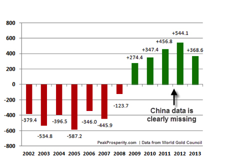
(Source) Note the dotted red line in this chart: it shows the current level of mine production. World demand has been higher than mine production for a number of years. Where has the additional supply come from to meet demand? We'll get to that soon, but the quick answer is: it had to come from somewhere, and that place was 'the West.' A really big story in play here is the truly historic and massive flows of gold from the West to the East, with China being the largest driver of those gold flows. ChinaAlasdair McLeod of GoldMoney.com has assembled the public figures on China's cumulative gold demand which, notably, do not include whatever the People's Bank of China may have bought. Those are presumably additive to these figures unless we are to believe that the PBoC now purchases its gold over the counter and in full view (which they almost certainly do not). Using publicly available statistics only, it's possible to calculate that in 2013 China alone accounted for more than 2,600 tonnes of demand, or more than 60% of total demand or, as we'll soon see, almost all of the world's total gold mine production:
(Source) Of course China has a lot of money to spend, a long and comfortable relationship with gold as a legitimate asset to hold, and has to be very pleased by the repeated bear raids in the western markets that drive the price of gold down, even as gold demand has surged to record highs as a consequence of these lower prices. Of course the big risk in all that Chinese demand for gold is that China may stop buying that much gold in the future for a variety of reasons. One could be that the Chinese bubble economy finally bursts and people there no longer feel wealthy and so they stop buying gold. Another could be that the Chinese government reverses course and makes future gold purchases illegal for some reason. Perhaps they are experiencing too much capital flight, or they want to limit imports of what they consider non-essential items. Who knows? I do know that Chinese demand has been simply incredible and, keeping all things equal, I expect that to continue, if not increase. IndiaIndia, long a steady and traditional buyer of gold, saw so much buying activity as a consequence of the lower gold prices that the government had to impose controls on the amount of gold imported into the country, even banning imports for a while:
(Source) Central BanksAnother factor driving demand has been the reemergence of central banks as net acquirers of gold. This is actually a pretty big deal. Over the past few decades, central banks have been actively reducing their gold holdings, preferring paper assets over the 'barbarous relic.' Famously, Canada and Switzerland vastly reduced their official gold holdings during this period (to effectively zero in the case of Canada), a decision that many citizens of those countries have openly and actively questioned. The UK-based World Gold Council is the primary firm that aggregates and reports on gold supply-and-demand statistics. Here's their most recent data on official (i.e., central bank) gold holdings:
(Source) Note that the 2009 data is lowered by slightly more than 450 tonnes in this chart to remove the one-time announcement by China that it had secretly acquired 454 tonnes over the prior six years, so this data may differ from other representations you might see. I thought it best to remove that blip from the data. Also, the data for 2012 and 2013 must also be lacking official China data because the last time they announced an increase in their official gold holdings was in 2009. In just 2013 alone, the gap between China's apparent and reported gold consumption was over 500 tonnes and the Chinese central bank, for a variety of reasons, is the most likely candidate to have absorbed such a quantity. If true, then China alone increased its official reserves by more than the rest of the world combined in 2013. The World Gold Council puts out what is considered by many to be the definitive source of gold statistics, which are the source data for the above chart. I do not consider the WGC to be definitive since their statistics do not comport well with other well reported data, but let's first take a look at what the WGC had to say about gold demand in 2013:
(Source) The big story there, obviously is that investment demand absolutely cratered even as jewelry and coins and bars rose to new heights. And nearly all of that investment drop was driven by flows out of the GLD investment vehicle. That is, gold was chased out of the weak hands of mainly western investors and into the strong hands of Asian buyers who wanted physical bullion and jewelry. This huge drop in total demand, led by plummeting investment demand, fits quite well with the 15% price drop recorded in 2013. So the WGC tells a nice coherent story so far. But the problem with this tidy story is that it simply does not fit with the above data about China's voracious appetite for gold, let along India's steady demand and rising demand in Europe, the Middle East, Turkey, Vietnam or Russia. The summary of the fundamental analysis of gold demand is
Now about that supply... Gold - SupplyNot surprisingly, the high prices for gold and silver in 2010 and 2011 stimulated quite a bit of exploration and new mine production. Conversely, the bear market from 2012 to 2014 has done the opposite. However, the odd part of the story for those with a pure economic view is that with more than a decade of steadily rising prices, there has been relatively little incremental new mine production. For those of us with an understanding of depletion it's not surprising at all. In 2011 the analytical firm Standard Chartered calculated a rather subdued 3.6% rate of gold production growth over the next five years based on lowered ore grades and very high cash operating costs:
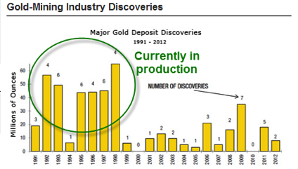
Since then, the trends for lower ore grade and higher costs have only gotten worse. But the huge drop in the price of gold in 2011 and 2012 was the final nail in the coffin and resulted in the slashing of CAPEX investment by gold mining companies. Of course, none of this is actually surprising to anyone who understands where we are in the depletion cycle, but it's probably quite a shock to many an economist. The quoted report goes on to calculate that existing projects just coming on-line need an average gold price of $1,400 to justify the capital costs, while green field, or brand-new, projects require a gold price of $2,000 an ounce. This enormous increase in required gold prices to justify the investment is precisely the same dynamic that we are seeing with every other depleting resource: energy costs run smack-dab into declining ore yields to produce an exponential increase in operating costs. And it's not as simple as the fuel that goes into the Caterpillar D-9s; it's the embodied energy in the steel and all the other energy-intensive mining components all along the entire supply chain. Just as is the case with oil shales that always seem to need an oil price $10 higher than the current price to break even, the law of receding horizons (where rising input costs constantly place a resource just out of economic reach) will prevent many an interesting, but dilute, gold ore body from being developed. Given declining net energy, that's that same as "forever" as far as I'm concerned. Just like any resource, before you can produce it you have to find it. Therefore the relationship between gold discoveries and future output is a simple one; the more you have discovered in the past, the more you can expect to produce in the future, all things being equal. This next chart should tell you everything you need to know about where we are in the depletion cycle for gold, as even with the steadily rising prices between 1999 and 2011 (going from $300 and ounce to $1,900), gold discoveries plummeted in 1999 and remained on the floor thereafter:
(Source) Here we see that the 1990's decade saw quite a number of large discoveries that are currently in production but which were not matched in later years. Since it takes roughly ten years to bring a mine into full production following discovery, it's fair to say that we are currently enjoying production from the discoveries of the 1990's. Future gold production will largely be shaped by the discoveries made since then. In other words: expect less gold production in the future. Meanwhile, there will be more money, more credit, and more people (especially in the East) competing for that diminished supply of gold going forward. Let's take another angle on gold supply, but which circles back and supports the above chart showing fewer and smaller discoveries in recent years. The United States Geological Survey, or USGS, keeps a mountain of data on literally every important mined substance. I think it's staffed by credible people, doing good work, and I've yet to detect political influence in their reported statistics. At any rate, the latest assessment on gold reveals that their best guess for world supply is that something on the order of 52,000 tonnes of reserves are left. Which means that, at the 2012 mining rate of 2,700 tonnes, there are 19 years of reserves left:
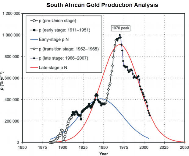
(Source) This doesn't mean that in 19 years there will be no more new gold to be had, as reserves are always a function of price; but it gives us a sense of what's out there right now at current prices. As much as I like the folks at the USGS, I will point out one glaring discrepancy in their data as a means of exposing why I think these reserves, like those for many other critical things like oil, are probably overstated. And that story begins with South Africa (highlighted in the table above with the blue dotted line.) There you'll note that, at 6,000 tonnes, South Africa has the second largest stated country reserves. However, according to official South African data, they claim to have an astonishing 36,000 tonnes of reserves. Which is right? Neither as it turns out. First, the true story of South African gold production is completely obvious from the production data. It's a story of being well and truly past the peak of production:
(Source) And not just a little bit past peak, but 44 years past; down a bit more than 80% from the peak in 1970. The above chart is simply not even slightly in alignment with the claims of the South African government to have 36,000 tonnes of reserves. But pity the poor South African government which knows that gold exports represent fully one third of all their exports. Of course they will want to claim massive reserves that will support many future years of robust exports. Instead, the South African production data can be modeled by the same methods as any other depleting resource and one such analysis has been done and arrived at the conclusion that there are around 2,900 tonnes left to be mined in South Africa.
(Source) The analysis is quite sound; and the authors went on to point out that the social, economic, energy, and environmental costs of extracting those last 2,900 tonnes are quite probably higher than the current market value of those same tonnes. If they are extracted, South Africa will be net poorer for those efforts. This is the same losing proposition as if it took more than one barrel of oil to get a barrel of oil out of the ground - the activity is a loss and should not be undertaken. For lots of political and economic reasons, however, gold mining will continue in South Africa. But, realistically, someone in government there should be thinking this through quite carefully. The larger story wrapped into the South African example is this: perhaps there are 19 years of global gold reserves left (at current rates of production), but I doubt it. Instead, the story of future gold production will be one of declining production at ever higher extraction costs -- exacerbated by the 80,000,000 new people who swell the planet's population every twelve months, the hundreds of millions of people in the East who enter the ranks of the middle class annually, and trillions of new monetary claims that are forced into the system each year. And this brings me to my final point of this part of the public part of this report. ScarcityIf we cast our minds forward ten years and think about a world with oil costing 2x to maybe 4x more than today, we have to ask ourselves some important questions:
After just 100 years of modern, machine-powered mining, all of the great ore bodies are gone, most of the good ones are already in operation, and only the poorest ones are left. By the time you are reading stories like this next one, you should be thinking, Why are we going to all that trouble unless that's the best option left?
The above article is just a different version of the story that led to the Deepwater Horizon incident. Greater risks and engineering challenges are being met by hardworking people going to ever greater lengths to overcome the lack of high quality reserves to go after. By the time efforts this exceptional are being expended to scrape a little deeper, after ever smaller and more dilute deposits, it tells the alert observer everything they need to know about where we are in the depletion cycle, which is, we are closer to the end than the beginning. Perhaps there are a few decades left, but we're not far off from the day where it will take far more energy to get new metals out of the ground compared to scavenging those already above ground in refined form. At that point we won't be getting any more of them out of the ground, and we'll have to figure out how to divvy up the ones we have on the surface. This is such a new concept for humanity -- the idea of actual physical limits -- that only very few have incorporated this thinking into their actions. Most still trade and invest as is the future will always be larger and more plentiful, but the data no longer supports that view. We are at a point in history where we can easily look forward and make the case for declining per-capita production of numerous important elements just on the basis of constantly falling ore grades. Gold and silver fit into that category rather handily. Depletion of reserves is a very real dynamic. It is not one that future generations will have to worry about; it is one with which people alive today will have to come to terms. The issue of Peak Cheap Oil only exacerbates the reserve depletion dynamic by adding steadily rising energy input costs to mix. Should oil get to the point of actual scarcity, where we have to ration by something other than price, then we must ask where operating marginal mines slot onto the priority list. Not very highly, would be my guess. Part 3: Protecting Your Wealth With GoldFor all the reasons above, it's only prudent to consider gold an essential element of a sound investment portfolio. In Part 3: Using Gold to Protect Yourself In Advance of the Greatest Wealth Transfer of Our Lifetime we detail out the specifics of how much of your net worth to consider investing in gold, in what forms to hold it, which price targets are gold and silver most likely to reach, and which eventual indicators (likely years away) to look for that will signal that it's time to sell out of your precious metal investments. The battle to keep gold's price in check is truly one for the ages. Not because gold deserves such treatment, but because the alternative is for the world's central planners to admit that they've poorly managed an ill-designed monetary system of their own creation. As a result, price manipulation is an additional important factor to be aware of, and to address in your accumulation strategy. Make sure you're taking steps today to ensure that the purchasing power of your wealth is protected, if not enhanced, when the trends identified above arrive in full force. Market ManipulationBefore we can address the idea of storing some of your wealth in gold (and/or silver) we have to visit the topic of market manipulation. As many of you are aware this is an area of exceptional controversy, although I am not entirely sure why given the distressing laundry list of recently proven, and often grotesquely brazen, market manipulations performed by big banks in many other market areas. Big banks have been proven or alleged to have manipulated energy markets, LIBOR, currency markets, the global oil market, and aluminum, among other things and all of these transgressions happened after they got caught engaging in forgery and fraud during the mortgage swindles of 2005 to 2007. On one side of the manipulation debate, we might place the Gold Anti-Trust Action (GATA) organization alleging constant official manipulation to suppress the price of both gold and silver, and on the other we might place Jeff Christian, managing director of the metals research firm CPM, whose position is that all price movements can be explained by ordinary market forces. I happen to be somewhere in between those views as I think both legitimate and illegitimate forces are part of the landscape. But I am heavily tilted towards market manipulation as the explanation for why gold (and silver) tend to move downwards violently from time to time and why the prices for each are not higher than they currently are. The SEC has a clear definition of market manipulation and I’ve reproduced it here but swapped out the words ‘security’ and ‘stock’ with ‘gold’ to make it that much clearer:
I also added the two words "or expanding" because that condition also applies to commodities. How likely is it that some firms have been trading in gold in such a way as to create a false, rigged, or deceptive picture of gold (and silver) prices? It’s all but proven in a court of law, but don't hold your breath waiting for that final proof, as the US court system has vigorously defended banks from such lawsuits for decades. I also happen to believe that gold is officially suppressed in price because it's what I would do if I were at the helm of the Fed and cared only for bolstering confidence in the dollar specifically, and fiat currencies generally, making the stock market a more attractive alternative, and also lending credence to political and monetary decisions (for the record, I am merely placing myself in the mind of the enemy here). Given that set of mandates, I would order up some hefty gold suppression because gold has a very bad habit of casting a bright light on rotten monetary and fiscal policy. Suppressing the price of gold just makes so much sense that I would consider it a form of derelict strategic weakness if the Fed et al. were not doing it. One of the more important times to suppress the price of gold would be when... |


More Keynesian Jabberwocky: Deflation’s Scary New Pal—”Lowflation”
By Peter Schiff
| In recent years a good part of the monetary debate has become a simple war of words, with much of the conflict focused on the definition for the word “inflation.” Whereas economists up until the 1960′s or 1970′s mostly defined inflation as an expansion of the money supply, the vast majority now see it as simply rising prices. Since then the “experts” have gone further and devised variations on the word “inflation” (such as “deflation,” “disinflation,” and “stagflation”). And while past central banking policy usually focused on “inflation fighting,” now bankers talk about “inflation ceilings” and more recently “inflation targets”. The latest front in this campaign came this week when Bloomberg News unveiled a brand new word: “lowflation” which it defines as a situation where prices are rising, but not fast enough to offer the economic benefits that are apparently delivered by higher inflation. Although the article was printed on April Fool’s Day, sadly I do not believe it was meant as a joke. Up until now, the inflation advocates have focused their arguments almost exclusively on the apparent dangers of “deflation,” which they define as falling prices. Despite reams of evidence that show how an economy can thrive when prices fall, there is now a nearly universal belief that deflation is an economic poison that works its mischief by convincing consumers to delay purchases. For example, in a scenario of 1% deflation, a consumer who wants a $1,000 refrigerator will postpone her purchase if she expects it will cost only $990 in a year. Presumably she will just make do with her old fridge, or simply refrain from buying perishable items for a year to lock in that $10 savings. If she expects the cost of the refrigerator to decline another 1% in the following year, the purchase will be again put off. If deflation persists indefinitely they argue that she will put off the purchase indefinitely, perhaps living exclusively on dried foods while waiting for refrigerator prices to hit zero. Economists extrapolate this to conclude that deflation will destroy aggregate demand and force the economy into recession. Despite the absurdity of this argument (people actually tend to buy more when prices fall), at least there is a phantom bogeyman for which to conjure phony terror. Low inflation (below 2%) is even harder to demonize. Few have argued that it has the same demand killing dynamics as deflation, but many say that it should be avoided simply because it is too close to deflation. Given their feeling that even a brief bout of minor deflation could lead to a catastrophic negative spiral, they argue for a prudent buffer of 2% inflation or more. But the writer of the Bloomberg piece, the London-based Simon Kennedy, quotes people in high positions in the financial establishment who offer new arguments as to why “lowflation” (as he calls it) is a “threat” in and of itself. And although the article was primarily concerned with Europe, you can be sure that these arguments will be applied soon to the situation in the United States. The piece correctly notes that those struggling with high debt tend to welcome high rates of inflation. The math is simple. By diminishing the value of money, inflation benefits borrowers at the expense of lenders. By repaying with money of lesser value, the borrowers partially default, even when paying in full. The biggest borrowers in Europe (and the United States for that matter) are heavily indebted governments and the overly leveraged financial sector. Should it come as a surprise that they are the leading advocates for inflation? The writer admits that higher inflation will help these interests manage their debt burdens and in the case of the financial sector, profit from the increased lending that low interest rates and quantitative easing encourage. On the other side of the ledger are the consumers, the savers, and the retirees. These groups want lower prices and higher rates of interest on their accumulated capital. Such a combination will lead to higher living standards for those who have worked and saved for many years in order to enjoy the fruits of their efforts. But these types of people are simply not on the “must call” list for our best and brightest economic journalists. As a result, we only get one side of the story. The article also points out that higher inflation gives businesses more flexibility to retain workers in periods of weak growth. The argument is that if sales revenue falls, companies will not be able to lower wages, and will instead resort to layoffs to maintain their profitability. However, this is only true in cases involving labor union contracts or minimum wage workers. In all other cases, business could reduce wages in lieu of layoffs. Plus, if prices for consumer goods are also falling, real wages may not even decline as a result of the cuts. In circumstances where wages cannot be legally reduced, as is the case for unionized or minimum wage workers, layoffs are often the employer’s only option for keeping costs in line with revenue. However, inflation allows employers to do an end run around these obstacles. In an inflationary environment, rising prices compensate for falling sales. The added revenue allows employers to hold nominal wage costs steady, even when the raw amount of goods or services they sell declines. When inflation rages, higher skilled workers will often demand, and receive, pay raises. But low-skilled workers, who lack such leverage, are usually left holding the bag. In other words, politicians can impose a high minimum wage to pander to voters, but then count on inflation to lower real labor costs, thereby limiting the unemployment that would otherwise result. So what the government openly gives with one hand, it secretly takes away with the other. Workers vote for politicians who promise higher wages, but those same politicians also create the inflation that negates the real value of the increase. But while government takes the credit for the former, it never assumes responsibility for the latter. The same analysis applies to labor unions. Based upon political protection offered by friendly officials, unions can secure unrealistic pay hikes for their members. But the same governments then work to reduce the real value of those increases to keep their employers in business. Of course, what the Bloomberg writer was really arguing is that governments need inflation to bail themselves out of the policy mistakes they make to secure votes. But two wrongs never make a right. The correct policy would be to run balanced budgets rather than incur debts that can only be repaid with the help of inflation. On the labor front, the better policy would be to abolish the minimum wage and the special legal protections offered to labor unions, rather than papering over the adverse consequences of bad policies with inflation. So be on the lookout for any more hand-wringing over the supposed dangers of lowflation. The noise will simply be an effort to convince you that what’s bad for you is actually good. And although it’s an audacious piece of propaganda to even attempt, the lack of critical awareness in the media gives it a fighting chance for success |
The Curated Jobs Report, Actual Depression and Bernanke’s Fraudulent Legacy
by Lee Adler
| A couple of things struck me about today’s jobs report. One was the regularity of the straight line trend in non farm payrolls. I mean, even casual observers know that markets and the economy move in trends, (which are your friends) but come on! This steady state 1.6% annual gain for the past 4 years is a bit ridiculous, even for a normally credulous guy like me who is willing to believe almost any statistic the government publishes. But now… NOW… they have just gone too far. This chart shows the actual, not seasonally adjusted nonfarm payrolls number for the month. The headline, seasonally adjusted payrolls number was reported higher by 192,000 which was a little less than conomists’ consensus guess of 195,000. That’s a fake number, a smoothed and stylized attempt to represent the trend. It will get a big revision next month, the month after, and then when the data is benchmarked to the tax data once a year. Then it gets revised 4 more times in following years as they try to fit the number to what actually happened. It’s amazing that it actually does, on occasion, more or less accurately reflect the trend of the data. Whether the data represents reality is certainly arguable. For example, take the birth/death adjustment. Please. |  |
| I won’t get into all the statistical arcana. It bores me. I track the real time Federal withholding tax data, and based on tremendous strength in that data in March, I have no quarrel with this jobs data as reported. It might even be too low, to be revised upward next month. But even if so, it won’t be enough. Which brings me to the other thing I noticed in the data, which is that in spite of the steady trend of improvement for the past 4 years, in terms of a truer measure of employment, the US is still in a Depression. That’s right, not a recession, a Depression. There has been virtually no recovery in the percentage of Americans with full time jobs since the pits of the crash in 2008. Admittedly it’s a selective Depression, but if you are among the selected, your suffering is real. And the drag that millions of unemployed Americans exert on the economy is real. The downward pressure they put on middle class wages is real. Jobs that paid well in the past no longer do. With labor oversupplied, the plutocrats, empowered by the courts and friendly legislators have wiped out the bargaining power of labor in the economy. ZIRP/QE have encouraged unproductive speculation, not job creation. So there are simply far too many millions of Americans so selected to be the losers, to experience the Depression. All of the money printing in the world, all of the ZIRP, has not helped them and has not reduced their numbers. Nor can it ever do so. |  |
| This is the fraud of Ben Bernanke’s legacy. In addition to discouraging job creation, ZIRP has also stolen the savings of seniors, suppressing their returns to the degree that they have been forced to spend their principal down to zero in many cases. For these people, ZIRP stands not for Zero Interest Rate Policy. It stands for Zero In Remaining Principal. For the millions who are unemployed, it stands for Zero In Rehiring Prospects. Bernanke’s policy of financial repression was designed to prop up the very bankers and speculators who, along with the Fed, caused the housing/credit bubble and ensuing crash. In that regard, the policy has succeeded. But Bernanke continues to protest that his real purpose was to save jobs. Either he’s an idiot who believes that ZIRP and money printing will accomplish that, or he’s a criminal liar, simply lining up for his ultimate payoff. There’s a de facto case for Bernanke not being an idiot. One piece of evidence is the millions he receives from his former banker clients and plutocrat funded industry groups just for showing up for a photo op and excuse-making session. He took care of them, now they’re taking care of him. But he’s just following the rules of the game. This is how the system works. Bernanke lives by the rules of that system the golden rule. Those with the gold, make the rules. And this week the Supreme Court again ratified the rules and control of government by the plutocrats. Like Benny himself said, in monetary policy there are winners and losers. He picked those who played by the rules, who worked hard and put money aside all their lives, to be the losers. The wild gunslingers and con men who, along with him, caused the crash, he rewarded with endless free money with which to gamble ad infinitum. By promising to keep interest rates at zero until he told them otherwise, he virtually guaranteed their profits. The result is yet another massive credit and equities bubble, while millions suffer and wait to win the jobs lottery. History has shown again and again that the bubbles created by too easy credit and too much money can only end one way–financial crash and economic contraction. And if they do see some jobs created they are fake jobs, gone with the wind when the air goes out of the bubble. The fake jobs from the last bubble have never come back. The few fake jobs created in this bubble will disappear too, never to return. At least the housing bubble created fake jobs that fed a few million families for a few years, and even temporarily falsely enriched some. This bubble has been a jobless bubble. Bernanke’s excuse for ZIRP and QE was that the resulting higher securities prices would cause a trickle down that would increase job creation. It was one of his many self justifying excuses– a bald faced lie from the bald little man. To encourage real investment that might result in real job creation, investors need real returns that encourage rational investments, rather than the rank, gross, wild speculation in credit, equities, and exotic derivatives. The speculation that Fed policy promotes and enables, creates only fictitious capital, not real tangible investment in ventures that create employment opportunities. In this sense, the end of ZIRP and QE cannot come soon enough. The question is whether it can come at all. With the US Government owing trillions, for the Fed and Federal Government any material rise in interest rates is simply unthinkable. Rising interest rates would force a brutal austerity. They will do anything to fight that. Under the circumstances, the steady hollowing of the middle class in America could go on indefinitely. The only way out that I can see would be a crash and reset. This hideous mess is Bernanke’s legacy. |
This Is The End!(?)
by Greg Harmon
 | The Symposium was a great exchange of ideas. For the most part the Keynote speakers were all very bullish in the US market for the long haul. Quite a bit different than the the sentiment above. All but one had no idea about what was happening Friday either because they spoke Thursday, or early in the day or just did not care or both. One that did, John Murphy (yes that John Murphy of InterMarket Analysis) closed the conference speaking at 4:00 pm Friday, knew what was happening, addressed that we may see a short term pullback but was also bullish. Just because these speakers are seasoned veterans and are bullish does not mean we cannot or will not see a pullback. or that they will not change their mind after looking at the situation this weekend. I doubt one more day will do that but who knows. Build a plan. Address the risks in it. And stick to it. |
Bulls vs. Bears: Some Profit Margin Stories Are Better Than Others
by ffwiley
I caught up recently on a debate about S&P 500 valuation involving GMO, Hussman Funds and their assorted critics (see here or here, for example). As you may know, GMO and Hussman take the position that stocks are expensive, citing a variety of indicators and arguing that profit margins should “mean revert” from record highs. On the other side, market bulls dispute the indicators and propose that fat margins are no big deal – they might just remain at record highs indefinitely. “High margins reflect a long-term structural change, not a short-term cyclical one,” according to one account of a popular position. Also: “It’s a mistake to think that margins will revert to a long-term mean just for the sake of reverting to a mean.” The message seems to be that mean reversion is for losers. This is a new era, or it’s a new economy, or whatever. I’m paraphrasing, but the story sounds a lot like the capital letter New Economy of the late 1990s. There’s even a technology angle once again, along with huge confidence in monetary policy and recession-free growth. Above all, there’s a notion that the world might be different. Needless to say, the new, new economy story comes with plenty of red flags. But let’s not dismiss it just because it didn’t pan out the last time around. If we’re not buying the story, we should at least have a clear rationale and not just assume mean reversion “for the sake of reverting to a mean,” as noted above. I’ll take a shot at providing such a rationale. Or, as Brad Katsuyama might say: “Let’s do this.” What exactly is mean reversion? As much as I hate to start with a definition, people seem to interpret mean reversion differently, with the problem that it’s not always clear what’s being said. I don’t claim any particular authority for my definition, but when I say that profit margins mean revert, understand that this is what I mean:
Why should profit margins mean revert? It goes without saying that the ups and downs of the profit cycle are closely tied to the business cycle. But cyclicality isn’t enough to meet all the criteria above, which require that cyclical changes aren’t overwhelmed by structural trends. There are two other forces that keep the structural trends in check – external and internal competition. External competition – meaning between businesses – is the most obvious of the two, and ever since Adam Smith, isn’t especially controversial. Businesses are naturally more eager to invest when profits are strong. This leads to more competition, less pricing power, and eventually, margins are pushed downwards. The implication is that there’s a close link between margins, which help determine the return on capital, and interest rates, which determine the cost of capital. It’s hard to imagine a “new economy” for margins without a corresponding “new economy” for interest rates. (But, as noted above, we’re going to try). Internal competition refers to the conflicting interests of executives and shareholders, otherwise known as agents and principals. Executives may evaluate potential expenditures in terms their own power or prestige rather than what matters most to the shareholder – return on capital. Generally, executives also like to be paid as much as possible and tend to make hay when the sun shines. When margins are fat, they loosen the purse strings for pet projects, and especially, compensation. They normally manage to claw back some of the shareholders’ profits. This is the classic principal-agent problem, and it contributes to mean reversion. The new, new economy Now for the bull story, or at least a few of the key pieces that are getting particular attention, as shown in this chart:
The chart suggests that the increase in margins can be divided up neatly into a few factors, including a decline in effective corporate tax rates, low interest rates and good times in particular sectors. This is helpful information for anyone trying to understand recent results and how they may change in the immediate future. But it doesn’t say much about mean reversion. Apart from the business cycle, mean reversion is explained by competition occurring between and within businesses, as discussed above. It has little to do with current taxes and interest rates or booms in specific sectors. Therefore, even though the chart may depict changes that are structural in a general sense, such as the decline in corporate tax rates, it doesn’t describe changes that have structural effects on margins. Look at it this way: Let’s say Congress eliminates every tax loophole tomorrow, tripling the average tax rate on U.S. corporations. Margins would fall sharply, no doubt. But does anyone really think the effect would be permanent? That businesses wouldn’t raise prices and/or cut costs to neutralize the higher taxes? And if you accept that businesses adjust to rising tax rates, why wouldn’t they adjust to falling tax rates? The answer is that businesses do adjust. Over time, competition (again, external and internal) pushes extreme margins back to normal. That can only change if the competitive forces themselves weaken. Therefore, analysis that purportedly demonstrates an end to mean reversion shouldn’t ignore these forces. Which leads to the question of whether we can come up with other stories that are genuinely structural, rather than cyclical, explanations for high margins. I can think of three possibilities: The “Munger” story
If shareholder advocates have learned as much about incentives as Munger, they may have mitigated the principal-agent problem, and consequently, boosted margins. If so, this would be a structural effect. Is the story true? On the one hand, you might argue that there’s more equity-linked compensation than, say, in the 1980s. This would better align principals with agents. On the other hand, there’s also more dilution. Stock options are a great way for executives to grab a bigger piece of the pie. Call me cynical, but I’m guessing these effects offset. More broadly, I expect margins to gradually succumb to temptations, as they always do. When earnings are strong and stock prices lofty, empire builders get busy and pay negotiations become more aggressive. At the same time, you don’t hear as much from the folks who are naturally cost conscious. These facts of life aren’t easily overturned by corporate engineering. The “Lewis” story
Judging from the crony capitalism chronicled in Lewis’s book, you might wonder if profit margins are high because they’re protected by corrupt politicians. There’s no better way to build a moat than through government-sanctioned advantages, and companies spend more money lobbying for those advantages than ever before. Think of it this way: The invisible hand may squeeze margins, but the invisible handshake works in the opposite direction. Sadly, I suspect there’s some truth in this story, but it’s unlikely to be either a large effect or especially bullish. One obvious offset to the positive effect on profits is that cronyism saps productivity over the long-term. Another is that the gains don’t necessarily accrue to shareholders (see “Munger” story above). The “Fama” story
When assets appear to offer unusually high returns, Fama would say that investors see unusually high risks. By the same logic, you might argue that extreme margins aren’t being competed away because it’s a lousy environment for risk-taking. I won’t repeat the reasons why this may be so, since I discuss them often. I’ll just point out that margins are high partly because of the same risks that are holding back business investment, which I discussed here. Of course, business investment also affects margins more directly by raising costs, and this is another factor to consider. One way or another, the co-existence of strong profits and weak business investment seems best explained by risk. These trends could persist, but it’s not a particularly bullish story. What is and isn’t new If you’re keeping score, you’ve noticed that I mostly dismissed the first two stories but not the third. Essentially, I’m arguing that we may indeed be witnessing a new economy, but the newness isn’t explained by profit margins being structurally higher than before. They may be somewhat higher, but probably not by much. Rather, newness is explained by attitudes towards risk, which perhaps isn’t surprising if you consider that today’s extreme highs in profitability were preceded by extreme lows at the last trough. In fact, increasing volatility is what stands out most in the last two decades of data. Moreover, even bulls accept that there’s little potential for further margin expansion. Such asymmetry of risks – high probability of an eventual fall in margins coupled with little chance of a significant increase – is another way to think about the consequences of mean reversion. Circling back to the Business Week excerpt from the beginning, I saved the Alan Greenspan article after reading about it in Robert Shiller’s Irrational Exuberance Investment implications This post is already too long for a full investment discussion, but I’ll close with a few points that I think are important. First, profit margins are unlikely to determine stock prices in the next quarter or year. For tactical investors with short horizons, the biggest questions still have to do with the Fed, and specifically, its reactions to changes in the economy. Does weak data mean that the taper tapers or untapers or however that should be said? Does strong data mean that rate hikes come sooner rather than later? Does QE mean revert? Okay, the last one may or may not make sense but you get the idea. Second, mean reversion isn’t the same as valuation. Of the indicators used most often in the valuation debate, I can’t think of any that assume margins return to long-term historic averages. Most don’t require any assumptions about future margins at all. I’ve even reported a price-to-trend-earnings measure that can have the effect of extrapolating an upwards margin trend into the future, rather than reverting it back to historic norms. Third, the margin discussion is ultimately about risk, as suggested above. Some analysts have recommended ignoring risk and contemplating only future cyclical peaks for indicators such as margins and valuation multiples. This may be okay for investors with the ability and foresight to liquidate only near market tops. Unfortunately, the vast majority of investors aren’t quite that deep-pocketed and skilled. For most investors, cyclical troughs can be costly and risk matters. |

Tech breaks support with Momentum hitting highest levels since 1999!
by Chris Kimble
|
CLICK ON CHART TO ENLARGE Two weeks ago the Power of the Pattern shared that the NDX had recorded the highest overbought momentum readings since the 2000 highs. At the same time it was forming a bearish rising wedge at resistance as key Bio Tech names were already breaking support. (See post here) The chart above updates the NDX pattern, reflecting that that support of the bearish rising wedge is breaking and Mo Mo is too! These set up reflected a price point to manage risk, from a portfolio construction perspective and the action over the past two weeks hasn't changed this message! Party like its 1999??? |

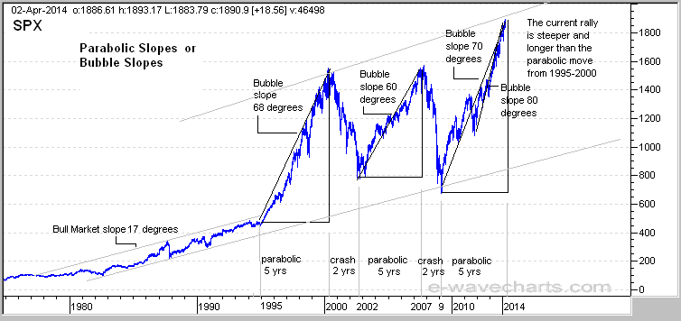
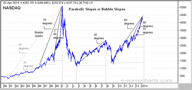
Stock Markets Bubbles and Parabolic Slope Theory
By: Dan_Stinson
| There has been extensive discussion questioning the current rally and if it has reached bubble status. Firstly, what is a bubble from a technical standpoint? A bubble is a parabolic advance in a market or stock where the price appears to move straight up without normal corrections. The corrections or pullbacks are small, sending the stock or index straight up. Greed and euphoria are high and complacency is low. The higher the market or stock moves, the bigger the bubble and the more pain on the way back down. As we have seen, bubbles can occur in stocks, stock markets, commodities, debt, Real Estate and derivatives. Parabolic advances can't be sustained and always end poorly, with the price usually falling below the starting point of the parabolic move. What goes straight up, comes straight down faster and usually further. So, to determine if a bubble is in play, we need to analyze the advance to determine if it has gone parabolic. We know that parabolic advances always fail, so a parabolic advance in a market where it is questioned to be a bubble, will also fail or burst. [Parabolic advance = Bubble] S&P500 Parabolic Slopes and Bubble Tops 2000 - 2007 - 2014
Parabolic Slopes and Market Bubbles including Gold - Nasdaq - SOX - Nikkei and a few stocks
We can see similarities on these charts to determine if a bubble is in play on any chart. Parabolic advances that are near the 70 degree slope range always fail. In fact, some of the charts only had a 30-60 degree slope rally into the 2007 high. We can see that some of the charts had a major bubble in 2000 and have had smaller bubbles in 2007 and currently in 2014. We can see that some of the stocks are in bubbles now which have pushed the indices into bubble status as well. We can also see the classic 70 and 80 degree slope rule for Gold into the 1980 bubble top and again into the 2011 bubble top. Parabolic advances or (bubbles) always end poorly and usually retrace the entire advance. We can use our 70 degree parabolic slope rule to determine if an index or a stock is in a bubble. If the last advance of the move is running at an 80 degree slope or higher, then this could suggest that the last wave up is in play and possibly as wave (5) up. |
Subscribe to:
Posts (Atom)