Monday, March 10, 2014
Gold Price Seasonal: When Is the Best Month to Buy?
By: Jeff_Clark
Many investors, especially those new to precious metals, don't know that gold is seasonal. For a variety of reasons, notably including the wedding season in India, the price of gold fluctuates in fairly consistent ways over the course of the year.
This pattern is borne out by decades of data, and hence has obvious implications for gold investors.
Can you guess which is the best month for buying gold?
When I first entertained this question, I guessed June, thinking it would be a summer month when the price would be at its weakest. Finding I was wrong, I immediately guessed July. Wrong again, I was sure it would be August. Nope.
Cutting to the chase, here are gold’s average monthly gain and loss figures, based on almost 40 years of data:

Since 1975—the first year gold ownership in the US was made legal again—March has been, on average, the worst-performing month for gold.
This, of course, makes March the best month for buying gold.
But: averages across such long time frames can mask all sorts of variations in the overall pattern. For instance, the price of gold behaves differently in bull markets, bear markets, flat markets… and manias.
So I took a look at the monthly averages during each of those market conditions. Here’s what I found.
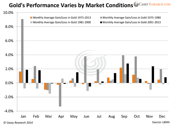
Key point:
The only month gold has been down in every market condition is March.
Combined with the fact that gold soared 10.2% the first two months of this year, the odds favor a pullback this month.
And as above, that can be a very good thing. Here’s what buying in March has meant to past investors. We measured how well gold performed by December in each period if you bought during the weak month of March.

Only the bear market from 1981 to 2000 provided a negligible (but still positive) return by year’s end for investors who bought in March. All other periods put gold holders nicely in the black by New Year’s Eve.
If you’re currently bullish on precious metals, you might want to consider what the data say gold bought this month will be worth by year’s end.
Regardless of whether gold follows the monthly trend in March, the point is to buy during the next downdraft, whenever it occurs, for maximum profit. And keep your eye on the big picture: gold’s fundamentals signal the price has a long climb yet ahead.
Everyone should own gold bullion as a hedge against inflation and other economic maladjustments… and gold stocks for speculation and leveraged gains.
The greatest gains, of course, come from the most volatile stocks on earth, the junior mining sector. Following our recent Upturn Millionaires video event with eight top resource experts and investment pros, my colleague Louis James released his 10-Bagger List for 2014—a timely special report on the nine stocks most likely to gain 1,000% or more this year. Click here to find out more.
Micro to Macro Charts In Support of Silver Price
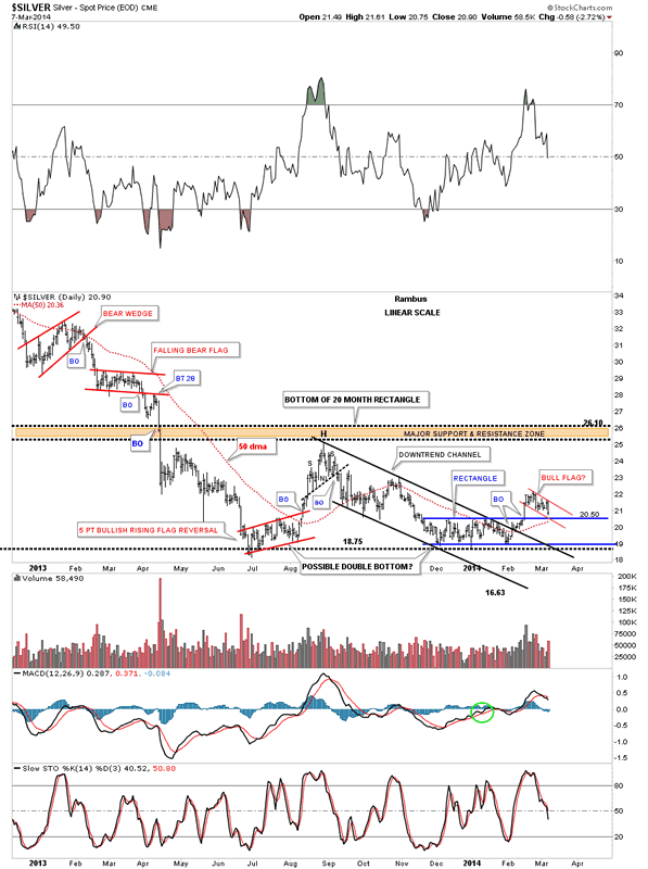
In this report I want to take a good hard look at silver which has been the laggard in the precious metals complex to see if there is something technically wrong. If you been following the precious metals complex for any length of time you'll know that silver can be contrarian at times. It likes to start out slow and then once gold begins to pickup the pace then silver will play catchup. Once silver gets ready to move it can rally hard and fast catching up to gold and surpassing in on a percentage basis. So far since the December low silver is playing its game of Opossum by looking weak and not confirming the move in gold or the precious metals stocks. I think this is a deceptive look on silver right now. Lets see what the charts are telling us about silver and look for some clues that might help shed some light on what is really taking place right now.
The first chart is a six month daily look that shows our five point rectangle reversal pattern that has reversed the downtrend. The breakout was accompanied buy some really heavy volume which is what you like to see. I've added a brown shaded support and resistance zone that gives us a place to look for support now that silver has broken above that area of resistance. That zone is roughly 20.35 to 20.60 which should offer good support. One last important note on the chart below. Since silver made its breakout high it has been in backtest mode which is to be expected. In doing so it has created a small red rectangle halfway pattern to the downside. Using the impulse measuring technique I've been showing you the little red rectangle halfway pattern has a price objective down to the 25.53 area which is in the brown shaded support and resistance zone.
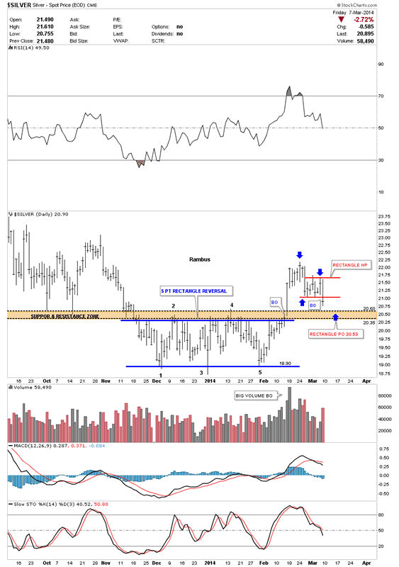
Lets now look back about one year that shows the two reversal patterns that are now in play. The first reversal pattern is the big blue five point Diamond reversal pattern. This Diamond has shown up on a lot of the PM stocks which has done a little morphing since we first started to recognize it last year. The other reversal pattern is the blue five point rectangle reversal pattern that we looked at on the chart above. We have two - five point reversal patterns in play right now that suggests a decent bottom should be in place right now.
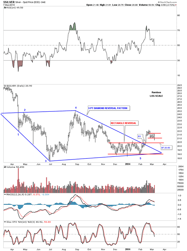
Lets look at another daily chart for silver that is about a year long that shows us another positive development. When silver broke above the brown shaded support and resistance zone it also took out the top rail of a six month downtrend channel along with the top rail of the 5 point blue rectangle. If you look real close you will see that silver backtested the top rail of the downtrend channel, around the 20.50 area, for just two days before it shot higher. It now looks like silver is going to backtest the brown shaded support and resistance zone, from the topside, just as it did back in October of last year. Note how fast silver moved up last August when it was ready to go. If you're not positioned before a move like that it's hard to get on because there is no pullback. You either plug your nose and jump in or you miss the move.
Lets look at one more longer term daily chart for silver that puts the downtrend channel and the blue five point rectangle reversal pattern in perspective. I would like to focus your attention to the bottom right hand side of the chart that shows our current price action. There are three possible areas of support that intersect right at the 20.50 area. The first one is the top of the blue rectangle. The second is the bottom rail of the red bull flag that is made up of the little red rectangle halfway pattern that I showed you on the first chart above. The third possible area of support is the 50 dma that comes in at 20.36.
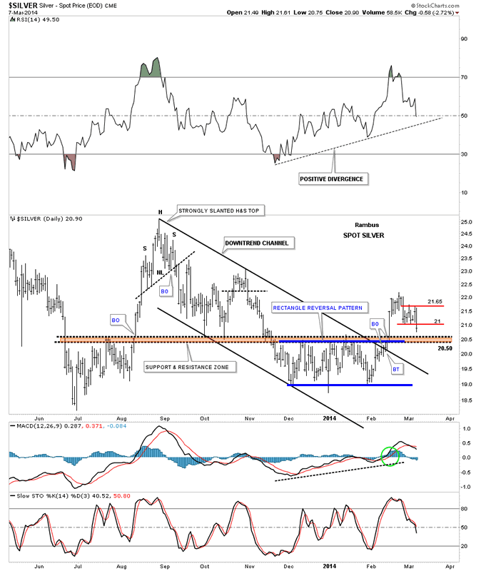
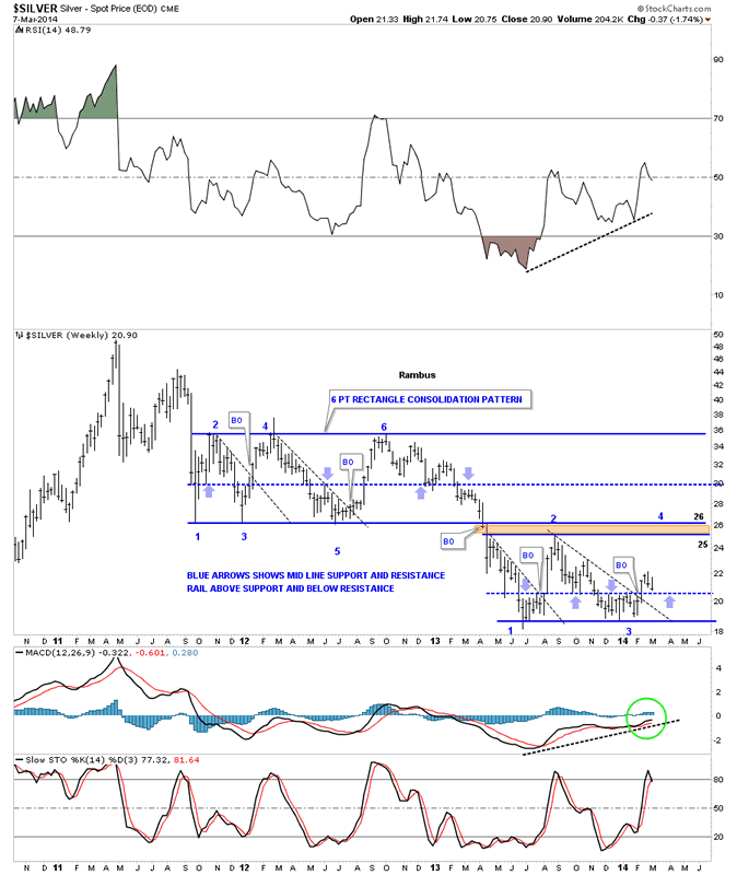
Now lets take a look at a weekly chart that starts putting the big picture into focus. This weekly chart shows the rally up to the 50 area and the bear market that has ensued. After breaking down from the unbalanced double top silver went right into a six point rectangle consolidation pattern that lasted almost two years. Whenever you have a horizontal trading range or rectangle I always look for a mid rail that forms in the center of the rectangle. Sometimes these mid rails will be exactly in the middle and sometimes they can be offset just a bit either up or down from the mid point. As you can see on the upper six point rectangle the center blue dashed rail is pretty close to the center as shown by the light colored blue arrows. What the blue arrows are showing is the tops and bottoms which you connect your center line to. Above is support and below is resistance. As you can see in our current horizontal trading range the mid line is a tad lower as shown by the thin blue arrows. It comes in at, you guessed it, 20.50. The black dashed down sloping trendlines shows what happens when they get broken to the upside. As you can see there is generally a very strong rally backup to the top of the trading range. So far silver is four weeks into its breakout move above its black dashed downtrend rail. Hopefully when the backtest gets finished it will waste little time rallying back up to the top of the trading range between 25 and 26.
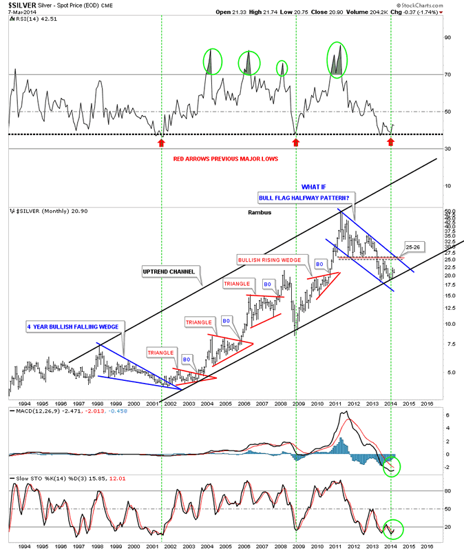
Lets look at the monthly chart that shows the very large uptrend channel that silver has built out over the last 12 years or so. The two big blue patterns make up the width of the uptrend channel with the smaller red secondary patterns making up the rest of the bull market in the move going into the April 2011 top. Whenever I see a chart like this, that has several smaller consolidation patterns that form in an uptrend, and then the stock makes a much bigger consolidation pattern, I always think of the bigger consolidation pattern as a halfway pattern. This can be on any time frame. This is one of those "WHAT IF" moments. What if this three year blue bull flag is a halfway pattern to the upside. What would the price objective for silver be if this is the case? If this three year bull flag is actually a halfway pattern in the secular bull market, that the precious metal complex has been in since the beginning 2000, then the price objective would be around the 200 area give or take 20 dollars. That's a long time from now but it's a possibility. Right now we have to worry about the 20.50 area holding support and take it one step at a time.
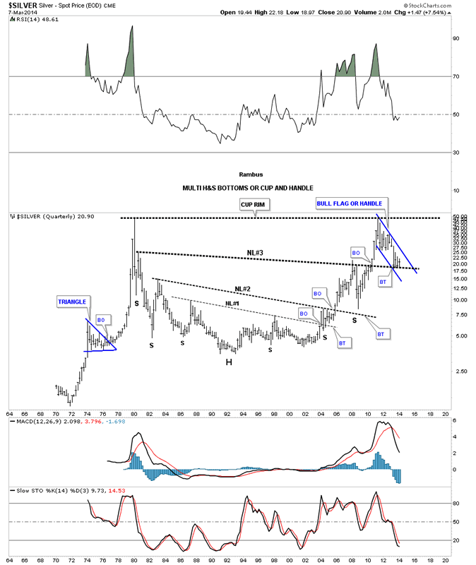
The last chart I would like to show you for silver is the quarterly chart that shows all the history going back to 1970. You can see why the possibility for 200 isn't out of the question. Silver has been reversing symmetry back up to how it went down after the 1980 all time high. Its been making a series of H&S bottoms with the third and largest H&S bottom working as support as silver is in backtest mode right now. Also silver could be forming a very large cup and handle with our blue bull flag being the handle. The first thing we need to see happen is for silver to breakout of its bull flag then takeout the all time high at 50. So there is a lot of work to do but the possibility is there in the long term picture. Note how big our current blue flag looks compared to any other consolidation pattern on this very long term chart.
In the very short term silver needs to hold support around the 20.50 area and then rally strongly up from there. If it can do that then our first price objective will be the 25 to 26 area which is the top of our recent high in this consolidation pattern and the bottom of the six point rectangle that formed after silver put in its major top in April of 2011. So we wait for silver to shows us her hand.
Evening markets: Brazil boosts coffee. But China sinks soy
by Agrimoney.com
Evening markets: Brazil boosts coffee. But China sinks soy
Coffee and sugar retained their appeal to investors. But grains and soybeans sure struggled.
Arabica coffee soared 3.3% to 203.40 cents a pound in New York for May delivery, after earlier touching 206.85 cents a pound, the best for a nearest-but-one contract since February 2012, amid ideas that rainfall over the weekend in the Brazil coffee belt was less than generous, and with little hope of much more for now.
Brazilian weather group Somar said that the weekend was marked by "low cumulative rainfall and higher temperatures" in most coffee-producing areas, while the departure of a cold front looked like meaning "decreasing" rainfall ahead.
In the US, MDA said that "significantly dryness continues" in central Minas Gerais, the top coffee-growing state, besides east central Sao Paulo, the neighbouring state which is Brazil's top grower of sugar cane.
As an extra boost, data late on Friday revealed that hedge funds had increased only by a small amount their net long position in arabica coffee futures and options, by just 6 contracts to 27,872 lots, still well below historic highs and signalling scope for further long positions.
Extreme net long positions question whether further buyers remain to come in and prop up prices further.
Sugar revival
In New York raw sugar, there was some concern over a hike of nearly 43,000 contracts week on week in the managed money net long, more than some investors had expected, and prompting some
"The increase… and rain arriving in Centre South Brazil sugar areas over the weekend was enough to prompt some early selling this morning on the opening in New York," Nick Penney, senior trader at Sucden Financial said.
But with the rainfall emerging as ungenerous, and the dry outlook for some areas, raw sugar for May closed up 1.2% at 18.22 cents a pound, albeit still below last week's highs.
(The managed money net long in raw sugar topped 200,000 contracts in October, by the way, suggesting plenty of scope for further buying if funds further get the bullish bit between their teeth.)
Inventory revisions
Also among soft commodities, cotton managed a higher close, up 0.3% at 91.56 cents a pound for May delivery, among the highest closing levels for a nearest-but-one contract of the last two years.
The US Department of Agriculture, in its monthly Wasde crop report, nudged higher by 320,000 bales to 96.8m bales its forecast for world cotton stocks at the close of 2013-14, a reflection of dimmer hopes for Chinese and Pakistani consumption.
"China's consumption is lowered 500,000 bales based on increasing concentrations of domestic supply in the national reserve and continued growth in cotton yarn imports," the USDA said.
"Pakistan's consumption also is lowered 500,000 bales, as sluggish imports indicate lower use.
But the forecast for US stocks was cut by 200,000 bales to 2.8m bales, reflecting an improved hope for exports, and supportive for prices.
Soybeans slump
The Wasde might, on the face of it, have been expected to have proved supportive for row crops, in cutting the estimates for US corn and soybean stocks at the close of 2013-14.
Corn stocks were downgraded to below market expectations, and although the soybean figure was a touch above, it still represented the tightest, compared with use, for 48 years.
But all the data appeared to do was turn a downbeat session into something of a rout, with soybeans for May slumping 2.7% to $14.18 ¾ a bushel.
The contract fell temporarily below its 10-day moving average for the first time in more than a month.
Already dialled in
One trouble was the high expectation for the report, in terms of providing bullish news, sentiment evident in the large hedge fund bets on higher prices.
"When you have run up as much as we have in all of these markets, it is difficult for a [Wasde] report to provide the bullish numbers needed to sustain strength," Darrell Holaday at Country Futures said.
However, there was also the problem of Chinese cancellations of import orders which, even if not evident in orders from the US, are rumoured to be affecting purchases from Brazil.
The tumble overnight in soybeans on China's Dalian exchange, where the best-traded September contract settled down 2.3% at 4,367 remninbi a tonne, added weight to such talk.
Negative margins
"China has reported washed out of 18 cargoes of Brazilian soybeans, and is reportedly looking to wash out of 20-25 more," Mr Holaday said.
"This is a problem for the soybean complex as it reflects the backlog of soybeans in China."
Indeed, Chinese soybean crush margins have tumbled from a positive $150 a tonne in October to a negative $30 a tonne or so, according to Morgan Stanley.
Benson Quinn Commodities said that "it appears China may have cancelled as many as 15 cargos. Chinese port supplies are ample, while crush margins are negative."
US Commodities noted rumours of "10-15 vessels cancelled in South America by China".
'More difficult to cancel'
It was noteworthy that orders of Brazilian, rather than US, soybeans are being ditched.
"China bought a lot of US soybeans delivered (CIF), which makes them much more difficult to cancel," Mr Holaday said.
The cancellations will have a knock on effect on the US in freeing up supplies for other buyers, but Benson Quinn Commodities noted some reason not to panic just yet.
"Brazilian basis levels weakened on the news, but the spread between Brazilian and US values has not reached levels that would indicate the pace of US imports from Brazil increasing," the broker said.
Corn vs soybeans
Corn dropped heavily too, by 2.2% to $4.78 ¼ a bushel, although not by quite enough to sacrifice the contract its hard-won 200-day moving average, regained last week.
Besides the broader "buy the rumour, sell the fact" thinking, the grain may tend to take more notice of soybeans for a while, given the imminent spring planting period, in which the two crops compete strongly for area (and with cotton a bit too).
This theme will come sharply into focus on March 31, with the release of a key US report on prospective plantings.
The soybean: corn ratio, on a November: December futures basis, actually closed at 2.46: 1, firmly encouraging plantings of the oilseed over corn.
'Great deal of risk premium'
Wheat, while initially resilient, lost ground too, ending down 2.0% at $6.40 ¾ a bushel in Chicago for May delivery.
In fact, the Wasde produced few changes for wheat. And among these changes was an upgrade to the forecast for Russian exports in 2013-14, by 1.0m tonnes to 17.5m tonnes, rather than showing any hint of concern at any fallout on trade from the Ukraine crisis.
In fact, "a great deal of risk premium is now in the market on the Russia/Ukraine situation" US Commodities said.
But without fresh signs of Ukraine unrest, investors were reluctant to add any more.
In Paris, the May contract fell in sympathy, by 1.4% to E207.00 a tonne, despite an upgrade by the USDA to its estimate for European Union exports, by 1.5m tonnes to a record 29.0m tonnes.
Aggressive Stock Market Sell Signals Abound
I just came back from juror orientation and will be on call the rest of this week. I will let you know when I get called later this week.
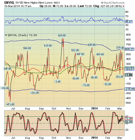
The NYHL broke down beneath its prior low and beneath mid-Cycle support at 194.91. This gives us a tentative sell signal, since we must see whether the signal remains at the close.
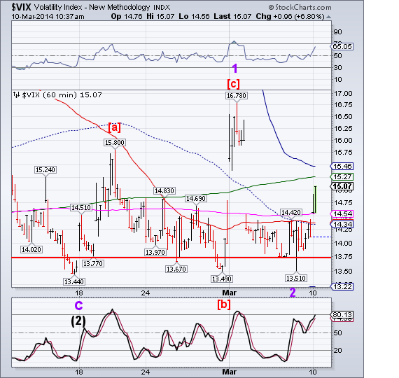
VIX has also given a SPX sell signal by rallying above its 50-day moving average at 14.54 and remaining above it at the retest. This is a good signal because it passed the retest. You can wait until it breaks above Intermediate-term resistance at 15.26 for even more confirmation.
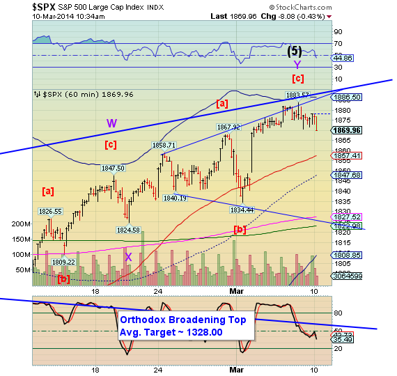
SPX just broke beneath last week’s post rally lows, putting it on an aggressive sell signal. Short-term traders may take a position against the SPX. Those longer term traders may ease into their short positions with a partial position.
Stocks Bull Market Continues
By: Tony_Caldaro
The week started with Russia flexing its military muscle in the Ukraine, and the market sold off to SPX 1834 by Monday noon. After the event was temporarily neutralized the market recovered, and made all time new highs every day thereafter. For the week the SPX/DOW were +0.90%, the NDX/NAZ were +0.45, and the DJ World index rose 0.40%. Economic reports for the week finally turned positive, with positive reports outpacing negatives ones 10 to 7. On the uptick: personal income/spending, PCE prices, ISM manufacturing, construction spending, monthly payrolls, the MIS, monetary base, the WLEI, plus weekly jobless claims improved. On the downtick: monthly auto sales, the ADP, ISM services, factory orders, consumer credit, plus the unemployment rate and trade deficit nudged higher. Next week we have Retail sales, Business/Wholesale inventories and the PPI.
LONG TERM: bull market
This liquidity driven Cycle wave [1] bull market continues to exceed expectations. Just as, I would imagine, the liquidity driven 1932-1937 Cycle wave [1] bull market did decades ago. Then, Primary waves I and III were rather simple one year affairs, with an extending Primary V taking three years to unfold. Quite similar to the 2002-2007 bull market. Although the waves in the 2002-2007 bull market were of a lesser Major degree.
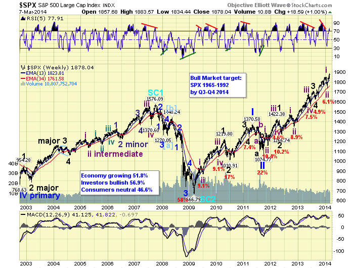
This bull market has had a two year Primary I and, currently, a three year Primary III. Primary II, for those that keep count, only lasted five months. Primary I naturally divided into five Major waves, with a subdividing Major wave 1. Primary III is also dividing into five Major waves, but Major waves 1, 3 and 5 are all subdividing. Major waves 1 and 2 completed by mid-2012. Major waves 3 and 4 completed by mid-2013. It would make sense then, to expect Major wave 5 to complete around mid-2014. Especially since the subdividing waves of Major waves 1 and 2, Primary I, also completed in mid-year.
MEDIUM TERM: uptrend
During this Major wave 5, Intermediate wave one completed in mid-January and Intermediate two in early-February. Intermediate wave three is only a month old and has already exceeded the old all time high by nearly 2%. The initial advance off the Int. two SPX 1738 low was quite strong and very implusive. The market rose to SPX 1848 (110 points) in just two weeks. After that it became quite choppy until this week. As it has risen just 36 points in over two weeks. This choppiness has left a short term pattern that has many potential counts.
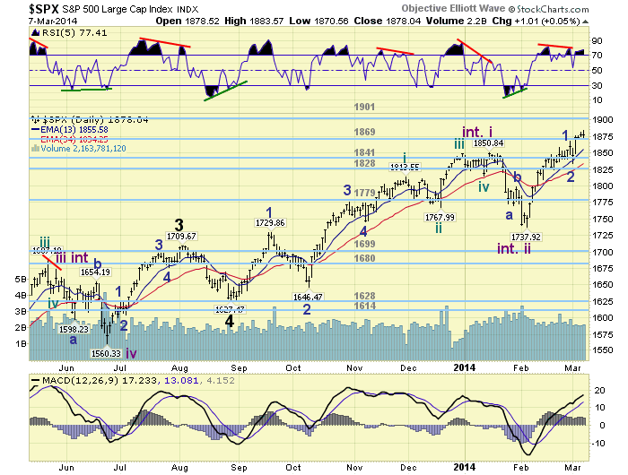
During this bull market third wave trends, which this is one, and there have been four, have lasted between 4 and 7 months in duration. This would suggest an Int. wave three high some time by around June, maybe longer. If this one is anything like Int. wave three of Major wave 1 (Nov11 to Mar12), when the SPX rose 263 points. Then we are looking at potentially an Int. iii high near June around SPX 2000. Actually our target for this uptrend is the OEW 1974 pivot, and the pivot after that is 2019. Medium term support is at the 1869 and 1841 pivots, with resistance at the 1901 and 1962 pivots.
SHORT TERM
Short term support is at the 1869 pivot an SPX 1859, with resistance at SPX 1884 and the 1901 pivot. Short term momentum ended the week just above neutral. The short term OEW charts are positive with the reversal level now SPX 1871.
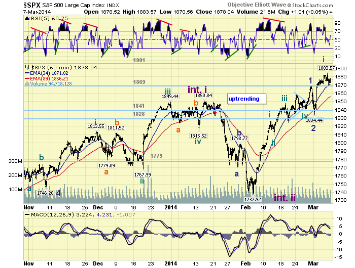
The uptrend can best be counted as five Minute waves up to complete Minor 1 at SPX 1868. The five Minutes waves are: 1827-1809-1848-1841 (triangle)-1868. Minor wave 2 then completed at SPX 1834 on Monday. From that low the market rallied to SPX 1884 early Friday, completing Minute one. Then pulled back to SPX 1871, also on Friday, possibly completing Minute wave two. As soon as the market rallies above SPX 1880 we will label that low, or the next low, as Minute wave two. Best to your trading!
FOREIGN MARKETS
Asian markets were mostly higher for a net gain of 1.2%.
European markets were mostly lower for a net loss of 0.6%.
The Commodity equity group was also mostly lower for a net loss of 3.3% - mostly Russia.
The DJ World index is uptrending and gained 0.4% on the week.
COMMODITIES
Bonds entered a downtrend and lost 0.8% on the week.
Crude was quite choppy losing just 0.1% on the week.
Gold continues to have negative divergences, but gained 0.8% on the week.
The USD remains in a downtrend and lost 0.1% on the week.
NEXT WEEK
Tuesday: Wholesale inventories. Wednesday: the Budget deficit. Thursday: weekly Jobless claims, Retail sales, Export/Import prices, and Business inventories. Friday: the PPI and Consumer sentiment. On Thursday FED governor Powell will give Senate testimony. Best to your weekend and week!
Copper limit Down in Full Crash Mode, Commodities in Peril
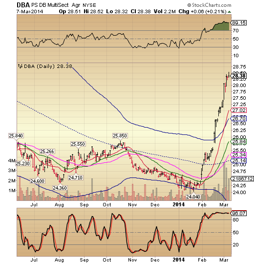
DBA has just completed a 65.6% retracement of its previous decline. This is a typical bear market rally propelled by shorts having to cover. This is why shorting the market can be a zero sum game, if profits aren’t taken early. On the other hand, this presents another opportunity to short agricultural products. The decline may be breathtaking, as DBA goes into a Primary Cycle decline.
Investing.com - U.S. corn futures fell from a six-month high on Monday, as investors readjusted positions ahead of the U.S. Department of Agriculture’s closely-watched monthly supply and demand report due later in the day.
On the Chicago Mercantile Exchange, corn futures for May delivery fell to a session low of $4.7888 a bushel. Corn prices last traded at $4.8038 a bushel during U.S. morning hours, down 1.65%.
Copper is yet another example of a commodity going into crash mode. It is difficult to say whether it is going into Wave 3 of (3) yet, or not, but the decline should be powerful, nonetheless.
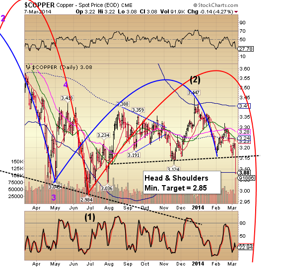
ZeroHedge comments, “It would appear the fecal matter is starting to come into contact with the rotating object in China. Worrying headlines are beginning to mount on the back of real economic events (an actual default and a collapse in exports):
*COPPER IN SHANGHAI FALLS BY 5% DAILY LIMIT TO 46,670 YUAN A TON
*CHINA YUAN WEAKENS 0.46% TO 6.1564 VS U.S. DOLLAR
*YUAN DROPS MOST SINCE 2008
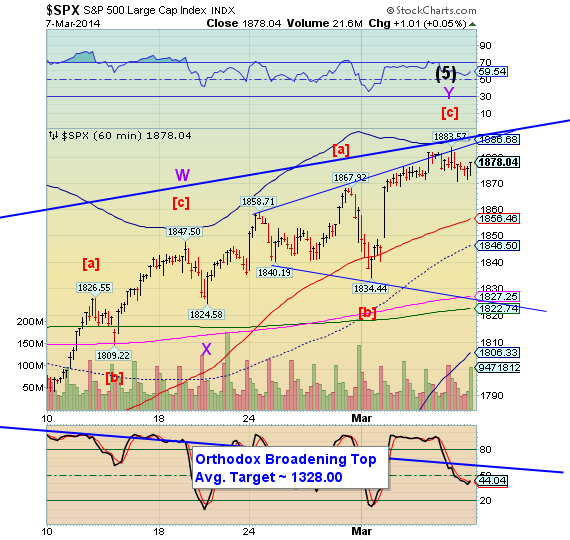
The Pre-market is down, but not convincingly yet. I won’t be available to comment during the day, so use your better judgement. The Orthodox Broadening Top won’t be triggered until it breaks through the lower trendline at 1825.00. The trading bands are narrowing, suggesting a big move ahead, but it may take another day or two to set it up.
Weekly Sentiment Report: Is There Another Rabbit in the Hat?
Does the Federal Reserve have another rabbit to pull out of the hat?
TACTICAL - BETA is 100% FREE....get some NOW!!
Several weeks back, we noted that the "smart money" was bearish on the markets, and that higher equity prices would see even more selling extremes amongst corporate insiders. As we look at the data this week, this is exactly what has happened as the "smart money" indicator is at its most extreme degree of selling since November, 2010. See figure 1 below.
Figure 1. "Smart Money"/ weekly

But as we can see in the figure, the "smart money" was wrong. Over the next 13 weeks, the SP500 gained an additional 13%. So what went wrong? As it turns out, November, 2010 coincides with the implementation of the Fed's QE2 bond purchase program.
Now let's fast forward to December, 2012. See figure 2. Once again, the "smart money" was selling to an extreme degree. The US government was facing the fiscal cliff. This was "resolved" as Congress kicked the can down the road in response to a mini - market swoon. While the market welcomed that news positively, which was a foregone conclusion that the "crisis" would be resolved, it really was the Fed's announcement that it was going all in for as long as possible that really ignited the SP500 for a 30% gain in 2013. The "smart money" was wrong, again.
Figure 2. "Smart Money"/ weekly

So is the "smart money" really that bad? Looking at figure 3, we have highlighted the extremes in selling by the "smart money" since November, 2010. Despite the two misses as outlined above (and these were big misses), the "smart money" indicator has done a decent job at identifying intermediate term tops. The common denominator as to why the "smart money" indicator has failed is quantitative easing or perceived market intervention (i.e., jawboning) by the Federal Reserve. So this begs the question: Does the Federal Reserve have the ability to pull another rabbit out of the hat?
Figure 3. "Smart Money"/ weekly

The Fed remains in taper mode, yet market participants still believe that the Fed will do whatever it takes to maintain asset prices. This market dynamic -- i.e., that the Fed has my back -- has yet to be tested. I suspect it will be tested sometime soon, but until it is, investors will continue to believe in the magical powers of the Fed and the mystical powers of QE. A test of the notion that "the Fed has my back" can only come after a market sell off. After a market sell off, the Fed will act or market participants will look to the Fed to act, and it is the success or failure of that bounce that will determine the course of this bull market. In the absence of another asset purchasing program (i.e., QE5), I don't believe the market will power higher. To go higher while the "smart money" was bearish essentially required the implementation of new QE programs, and let's not forget that each successive QE program was bigger and "better" than the last. Once again: can the Fed pull that kind of rabbit out of the hat? I don't believe so.
Despite the new all time highs in the SP500, it has been my contention for the past 4 weeks that we are in a NEUTRAL market environment. A neutral market environment implies that the markets will be ruled by overbought and oversold conditions. Four weeks ago we had a sell signal, and although the market is at new highs, our sell signal was not followed by a buy signal. What would constitute a buy signal? If investors had turned extremely bearish on equities following January's sell off, then we can say that this is a meaningful bottom that should lead to higher prices. Buyers short circuited January's sell off repeating a pattern that has been in place since 2012 where dips have been shallow as investors have anticipated Federal Reserve intervention, which seemed to be timed to limit investors' angst because the markets had pulled back almost 5%. Oh my gosh! In any case and as the data shows, a market that fails to periodically clear itself of the weak hands (i.e., those investors late to the rally) is a weak market, and with 1 buy signal in 2013 alone (when historically over 23 years of data there have been 2.5 per year), this market is vulnerable.
By our measures, the upside should remain limited.
The Sentimeter
Figure 4 is our composite sentiment indicator. This is the data behind the “Sentimeter". This is our most comprehensive equity market sentiment indicator, and it is constructed from 10 different variables that assess investor sentiment and behavior. It utilizes opinion data (i.e., Investors Intelligence) as well as asset data and money flows (i.e., Rydex and insider buying). The indicator goes back to 2004. This composite sentiment indicator moved to its most extreme position 10 weeks ago, and prior extremes since the 2009 are noted with the pink vertical bars. The March, 2010, February, 2011, and February, 2012 signals were spot on — warning of a market top. The November, 2010 and December, 2012 signals were failures in the sense that prices continued significantly higher. The current reading is neutral.
Figure 4. The Sentimeter

![]()
Dumb Money/ Smart Money
The “Dumb Money” indicator (see figure 5) looks for extremes in the data from 4 different groups of investors who historically have been wrong on the market: 1) Investors Intelligence; 2) MarketVane; 3) American Association of Individual Investors; and 4) the put call ratio. The indicator shows that investors are NEUTRAL.
Figure 5. The "Dumb Money"

Figure 6 is a weekly chart of the SP500 with the InsiderScore “entire market” value in the lower panel. From the InsiderScore weekly report: “Market-wide insider sentiment has moved into Strong Sell Bias territory. There was a record number of Weekly Net Cluster Sales this past week and an Industry Sell Inflection generated for the Entire Market, S&P 500 and multiple sectors, but it's important to recognize that there is a seasonal element to some of the selling due to the timing of annual restricted stock awards and vesting events. Presently, the Utilities, Materials, Industrial Goods and Healthcare sectors are displaying the strongest sell bias, followed by Technology and Consumer Discretionary. We note that our market-wide Industry Sell Inflection event has generated a total of seven other times since the March 2009 market bottom, most recently in November 2013, with the market posting gains in the six-month period that followed five times. Given the strong market backdrop and seasonal nature to some of the selling, the activity is not out-of-line with our expectations. That said, some caution is warranted as insider selling volume is clearly elevated. "
Figure 6. InsiderScore “Entire Market” value/ weekly
Manage Risk in a Grain Price Run-Up
By: Nate Birt
While unrest in Ukraine might appear to be the primary factor pushing grain prices higher, experts tell the U.S. Farm Report Market Roundtable it’s one of several contributors. What’s more, producers should be protecting their bottom line even as a bullish tone prevails.
"I think there are other factors," says Chip Nellinger, Blue Reef Agri-Marketing, Inc. "We started this rally ahead of problems developing in Ukraine. That was kind of the final dose of diesel fuel on the fire. We got undervalued in the place of corn, we started doing a lot of export business. So fundamentally we were undervalued, and that stimulated demand. The funds, also, huge change of ownership. They went from short 150,000 contracts of corn to now long 150,000 contracts of corn in less than two months."
The swing in prices shows how much marketing has changed over the years, adds Tommy Grisafi, Trade the Farm.
"In the old days when there was a pit, you would see someone who was representing a fund come in and see them bid for 1,000 or 2,000. Now on the screen, it’s hard to keep track, it all happens so fast, and a lot of it happens at night or over a Sunday," Grisafi notes. He continues: "In the rest of the world, our Sunday is Monday. I think we did record volume last Sunday on the Ukraine news, and my heart goes out to anyone who doesn’t have access to a real platform in the markets. But the things to watch, from a speculator’s view of protecting my own risk, at some point when we get a run-up like we have, even as a professional trader, I couldn’t react fast enough for how vicious these moves were, especially in oats and corn and everything else."
Looking ahead, the spreads are signaling what might lie ahead for prices – and are serving as an indicator that producers should be thinking about ways to protect their bottom line.
"The spreads are tightening in corn," Nellinger explains. "It’s a bullish scenario for corn, yet the cash basis levels have dropped off dramatically in most areas of the Corn Belt. So that’s telling you, or at least telling me, that we’re probably getting a little overvalued now on corn futures. Beans are a little different story. You’ve got such a dynamic there with old crop-new crop, but even the bean spreads, and what oil and meal spreads have done, are still hinting to me—although this week didn’t show much of a side of this—that we may be in the process of trying to top this bean market and the meal market."
In any case, have a plan and be comfortable with your decision, Grisafi adds.
"Hedging and futures and derivatives overall, it’s a great concept, but the exit strategy is so difficult," he explains. "There’s so many ways to protect this. But what’s most important for the person watching is that they’re comfortable with the risk they’re taking. Even though they have the physical product, they sell the futures or buy the puts or do any combination of a derivative, there’s so much risk and they’re locking in a profit. But they start to see the money and unlimited opportunities. In the end, you have to be comfortable with those opportunities."
Disinformation War Still Dominates Stock Markets - Charts to watch
By: Garry_Abeshouse
Bulls--t and criminality back in 1970 was much the same as bulls--t and criminality now.
January 2014 marked the 44th anniversary of one of the biggest mistakes of my life. Back in January 1970, I was young and inexperienced as to how stock markets functioned and balked at selling on the huge profit I was making at the time. The Australian speculative boom in nickel stocks was peaking and everyone around me was saying it was going to last forever. Even the solicitor I was using at the time told me to hold on, while unbeknown to me, he was actually dumping huge quantities of one of the stocks I was holding. This was in the middle of a huge feeding frenzy of disinformation that makes up a large part of every bull trap that has ever existed. But then as now the market tone was and is changing, from one where greed and overoptimism dominate, to one where fear again regains ascendance. Bull traps have forever been defined in these terms.
As in 2008, the combination of Murdoch domination and time poor journalists ever fearful for their jobs are letting us down, as they pursue the peripheral 24 hour news cycle as an easy way out of analysing and reporting the in depth news of the year or decade. Financial economists, uncomfortable with socio-economic issues, still treating people as merely impediments to “efficient” and “free” markets – have now been increasingly discredited by the likes of Naomi Klein, Matt Taibbi and “new age” economists such as Bichler and Nitzan. But reading or listening to the mainstream media, you would never know. The longer the financial discourse is limited to the theoretical economic constructs so beloved of the financial media, the less chance we have of limiting future collateral damage to our socio-economic wellbeing.
It’s rather ironic that much of the major exposés of abhorrent bank behaviour since 2008 have been pushed rather reluctantly into the light of day by a journalist from Rolling Stone Magazine, rather than from the mainstream media. And yet again on February 27th 2014, Matt Taibbi has exposed more “unusual activities” that these banks have been up to under the by-line of “The Vampire Squid Strikes Again: The Mega Banks' Most Devious Scam Yet”. Go to the Rolling Stone Magazine website and read it in mind boggling detail and weep.
But what is more incredible than the article itself, is the TOTAL lack of follow through by the rest of the world’s media after the initial publishing.
Vladimir Putin: We should be more than a little concerned.
At the time of writing, it appears that Vladimir Putin and his all too apparent bully boys, may have won the battle for the Crimea, as could well be construed to be his historical right. But money talks as they say and it just may be that Putin was too slow in his socioeconomic reforms and a little too overzealous in his personal ambition of re-establishing Russian prominence in the world political order.
As Alexandr Dugin, from Moscow State University recently wrote on Ft.com: Putin’s reign “has been moulded from inside by the desertion of the middle class from the ranks of his supporters and the growth of a liberal protest movement. . . . He will pursue the national interest, regional and global power, protectionism and mercantilism. Having lost the cold war, Russia will try to revise the status quo using all available opportunities.” Whatever the outcome, the winner of course will be the Vodka manufacturers.
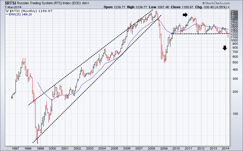
As Putin should know, destruction of the social compact of any nation never happens overnight. It takes generations of intentional neglect for this to happen, hence the ancient Chinese saying of how "the portals of the rich reek of flesh and wine, while frozen bodies by the roadside lie". Long market tops have a habit of allowing ugly truths of greed and socioeconomic bastardry to lie in the shadows far longer than they should; coming to light only when the bull trap is sprung, panic sets in and a “Dragon King” is born. Putin may indeed have won the battle for Crimea, but he may just end up losing the aftermath, if the following chart of the Russian RTS Index has any significance at all.
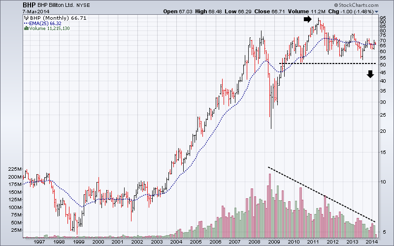
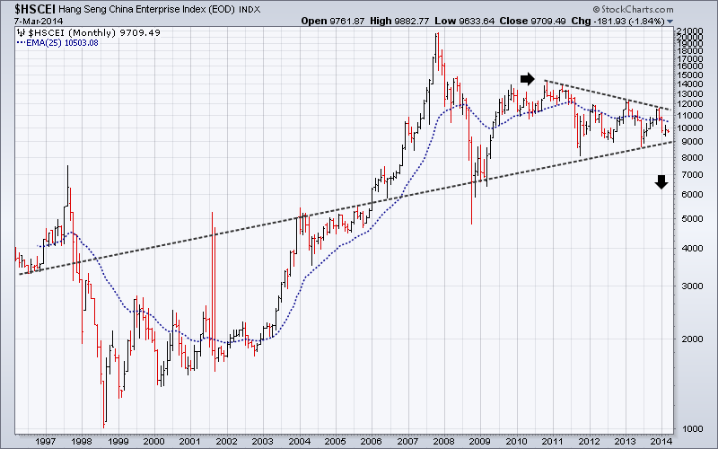
Industrial Metals Spot prices, BHP, Emerging Markets and China.
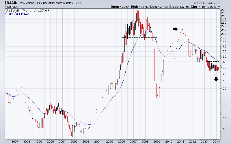
Large mineral exporters such as Australia, Canada, Brazil and others, should really be seen as early reactors to the global economic slowdown. This is quite separate to the froth and bubble associated with Wall Street and their media and blogger hangers on. The performance of large mining companies is linked strongly to the changing perceptions of China’s immediate future, while in turn China’s future is linked to the economic health of the more affluent consuming nations, which in turn are cutting back their consumption as any meaningful return to rising job numbers fails to materialise. Falling birth rates and rising unemployment around the world are not generally conducive to rising import of raw materials to China or exports from China.
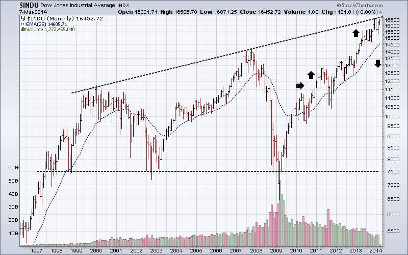
The sequential topping out of financial markets continues as expected. The DJ-UBS Industrial metals Index has already broken down from a top even larger than the one in 2006/2008. Further falls in metal prices would effectively reconfirm the current bear market that commenced in early 2011, as can be seen in all the charts below, confounding the optimists as day traders push up the Dow (see the above monthly chart).
Australia, as a major mineral exporting nation to China, has a very thinly traded equity market by NYSE standards. This enables Indices and stocks to be easily manipulated by the major traders, which in this case would be mainly hedge funds and super funds owned by the major insurance companies and banks. Highest volume comes from just a handful of stocks dominated by the big four banks, BHP and a few others.
By comparison, the average monthly number of equity shares traded over the last twelve months on the entire ASX is around 15.75 million shares compared to the 1.5 billion shares traded just for EEM.
This means that the whole of the Australian equity market as reported by the ASX, is only about 1% of the EEM ETF volume.
BHP has always been a market leader and is showing signs of being at the tail end of a 4 year old classic Head & Shoulders top, distinguished by its declining volume over the same period of time. This can be seen in many other equities as well. Should this be the case, then similar patterns found in other key charts would certainly follow into a resurgence of the major bear market, when the BHP price falls below $50.00. BHP as a market leader would also be a key bear market indicator.
The following four charts and what they represent are inexorably linked to the historical global socio-economic slowdown we are now experiencing. What all the monthly charts here (except the Dow) have in common, is that they have each formed a major peak in the first half of 2011, which in effect saw the beginning of a new sequential topping out of financial markets across the world. Fighting this trend into a new major Bear Market of course, has been the weak recovery of the US economy and the unfettered flood of cheap money moving via the banks into high end real estate, selected equities and on and off balance sheet derivatives at historically record volumes, based on who knows what going to who knows where. See the BIS statistics below.
Compare for instance the Russian and US Equity markets to the financial markets illustrated below and you will see a distinct divergence since the first half of 2011. It is totally inexplicable that over future months we could have any extended improvement in the world economy without a profound change in sentiment shown in these markets.
Note that the Hang Seng China Enterprises Index (“H-shares Index") is a major index that tracks the performance of China enterprises listed in Hong Kong in the form of H shares and is dominated by Financial stocks (62%) and Energy stocks (20%), making it an excellent lead indicator for Chinese equities. On the other hand I would expect high profile technology stocks, such as Baidu to lag.
Emerging Markets
In May 2013, ING (as quoted in the WSJ) estimated that “The total indebtedness of the world, including all parts of the public and private sectors, amounted to $223.3 trillion or 313% of global gross domestic product.” And “that debt in developed economies amounted to $157 trillion, or 376% of GDP. Emerging-market debt totalled $66.3 trillion at the end of last year, or 224% of GDP.” 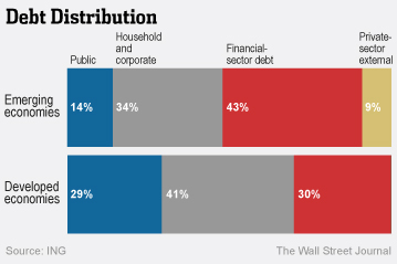
ING further commented that “Debt can become dirty when the rise of debt service costs exceeds income and a borrower’s long-term ability to make payments and often when rapid growth of debt and/or lack of adequate transparency disguises creditworthiness issues.” With the currencies from BRIC and developing nations looking increasingly shaky and the USD underpinned by a comparatively stronger economy, the scenario I painted back in June last year concerning the USD debt payments of debtor nations looks to be well on track.
The EEM ETF was developed as an equity benchmark for emerging markets stock performance. As you can see below it turns over roughly between 1 and 2 billion shares per month. It is has the second highest turnover of all the ETF’s listed on the NYSE (the first being SPY (S&P500 ETF), which averages 2 billion plus per month). The top 10 stock holdings have only a 16.6% weighting, while China, South Korea, Brazil and Taiwan have a combined weighting of 57.4%. The ETF covers stocks from 24 countries. As of September 30th 2013, EEM had a net asset backing of $41.44 billion and a P/E ratio of 18.1. By way of comparison, the current Shiller P/E Ratio for the US S&P 500 Index is 24.99. This combination of factors makes it one of the most important and influential indexes to watch. 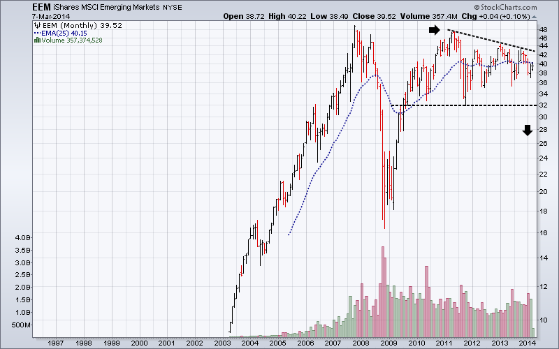
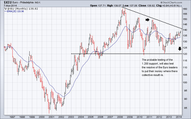
The Euro/USD and the Canadian Dollar
Given that the USD Trade Weighted Average is still in a long term base, the most likely scenario for the Euro will be the confirmation of a 10 year top at some future time. When the “Dragon King” type crunch does arrive, the most likely triggers will be rising unemployment and social unrest destabilising already fragile national political systems. The associated financial crises will be merely the facilitators of the economic meltdown. They will pay the ultimate price for living in a virtual world for far too long, as they find themselves haunted by the unexpected consequences of “free market economics” and unfettered globalisation.
One potential game changer over the coming months will be the German reaction to the testing of the 1.200 support of the Euro against the USD. If or when this happens, there will be a huge amount of pressure on Germany to agree to unleashing the money supply in some way in a desperate attempt to reflate the European economy as the United States has done. I expect the pressure to do this at some future time will be huge, the potential repercussions largely unknown and will depend on the “dramatic” circumstances at the time.
George Soros, in a major piece published on Caixin Online, commenting on the Ukraine, said in part, “I hope and trust that Europe under German leadership will rise to the occasion. I have been arguing for several years that Germany should accept the responsibilities and liabilities of its dominant position in Europe. Today, Ukraine needs a modern-day equivalent of the Marshall Plan, by which the United States helped to reconstruct Europe after World War II. Germany ought to play the same role today as the United States did then.” If so, who will be next, and the next and the next . . . .
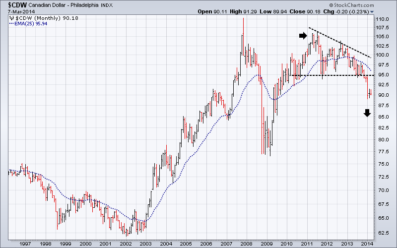
The Canadian Dollar, the Brazilian Real and the Australian dollar have already broken down from 3 to 4 year tops and look set to drop substantially further. It is no accident these three currencies look similar to many of the above charts, as they represent countries with a major stake in global mining and the export of industrial metals, and as such should be considered as “canaries in the proverbial coal mine”. These three currencies have already broken through their individual supports, in a similar way to the Canadian Dollar chart below, confirming the global economic slowdown is showing no sign of ending soon. In other words, these “canaries” have already tweeted their warning, but is anyone listening? All these currencies falling against the USD, will further strengthen and consolidate the USD’s long term base.
National economies and financial markets have been peaking sequentially for many years.
It “Bears” repeating what I said back in June last year about the sequential topping out of equity markets.
“Global GDP has certainly peaked. Gold, Silver and Industrial metal prices have also peaked. Most currencies have peaked against the USD. Equity markets have been sequentially peaking over the last 13 years or more, but have yet to utter the final gasp of the economic endgame. Although the large number of index and stock price failures now apparent on charts, does suggest this time is edging closer. And lastly oil is only up where it is because the major oil companies want to keep the retail price as high as possible as long as possible and stuff the consumers.
Currency markets, skittish in the increasingly risk averse conditions are falling against the USD in rapid succession in a race to be more competitive in a world, where overall consumption is declining, long term unemployment is going through the roof and large corporations like BHP and Rio are preparing for the perceived lean years ahead.
The over concentration of media attention on a small number of US composite indices such as the Dow 30 industrials and the S&P 500 Large Cap index has both distorted and underplayed many underlying weaknesses in equity markets across the world. Some people inside the borders of the USA may think they are still the centre of the universe, but there are many others elsewhere, who would disagree. If you are like me and accept that equities are in a multiyear top, it becomes far more logical to accept that equities will top out sequentially over time rather than all at once. If you check a range of long term charts, you will see that this has indeed been the case.”
The charts above have behind them stories of greed and false hopes, but what they all have in common (excluding $RTSI and $INDU) is that they are all lower now than their 2011 peaks. What continues to be ignored is the lack of “blue sky” in key indices and stocks as they continue to hover above their 2008 highs.
Short term charts also suggest that despite recent new highs in key US indices, sentiment is definitely turning towards the Bear.
Here are three of the best. 
BIS statistics show that Notational Amounts of Derivatives outstanding have continued to grow over the last 5 years.
These figure should be compared with the most recent estimates from the BIS, which showed “that notional amounts outstanding totalled $693 trillion at end-June 2013”, and that “Gross credit exposures – gross market values after legally enforceable bilateral netting but before collateral – stood at $3.9 trillion at end-June 2013.” This $693 trillion figure is now about 10 times the most recent world GDP amount of $72 trillion and still does not take into account off-balance sheet amounts. If we add those to the BIS figure it would easily take the total over the 1 quadrillion mark.
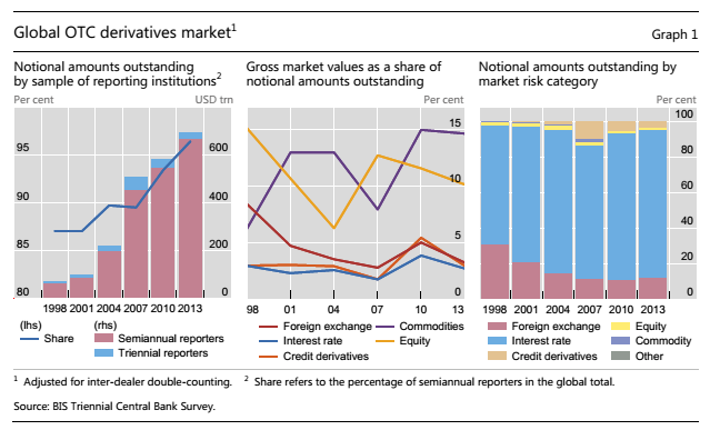
“Gross credit exposures – gross market values after legally enforceable bilateral netting but before
collateral – are collected only in the semi-annual survey. They jumped by 8% between end-December 2012
and end-June 2013 to $3.9 trillion. Relative to gross market values, exposures rose from 15% to 19%,
which was the highest percentage reached since end-2007 (Graph 2, right-hand panel).”
Key financial and economic data are out of sync with reality.
There is a certain disconnect between this graph on the level of corporate profits: 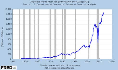
And this one: 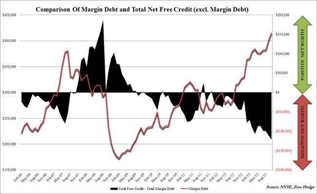
“Relative to the NYSE Composite, this is the most “leveraged’ investors have been since the absolute peak in Feb 2000. What is more worrisome, or perhaps not, is the ongoing collapse in investor net worth - defined as total free credit in margin accounts less total margin debt – which has hit what appears to be all-time lows (i.e. there’s less left than ever before) which as we noted previously raised a “red flag” with Deutsche Bank. Relative to the ‘economy’ margin debt has only been higher at the very peak in 2000 and 2007 and was never sustained at this level for more than 2 months.”
(Graph from Feb. 2006 and Comment courtesy of STA Wealth)
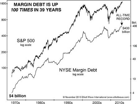
And this one courtesy of Elliott Wave International, putting margin debt in historical context:
Muddying the waters of truth and justice will be the American way over the next 8 months.
As if it was ever any different. Between now and the November 4th elections in the USA, you may expect an ascendency of spin, the likes of which have never been seen before, because from the Obama’s governments perspective, the stakes have never been so high as they try and get rid of the Tea Party electorally once and for all. The US Fed and its leaders are past masters of the art of spinning to emotional financial markets operating on hair triggers in a low volume environment. A pliable and superficial financial media more interested in the day’s headlines than what lies underneath, just makes it that much easier. The world’s shadow financial system is now so huge and complex; it has become like a ship the size of a planet with no one at the helm. The hedge funds desperate for short term profits wherever they can get them have become more amiable to risk taking than ever before, as seen by the record levels of margin debt.
Watching the day to day currency movements you can easily see how emotional these markets have become. The US Fed can tweak financial markets whichever way they want, just by rumour mongering at certain times of the trading calendar, especially when option and futures prices are most vulnerable. For example, the recent Janet Yellen speech combined with the impending President’s Day long weekend, triggered off a huge flurry of short and long covering in financial markets, strong enough to be considered a mini Bull Market of its own. Exquisite timing wouldn’t you say? Like the annual price hikes in the UK Pound and the Euro during DAVOS in Switzerland.
At least until November 4th, Obama and the US Fed will want the USD kept low, giving them and definite export edge over other exporting nations. This could possibly be assisted by the Chinese government selling off some of their $4 trillion worth of US treasuries. This would have the dual benefit of keeping internal liquidity buoyant over the short to medium term, without printing too much paper. Certainly something to watch.
Labour intensive work is disappearing faster than new jobs are being created.
The good news on jobs is not necessarily good news on future jobs for all. Matt Wade a senior writer for the Sydney Morning Herald, explores a dilemma many countries now face. Extracts:
“Terry Rawnsley, who researches regional economies for consultancy firm SGS Economics and Planning, says businesses in the global economic corridor have proven highly competitive in global markets.
''The people working in that corridor tend to be very good at what they do,'' he says.
It has become a magnet for workers, especially the highly skilled, over the past five years. Employment growth in that corridor has been three times higher than the rest of Sydney since 2008 and about 40 per cent above the national average. Rawnsley says an extra 93,000 jobs were added in the global economic corridor between 2008 and last year, which equates to an average annual growth rate of 2.1 per cent. By comparison, average jobs growth in the rest of Sydney was just 0.7 per cent in that period and national employment grew by 1.3 per cent. Globalisation and the advance of technology have put some industries, notably manufacturing, under great pressure. But enterprises along the global economic corridor seem to have thrived on those same forces.
But the success of the global economic corridor exposes an urban paradox. Even though mobile technology has made remote communication easier than ever, the city's fast-growing knowledge industries are bunching together in fewer, more valuable locations.
Knowledge-intensive industries cluster because their workers rely heavily on face-to-face communication in order to share information, generate ideas and cut deals. These crucial knowledge ''spillovers'' also happen as firms trade and as employees move between organisations.
''These are ''thinking jobs'' rather than ''making jobs'' and those are the types of jobs where agglomeration economics really works because they are very human-centred,'' says Jane-Frances Kelly, director of the Grattan Institute's Cities Program.
Sydney is not alone - in cities across the world knowledge jobs are clustering closer together. Global economic forces are not often linked to day-to-day life in the city. But Committee for Sydney chief executive Tim Williams believes these sweeping trends are having a major impact on the way Sydney works. ''These great global forces are reshaping cities,'' he says. ''They are essentially putting the high value knowledge jobs in one place and the residential development in another place.''
The concentrated pattern of jobs creation in knowledge intensive industries reverses the much more dispersed pattern of job creation when the economy was more reliant on manufacturing. Decades of urban sprawl, influenced by the old dominance of manufacturing, has left many outer-urban communities distant from high-value jobs.
In Closing:
Look around. The precursors of future “Dragon Kings” are everywhere.
To recap from last time:
“In a paper presented to a prestigious Engineering Journal in July 2009, Didier Sornette “proposed that the true origin of a bubble and of its collapse lies in the unsustainable pace of stock market price growth based on self-reinforcing over-optimistic anticipation.”
He proposed that the eventual collapse of a market top is preceded by the accumulation of several bubbles, whose interplay and mutual reinforcement leads to an illusion of a “perpetual money machine”, allowing financial institutions to extract an increasing amount of wealth from an unsustainable and artificial process. As the speculative bubble progresses to maturity, it becomes more and more unstable and extremely sensitive to any disturbance, which in turn leads eventually to a crash. These resultant crashes or outlier events, he terms “Dragon Kings”.
“Dragon Kings” have been with us for hundreds of years, and while being terrifying when they occur, always arrive littered with history’s collateral damage. The next one will see many global corporations diminished in size, and most of the financial economists will have missed their chance of picking the Bear once again.
WASDE: U.S. Wheat Supply, Use Remain Unchanged
WHEAT: There are no changes to the 2013/14 U.S. all wheat supply and use projections this month. A 15-million-bushel increase in projected Hard Red Spring wheat exports is offset by a decrease for Soft Red Winter wheat, with both changes reflecting the pace of sales and shipments. Projected ending stocks for both classes are adjusted accordingly. The projected season-average farm price for all wheat is raised 10 cents on the bottom end of the range to $6.75 to $6.95 per bushel based on recent strength in prices.
Global 2013/14 wheat supplies are raised slightly with a 0.8-million-ton increase in world production. Production is raised 1.1 million tons for India and 0.5 million tons for Australia based on the latest government reports. China is lowered 0.3 million tons, also based on the latest official indications. Production is lowered for Uruguay and Paraguay, down 0.3 million tons and 0.2 million tons, respectively, reflecting dry growing season conditions in both countries and early season freeze damage in Paraguay that also reduced yields.
Strong demand in the Middle East and North Africa boosts 2013/14 world wheat imports 3.0 million tons. Imports are raised for Iran, Saudi Arabia, Morocco, Syria, Algeria, Iraq, and Turkey. Exports are raised for the European Union, Russia, Serbia, and Turkey. European Union exports are raised 1.5 million tons reflecting the strong pace of licenses with higher corn imports and feeding freeing up more wheat for export. For Russia, higher wheat imports and reduced wheat feeding support a 1.0-million-ton increase in wheat exports. Export business has remained strong for both countries well into the second half of the 2013/14 marketing year as prices remain attractive for buyers in the Middle East and North Africa.
World wheat consumption is raised slightly for 2013/14 with increased use for India, Iran, Australia, Iraq, and Morocco more than offsetting lower feed use for the European Union and Russia, and for South Korea, where wheat imports are lowered. Wheat feeding is raised for Australia as drought reduces sorghum supplies and boosts the use of grain in livestock rations. Global wheat ending stocks are nearly unchanged.
China Loan Creation Tumbles, Lowest Credit Growth In 20 Months
by Tyler Durden
One month ago, when we last looked at the incredible amount of Chinese new loan issuance, a topic which even the mainstream media is slowly starting to circle in on as the primary source of hot money flow creation in the world, we found the highest loan notional issued by the country's semi-sovereign banks since 2009, and the largest one-month ever monthly total in the largest aggregated, Total Social Financial, series, which rose by an unprecedented CNY2.6 trillion, or over $400 billion in one month! That was just before the tremors surrounding first the potential defaults of several Chinese shadow-banking Trusts, and certainly before the first official corporate bond default which took place last week.
Overnight, the PBOC released its latest, February, loan data. As expected, it reveals something else entirely.
In the month in which there were pervasive fears that China would let one or more Trusts go bankrupt (a fear which was unfounded as China did bail out two shadow trusts in February, only to finally allow a corporate bond default last week), loan creation ground if not to a halt, then certainly was significantly impacted, and its collapse may explain the abysmal February trade data as well, which far more than merely indicating calendar effects from the Chinese Lunar New Year, shows that something dramatically changed with the well-greased Chinese economic machine. That something was an abrupt drop in credit.
To wit: Chinese banks made 644.5 billion yuan ($105.21 billion) worth of new yuan loans in February, lower than a forecast of 716 billion yuan and below the previous month's 1.3 trillion yuan, central bank data showed on Monday.

Looking at the bigger picture, total social financing in February stood at 938.7 billion yuan, well below the previous month's 2.58 trillion yuan, and also well below expectations.

It gets worse: as SocGen calculates, Total social financing (TSF) recorded a gain of CNY 939bn in February. The sharp decline from the January level (CNY 2580bn) can be mostly attributed to seasonality but the TSF was also down yoy (1071bn last February), which dragged total credit growth down to a 20-month low of 17.1% yoy from 17.5% yoy, according to our estimate.

Breaking down the loan creation by various components, va SocGen:
Yuan loans increased notably less than expected by CNY 645bn (Cons. 730bn, SG 750bn). Although it was still 25bn more yoy, growth of outstanding loans inched down to 14.2% yoy from 14.3% yoy. However, once again, non-bank credit saw a much bigger slowdown. Entrusted loans increased CNY 80bn, CNY 63bn less yoy and the lowest in 20 months. Probably due to easier interbank liquidity conditions lately, the net increase in bond financing was up to CNY 99.5bn from the very depressed levels in the past two months. However, the first bond default that occurred on 7 March will likely reverse this nascent improvement trend. New trust loans had a sharp fall of CNY 104bn from January to CNY 78bn, the second smallest monthly increase since mid-2012. Reportedly, formal banks have started to distance themselves from the trust sector by scaling back trust product distribution to banks’ clients. It may also be the beginning of investors adjusting for the long over-due first defaults of trust products. Whichever the case, the near-term prospect for trust financing is not beautiful.
This latest money and credit report again supports our view that credit growth is still sliding and will likely remain so in the near term. In H2 2013, the credit slowdown was mostly responding to higher interbank rates, as intended by the PBoC. From here onwards, the downward pressure will come from follow-up regulatory tightening of the Document 107 issued by the State Council in January and, more critically, from financial market participants’ adjustments to fast rising default risk. Such adjustments are necessary for China in the long run to develop a healthy financial market, but are nothing if not risky in the short term. We think that the policymakers will run more default experiments, but at the same time stand ready to intervene so as to avoid a systemic financial crisis. Our central scenario remains that there will be disruptions but not a meltdown, but the risk is tilting to the downside.

Finally, the French bank's conclusion is hardly welcome for China bulls:
China’s total credit growth slowed further in February, again driven by shadow banking deceleration. Lower interbank rates have not really helped ease credit conditions. It seems that the rising default risk has started to erode Chinese investors’ confidence. Together with continued regulatory tightening on banks’ off-balance-sheet activity, we are certain that this slowing credit trend has further to go and will inflict real pain on the economy. The season of weak Chinese data has just begun.
That's ok, all of the above, too, is priced into the USDJPY algos.
WASDE: Soybean Exports Reach Record 1.53 Billion Bushels
OILSEEDS: U.S. soybean supply and use projections for 2013/14 include higher imports and exports, reduced crush, and reduced ending stocks compared with last month’s report. Soybean exports are raised 20 million bushels to a record 1.53 billion reflecting continued strong sales and shipments through February. Soybean crush is reduced 10 million bushels to 1.69 billion reflecting weaker-than-expected domestic soybean meal use through the first quarter of the marketing year. Soybean stocks are projected at 145 million bushels, down 5 million from last month. Soybean oil stocks are reduced on lower production and increased exports. Other soybean oil changes include reduced use for biodiesel and an offsetting increase for food, feed, and other industrial use.
Soybean and soybean product prices are all projected higher this month. The season-average price range forecast for soybeans is raised 25 cents on both ends of the range to $12.20 to $13.70 per bushel. Soybean oil prices are forecast at 36 to 39 cents per pound, up 1.5 cents at the midpoint. Soybean meal prices are projected at $450 to $490 per short ton, up 25 dollars at the midpoint.
Global oilseed production for 2013/14 is projected at 504.3 million tons, down 1.7 million from last month as reduced soybean and copra production are only partly offset by increases for rapeseed, sunflowerseed, and peanuts. Foreign production, projected at 407.0 million tons, accounts for all of the change. Brazil soybean production is projected at 88.5 million tons, down 1.5 million mainly reflecting hot, dry weather in the south when much of the crop was in the flowering and filling stages. Soybean production is also reduced for Paraguay due to the extended period of hot, dry weather. China rapeseed production is estimated at 14.4 million tons, up 0.2 million based on increased area and yield indicated in recently released government statistics. Other changes include higher rapeseed production for Australia and increased peanut production for China, Uganda, and Tanzania.
Global oilseed supplies, exports, and ending stocks for 2013/14 are projected lower this month while crush is projected higher. Soybean crush is projected higher for the European Union, Paraguay, and Zambia; rapeseed and peanut crush are each raised for China. Lower soybean stocks in the United States, Brazil, and Paraguay are only partly offset by higher rapeseed stocks in China. Global oilseed stocks are projected at 84.0 million tons, down 1.9 million.
WASDE: U.S. Grain Stocks Reduced on Higher Corn Exports
COARSE GRAINS: Projected U.S. feed grain ending stocks for 2013/14 are reduced with higher corn exports and lower oats imports. Corn exports are projected 25 million bushels higher on stronger world imports and the rising pace of shipments in recent weeks. Continued strong export sales also support the higher figure. Projected corn ending stocks are lowered 25 million bushels. Oats imports are projected 10 million bushels lower as Canadian logistical problems reduce the availability of importable supplies. Small reductions in U.S. oats domestic use and ending stocks are projected. The season-average farm price for corn is narrowed 5 cents on both ends of the projected range to $4.25 to $4.75 per bushel. Price ranges are similarly narrowed for sorghum and oats. The barley farm price is raised 10 cents on the low end of the range to $5.95 to $6.25 per bushel based on recently higher reported prices for feed barley.
Global coarse grain supplies for 2013/14 are projected 1.4 million tons higher with larger corn beginning stocks for Indonesia, higher corn production for China, and higher barley production for Australia. Partly offsetting is a reduction in expected sorghum output for Australia as a continuation of hot, dry conditions have sharply eroded prospects for this year’s sorghum crop.
Global coarse grain imports for 2013/14 are raised 1.3 million tons with higher corn imports for Indonesia and the European Union and higher barley imports for China. Higher expected corn and barley feeding in these countries drive the import increases. Barley feeding is also raised for Australia as drought reduces sorghum supplies and boosts demand for other feed grains. Sorghum exports are lowered for Australia. Sorghum imports are reduced for Mexico as strong demand from China has driven U.S. Gulf sorghum prices above those for corn in recent months limiting import opportunities for sorghum feeders in Mexico. Barley exports are raised for Australia with the larger crop. European Union corn exports are lowered, but more than offset by this month’s increase for the United States.
Global coarse grain ending stocks for 2013/14 are raised slightly with higher corn stocks in China and Indonesia more than offsetting lower barley stocks in the European Union and the reductions in corn and oats stocks in the United States.
China exports plunge, commodities worry
By Phil Flynn
A big drop in China exports has the commodity complex fearing demand destruction drops more than geo-political risk. Forget about Ukraine, Libya, a strong U.S. Jobs report or the possibility of a terrorist blowing up a Jet from Malaysia, it is about China in the early trade.
Chinese exports plunged tanked by a shocking 18.1% leading to a 23 billion dollar trade deficit. The markets are trying to adjust to a shaky new Lunar New Year. Oh, sure, some blame the holiday but after getting one China company default it is possible that China is headed towards a very hard landing.
The reason why this is so shocking is just one month ago China trade expanded by 10.6%. We saw copper imports were soaring. Still China Copper Imports were up January through February was up 41.2% but in February fell 29%.
China's consumer prices rose 2% in February at their slowest rate in 13 months. So it does give some room to stimulate if need be but one of the reason prices fell was pork prices fell by 9%. Pork prices are again on the rise as the Porcine Epidemic Diarrhea virus is devastated the U.S. pig crop. Producer prices fell for the 24th consecutive month by dropping 2%, slightly above forecasts for a 1.9% drop leading to more concerns that China is having a hard time keeping things together.
Add to that Japan revised down its growth estimate for the final three months of last year after announcing a record current account deficit for January. Japan's Cabinet Office said both private and public demand was lower than its earlier estimate.
Reuters is reporting that armed protesters in eastern Libya traded threats with the government on Sunday in a tense stand-off over the unauthorized sale of oil from a rebel-held port. A North Korean-flagged tanker, the Morning Glory, docked on Saturday at the port of Es Sider and local daily al-Wasat said it had loaded $36 million of crude oil. Prime Minister Ali Zeidan has said the military will bomb the 37,000-tonne vessel if it tries to leave.
Officials said on Sunday that the navy and pro-government militias had dispatched boats to stop it from getting out. The rebels said any attack on the tanker would be "a declaration of war." The escalating conflict over the country's oil wealth is a sign of mounting chaos in Libya, where the government has failed to rein in fighters who helped oust veteran ruler Muammar Gaddafi in 2011 and who now defy state authority.
The protesters, who also include former soldiers and ex-oil guards led by a former anti-Gaddafi commander, Ibrahim Jathran, have seized three eastern ports in the OPEC member country. The Defense Ministry issued orders to the chief of staff, air force and navy to deal with the tanker.
"The order authorizes the use of force and puts the responsibility for any resulting damage on the ship owner," it said in a statement. "Several navy boats have been dispatched. Now the tanker's movements are under complete control and nobody can move it," said Culture Minister Habib al-Amin, who acts as informal government spokesman. "The tanker will stay where it is. "All efforts are being undertaken to stop and seize the tanker, if necessary by a (military) strike, if it does not follow orders," he said, adding that state prosecutors would treat the loading of the crude as smuggling.
There was no sign of any immediate military action, but Libyan news websites showed some small boats close to a tanker which they said was the Morning Glory. Libya has been trying to rebuild its army since Gaddafi's overthrow, but analysts say it is not yet a match for battle-hardened militias that fought in the eight-month uprising that toppled him.
Well at least the break in the price of oil (NYMEX:CLJ14) may break gas prices that have been on the rise. Trilby Lundberg reported that the average U.S. price per gallon for regular gasoline is now almost $3.51, the highest since last September. Diesel fuel prices also rose, increasing by 2.58 cents from two weeks earlier to an average $4.0323 per gallon. The blame goes to higher “ethanol” prices, stemming in part from the unrest in Ukraine. Corn is a major export for the Ukraine and a rally in Corn and a drought in Brazil have grains hopping. Corn is pulling back a bit. According to the survey, the lowest average price for a gallon of unleaded gas in the U.S. is $3.18 in Jackson, Mississippi. Road Trip!
Ukraine, A Geopolitical Choke Point
by Charles Hugh Smith
Rather than attempt to reduce a very complex system to a cartoonish "explanation" of events, we would be better served by seeking out the geopolitical linchpins.
In trying to put the fast-moving events in Ukraine in perspective, we are equally prone to lose our way in simplistic reductions or obfuscating complexities. Many commentators reduce the many dynamics in play to a conventional binary conflict: Russia vs. the U.S. (Cold War redux), Russia vs. Europe, neo-fascist nationalists vs. leftists, western Ukraine vs. eastern Ukraine, etc.
While each of these binaries reflect one facet of the totality, claiming any binary is the key context guarantees a fatal blindness to all that is excluded by such reductionism.
On the other hand, the inability to discern key dynamics from background noise and sensationalism (World War III, coming to a screen near you!) triggers a free-fall into incoherence.
Rather than attempt to reduce a very complex system to a cartoonish "explanation" of events, we would be better served by seeking out the geopolitical linchpins that have proven key in every era and theater of operations. These include:
1. Energy
2. Transport routes
3. Military control of transport and geographical chokepoints
4. The support or resistance of resident populaces
We would also be wise to recall what Napoleon had to say about the limits of raw power: "Do you know what amazes me more than anything else? The impotence of force to organize anything."
I think what the great military genius was referring to was the impotence of force to organize anything beyond the taking of chokepoints by superior force, strategy, tactics and/or leadership.
Once the chokepoints are in hand, however, events tend to organize themselves.
I also think that exploiting leverage leads to a reaction, a dynamic expressed byReversal is the movement of Tao. As I noted last week, Russia's exploitation of its natural gas leverage over Europe has driven those on the receiving end to seek other sources of natural gas and other sources of counter-leverage.
With these dynamics in mind, let's turn to my recent discussion with Gordon T. Long, UKRAINE: Energy, Economic & Military Choke Point: (22 Minutes, 25 Slides)
view the program on YouTube
Viewer Garth H. offered this summary:
Hands down this has been the best presentation concerning scope and clarity on the situation in the Ukraine! It has taken too long to get quality information on this situation due to the volume of disinformation and sensationalism. I hope you explore the deep state economic plays/impacts in greater detail in the future. Appreciated!
Thank you, Garth. We hope our brief overview provides some context and perspective that will help make sense of geopolitical events as they unfold.
Of related interest:
Ukraine Gold Reserves Said To Be Put On Plane For Safekeeping in the US
by Jesse
This is a story based on a report out of the Ukraine. Obviously I do not know yet if it is accurate. The information coming out of the Ukraine and Crimea should be sifted carefully, no matter what the source.
I find this one hard to believe. I am informed by high reliable people that no one cares about gold anymore. And very important analysts claim that transporting many tonnes of gold (Ukraine is said to have about 33 tonnes) is very difficult, and so unwieldy and fraught with peril that it must be a multiyear project.
But if the Ukraine's gold was taken away for safekeeping, it may be so safe that they will never see it again for a long time. Just ask Germany.
Newswire 24
Ukrainian gold reserves loaded on an unidentified transport aircraft in Kiev
By Marcus Brooks
According to the iskra-news.info last night ,Ukrainian gold reserves (40 sealed boxes) were loaded on an unidentified transport aircraft in Kiev’s Borispol airport. The board took off immediately.
A source in the Ukrainian government confirmed that the transfer of the gold reserves of Ukraine to the United States was ordered by the acting PM Arseny Yatsenyuk.
So my guess is, that is if indeed this report is true it either means the new ruling elite have stolen the gold bullion or perhaps their is a legitimate fear of the Russians taking possession of this bullion, whatever the facts, it still looks very shady indeed.
Conclusion
Official narrative: gold bullion is going to USA (maybe to reassure the Germans their gold is in safe hands, after all the despite numerous requests from the German Govt The Feds have not given access for them to even view their Gold Bullion) . Real narrative: probably to Switzerland where it is divided between Yulia Tymoshenko and her cronies.Here is a machine translation of the story in Russian from Iskra News:
Tonight from Borispol in the U.S. strartoval plane with gold reserves of Ukraine
As our site workers airport "Borispol", this night in 2-00, with the designated airport runway started unregistered transport plane ...
According to the staff "Boryspil", before it came to the airport four collector car and two cargo minibus Volkswagen, while , all arriving truck license plate missing. Car pulled out of about fifteen people in black uniforms, masks and body armor. Some of them were armed with machine guns. These people have downloaded the plane more than forty heavy boxes ... After that, some mysterious men arrived too entered the plane.
All loading was carried out in a huge hurry. After unloading the car without license plates immediately left the runway, and the plane took off on an emergency basis ... Those who saw all this mysterious "special operation" airport officials immediately notified the administration of "Boryspil", from which received a strong recommendation "not to meddle in other people's affairs ..."
Later, in received call back one of the senior officials of the former Ministry of income and fees, which reported that, according to him, tonight, on the orders of one of the "new leaders" of Ukraine in the United States has been taken all the gold reserves in Ukraine ...
Goldilocks & the Three Bears
by Marketanthropology
Over the past five years, the equity markets have maintained a droning and repetitive message to anyone questioning the fundamental underpinnings lurking beneath the equity market rally.
- It doesn't matter.
Likewise, the same has been true for those that expected a fresh wave of inflation from the large-scale asset purchases (LSAPs) and stop-gap measures provided by the Fed since 2008.
For some of the marque money managers that dug their heels in and maintained a certain bearish dogma in the face of these perennial conditions, the inconceivable rally has sent them closing their doors in frustration to the public and likely soul searching and scratching their heads in private.
Unbeknownst to them, the analytical paradigms that worked so well throughout their successful careers, mysteriously vanished one morning in early March. Over the next five years, the two favored macro comparative narratives: the deflationary tumult of the 1930's or the more recent inflationary travails of the 1970's - only provided brief windows of coincident correlations with the current market environment, that did far greater harm than good with maintaining certain bearish leanings.

Historic. Unprecedented. Never-ending.
Most weeks you can still find the business headlines sprinkled and punctuated with these sharp adjective seasonings.
And yet, literally sandwiched in between the two macro economic porridges, sits a time-period that more closely resembles the temperature and market environment we so actively consume or reject today.

In an effort to keep interest rates low during and directly following WWII and avoid another chapter of the near-view Great Depression, the Fed purchased all available short-term US Treasuries and virtually all long-term US Treasuries from the market starting in April of 1942. When all was said and done, the US had a debt to GDP ratio that was almost 20% larger than where it currently resides today.
In Milton Friedman and Anna Schwartz's seminal "Monetary History of the United States", the market climate in the 40's is described as being so sensitive and suspect of the Fed and Treasury's very visible hand, that the entire equity market rally (150+%) from the April 1942 low through the cyclical high in 1946 was deemed "artificial" and likely to end very badly. The fresh scars of the Great Depression provided abundant fear for market participants of a possible revival of kindred economic instabilities, despite the countervailing strength of the equity markets that even continued to rally more than 20% through the recession in 1945.

The fact remains, that for all the banter between the two assets classes, equity traders still keep a Murryian maintenance presence in the bond market's Bushwood locker room. While its mostly conjecture that the bond market is pegged as smart money and the equity markets as dumb - broader sentiment leanings do roll downhill from the larger and deeper market. For both time periods that were defined by similar interventions from the Fed, the greater message diffused to the equity chaps has been - if the fixed income guys don't see a fundamental reason in the economy for the rally, than perhaps its not for real. Oh, and one more thing - it's going to end badly.
Always the jester to the fool, the markets have seen things quite differently over the past five years.


As described in last week's note (see Here) highlighting Shiller's CAPE ratio, we expect momentum in the equity markets to turn down and start consolidating their exceptional gains as the Fed tacts away from an accommodative stance. If economic data continues to improve, we would also look for the Fed's taper timeline to get truncated, which would lower the aggregate total of QE.
From a strategic asset allocation point-of-view, we have favored precious metals, bonds and the broader commodity sector, as we believe inflation expectations will continue to strengthen as the Fed moves further away from an accommodative posture, while long-term interest rates remain low.
During the back half of the 1940's, inflation began to breakout in fits and starts, while long-term interest rates flat-lined around 2.5% through the end of the decade. There was a unique combination of both structural and psychological factors that led to these atypical market conditions. Once WWII was over, the Fed pivoted from their accommodative monetary policies. They discontinued their guaranteed support for Treasuries and lifted a yield ceiling that had been in place since April 1942 on longer-term debt. The government also removed various consumer restrictions and price controls that had been in place since the war began.
What happened?
CPI Inflation went from ~ 2% in 1945 to over 14% in 1947. Equally shocking, however, was that long-term interest rates did not follow higher, but were suppressed by participants continued appetite for Treasuries as the equity market rally sputtered out and lost momentum. "It was going to end badly", deflation and another addendum chapter of the Great Depression appeared to be on the forefront of most participants minds. Not the reality which became a consolidating and digestive range in the equity markets, resurgent strength in commodities and inflation expectations - while consumers broadly normalized with the economy.
 Although the motivational catalysts were unique for each time period, we believe the underlying economic conditions and recency biases of the mid 1940's serve as the closest parallel with today. While the outbreak of WWII brought its own significant restrictions on consumption and inflation, the most recent financial crisis imposed similar governance on households. As evidenced in the strong commodity performance to date and the weakening US dollar index, we believe we are just beginning to see those conditions reverse - just as they did in the back half of the 1940's.
Subscribe to:
Posts (Atom)