Saturday, July 6, 2013

Why Bonds Are Set To Bounce Back

by James Gruber

Asset returns were all over the map in the first half of 2013. Stocks outperformed bonds. But within equities, developed markets pummelled emerging markets, with the U.S. and Japan leading the way. A similar trend happened in bonds, where investors who’d poured money into emerging markets promptly fled in May and June of this year. Of course, commodities were the biggest loser, and among these, precious metals trailed the pack on worries over QE tapering and Indian demand.

What then can we look for the second half of the year? Broadly, I expect deflationary concerns to take centre stage again as the U.S. economy stagnates, Japan intensifies currency wars and thereby exports deflation while Chinese GDP dips below 7% by the fourth quarter. This will take any talk of significant QE tapering in the U.S. off the table while Europe and Japan continue to provide ample liquidity amid weakening economies. China will be the only country tightening policy as it resists calls to reflate its credit bubble.

If this is right, bonds will be the big winners in the second half. Emerging market bonds may see more volatility with outflows intensifying in July before picking up as global stimulus ramps up. Stocks should have a sharper correction, possibly from September, as the U.S. economy stalls and China worsens. The “Bernanke put” will limit the correction though. Meanwhile, commodities should dip before bouncing hard as stimulus picks up again, with gold and agriculture significantly outperforming industrial metals.

That’s a broad, tentative roadmap, but let’s break it down a bit further:

1. The U.S. – The Fed will take fright at rising bond yields. It knows higher interest rates would stifle any housing recovery and lead to much higher interest costs on government debt, something the U.S. can ill afford. Not to mention that rising yields in the U.S. puts upward pressure on rates around the world. With much of the developed world economies near or at recessionary levels, increased yields are the last thing that they need. This will limit any QE tapering, if it happens this year at all. 

Meantime, the U.S. economy will stagnate as European economies fail to recovery, Japan depreciates the yen more aggressively and exporting deflation while China’s credit bubble pops. Yes, the U.S. will be better off than the rest of the developed world, but increasing talk of “recovery” will be put to bed.

Given the above, and the extraordinary performance of the S&P 500, I expect a more significant pullback in the stock market in the second half. Globally, equities should struggle but Europe may well outperform the U.S. given much cheaper valuations and lower expectations.

2. Europe – Crudely, you should expect more of the same. That is, weak economies burdened by the Euro and extraordinary debt loads. Partially offset by the European Central Bank and Bank Of England wearing out the world’s money printing machines by providing more and more stimulus.

France will become the big concern as investors realise that it is the next Greece, but this is probably a 2014 issue. A significant, compounding debt burden, extravagant social welfare system, stifling regulations limiting the private sector, worsening tax revenues and a clueless Socialist President make France the next domino to fall in Europe.   

3. Japan – After this month’s elections for the upper house, Shinzo Abe should have a stronger mandate to pursue reform, the so-called third arrow of his strategy to defeat deflation. He may provide broader reform, perhaps including badly need changes to the labor market and the agricultural sector. But any reform will be limited by the influence of powerful lobby groups. Given the low expectations for reform, there may be another temporary leg up for the Japanese stock market.

If the reforms do positively surprise, bond yields will spike, raising concerns again about the impact on interest costs of the government’s unprecedented debt levels. This will bring further government buying of bonds, crowding out private players, thereby leading to increased volatility. The stock market should again sell off when this happens.

The long-term picture remains that Japan is a train wreck waiting to happen. Given government debt of 245% of GDP or 20x government revenues, Japan has only two bad choices left: 1) Cut back on government services to such an extent that would cause an immediate depression or 2) Print truckloads of money to inflate the debt away. The government’s chosen no. 2, which will lead to significant yen depreciation and a blow-up in the bond market at some point. It’s a matter of when, not if this happens. 2014, perhaps?

4. China – It’s become clear that the China’s credit bubble is bursting. And the new government doesn’t want to risk reflating the bubble, preferring to deal with the mess now rather than later. This is a political choice, but a wise one. This way, blame for the economic downturn can be sheeted home to the previous government.

The choice though means that there’ll be a significant slowdown in economic growth, probably below a 7% GDP rate by the fourth quarter. At the same time, however, the government may significantly surprise markets by announcing deep structural reforms to restructure the economy. The changes may include the widespread privatisation of state assets, extensive financial de-regulation, broad-based tax reform and increased incentives for foreign investment.  

In the opinion of this author, Xi Jinping is both a pragmatist and a likely reformer. He’s thinking about the next 10 years, not the next three months. That means he’s willing to take short-term pain to reap the benefits later on.

How will China’s stock market react to all this? It’ll probably focus on the economic pain rather than structural reform, at least initially.

5. India – A depressed investment cycle needs to restart if India is to turn around. There are tentative signs that this may be starting to happen. Combined with a bounce in the rupee as the current account deficit stabilises from lower commodity prices, and India’s stock market could be one of the best performers in Asia in the second half.

The risk is around general elections next year and the pork barrelling which will occur before that. The positive thing about the large current account deficit is that it keeps pork barrelling in check to a certain extent. At least investors should hope this is the case.

6. South-East Asia – Foreigners have poured into this market since 2009 as it’s one of the few regions with genuine growth prospects. At the first recent hint of trouble though, this money headed for the exits. With more QE tapering talk over the next month or two, there’s more downside for South-East Asia. However, when this talk dies down, the region should once again attract foreign money.

That money is likely to head to Thailand and the Philippines. Indonesia will underperform as commodities suffer, its current account deficit deteriorates and attention turns to who will govern the country, with general elections set for next year. Meantime, Malaysia may attract investors with reasonable market valuations and a potential bounce in commodities later this year.

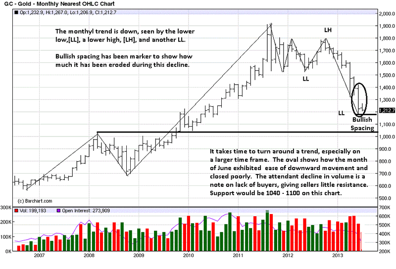
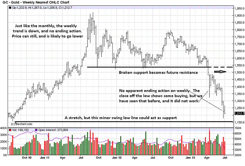
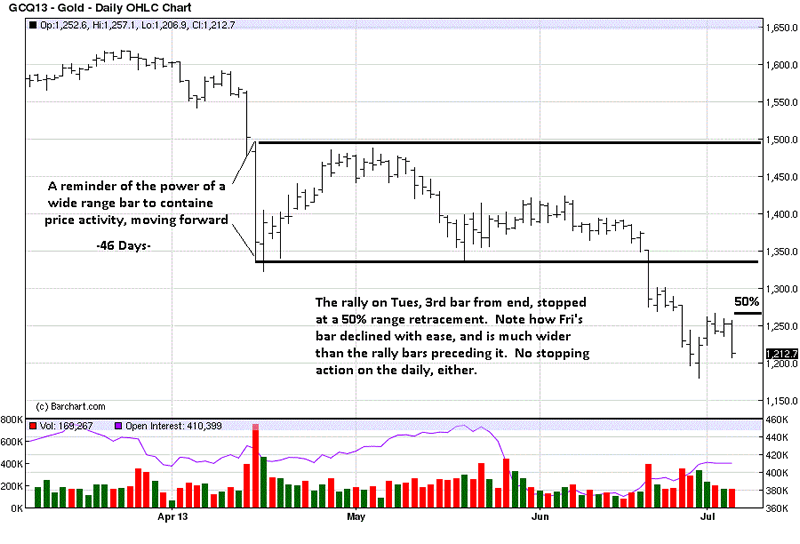
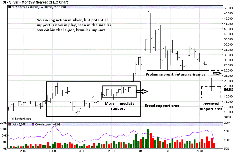
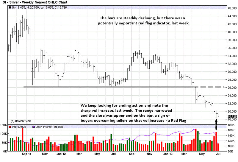
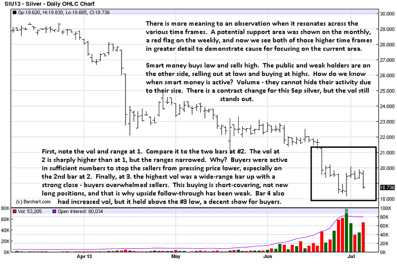
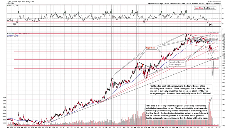
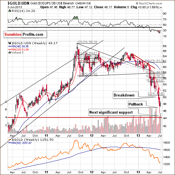
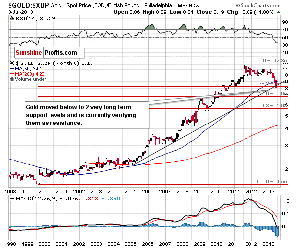
7. Commodities – I am among a significant minority of investors who believe that the commodities super-cycle isn’t over. To be specific, the best days of industrial commodities are behind it. But for precious metals and agriculture, they’re likely ahead. Precious metals remain an attractive hedge against central bank profligacy and currency debasement. While agriculture’s supply and demand situation is extremely tight, meaning any future supply disruptions should drive prices higher.

For the second half, you’re likely to have the continuing headwind of softening demand out of China. On the other hand, quietening taper talk will prove a nice tailwind. Many commodities are now seriously oversold and when it becomes clear that the U.S. will continue stimulus for several years to come, many of them will bounce hard. Pencil in the fourth quarter?

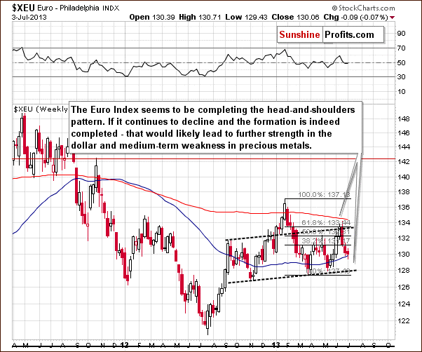
8. Currencies - I did a piece that attracted a fair amount of interest earlier this year called “Who will win the currency wars?” In it, I looked at potential currency winners and losers in the long term (3-5 years).  I suggested commodity currencies would be significant losers, highlighted the Aussie dollar as being particularly at risk. My preferences were the Singapore dollar, Thai baht and Malaysian ringgit due to the strong balance sheets and relatively attractive growth profiles. The call on commodity currencies has been correct, while my favoured currencies have performed ok on a global basis, less so versus the U.S. dollar.

I still see significant risks to commodity currencies, with the Aussie dollar heading towards 80 cents to the U.S. dollar this year, on its way to 60 cents in a few years. As China slumps, Australia should enter recession by the end of the year, as mining investment cutbacks deepen and the housing market stalls or declines as unemployment rises.

I still like the Singapore dollar, Thai baht and Malaysian ringgit. However, the U.S. dollar could well strengthen in the next 8 weeks before re-commencing its steady decline. That means my preferences should once again catch bids towards the fourth quarter. Having some money in U.S. dollars may make some sense, bearing in mind that it’s heading for trouble in the long-term given the country’s continued commitment to currency depreciation via money printing.

The Chinese yuan is a tricky one. I’ve been dead wrong calling for a yuan decline earlier this year. It’s been a great performer. But as China’s credit bubble unwinds and the Japanese yen weakens further, I can’t help but think that the government will want a weaker currency, and soon.

Lastly, the Japanese yen remains probably the world’s biggest short (yes, more than the Aussie dollar). Japan needs a significantly weaker yen to deflate its debt in yen terms. 

9. Bonds – U.S. long-term government bond yields should head higher in the very short-term before heading down towards 2% by year end. That’s if my view of a renewed commitment to QE proves correct.

Emerging market bonds may experience more pain over the next couple of months given continued QE tapering talk, accentuated by heightened political risk in some countries (Turkey & Egypt). But they should see some money flowing back in by the fourth quarter.

Understand that all predictions are fraught with danger and the ones above are no exception. What I call a tentative roadmap, others may just see as wishful thinking. Either way, it’s meant to be the starting point for a discussion. Please feel free to agree or disagree with any or all of it.

See the original article >>

Gold And Silver – Silver Market Sending A Message

By: Michael_Noonan

When the markets “speak,” we “listen.” For all of the non-stop bullish “news” about the unprecedented demand, more for gold than silver, and all of the talk about how useless the COMEX paper market is, it has been the paper market that the forces of supply and demand have been heeding. If it were otherwise, the unprecedented demand for gold would have the price of gold higher than the bogus paper market. Yet, that has not been the case.

When will this bear market in PMs turn around? When it does, and not a moment before. This is not some flip answer, it just happens to be the way all bear markets end: when they do. We have seen calls for a turnaround for several weeks now, none of which have been even close.

If you want to make rabbit stew, first, you have to catch the rabbit.

First, lets’ see some concrete signs that a bottom is in before the regurgitation of “Gold is going to $10,000!” starts showing up in a host of new articles pandering for attention. It sure did not work for the previous ones.

The best way is to decide for yourself. Anyone can read a chart, [just not necessarily well], so let us go to the most reliable source, the market, and see what the prices of gold and silver have to say about what everyone else has been saying about them. People have been known to exaggerate, even lie in their “opinions,” but the market never does either. It just is.

The issue we have with gold is a lack of an immediately identifiable support area. There is support, a little lower, and for that reason, we do not see a strong message coming from gold, just yet. On the other hand, [never take anything for granted in the markets], the fact that price is holding above obvious support is an indication of underlying strength. IF that is the case, we still need to see some concrete sign of stopping activity before price can turn around.

We show some potential support resting under current the price. Silver, unlike gold, is already at an area of support. We will get to that, shortly.

The reminder about the importance of how a wide-range bar usually contains future price activity is shown to keep it fresh in your mind when you see it again in the future. If you pay attention to charts, you will definitely see this pattern repeat over and over.

As we did these charts, in order as presented, after seeing the daily silver chart, you can come back and revisit this one with a different “eye” for its content. The difference between gold and silver was the synergy in all the time frames in silver, not so for gold.

It is a great example of reality is always there to be seen, but sometimes we fail to see it. The truth is often under the brightest light, while people look elsewhere for a “hidden” message.

Here is silver on the monthly, already into an identifiable area of support. We should be looking closely for some form of stopping action, telling us price may stop going down.

Last week’s bar stands out as a red flag for its price and volume. The same bar in gold was too similar to one that had already failed, so it could not be viewed in a more important vein as this one. We give a more detailed analysis on smart money and high volume activity on the daily chart, below. Suffice it to say that what is true on the daily is also true for the weekly. It is just more visible and easier to explain with more bar examples.

When you understand the explanation given on the daily, come back and look at this one again so you increase your discerning eye more when it may seem less is apparent.

Finally! The explanations on the chart as to why silver is sending a message. What needs to be understood is that there is no confirmation that a bottom is in. Before a trend can turn, it must stop going down.

No one can definitively say the trend has stopped going down, and even when it does, then we must deal with how long it may take to reverse. That can take many more months, or a year or two. It could turn around very quickly, but we cannot know the odds for that event, were it to occur. What we do, in the interim, is prepare! If this happens, then do that.

It never pays to buy the first rally after a bear market ends. There is usually a form of retesting of the lows before a market can begin to move higher. This is the first time we have talked about specifically preparing for a possible change in trend, at least from a pragmatic perspective. Sentiment for a change has been long-standing, [but of no avail.]

Keep accumulating physical gold and silver, a pragmatic stance we have advocated during the entire market decline, but for a different purpose. We cannot say the turnaround for gold and silver is “rabbit stew” ready, just yet. If the end is near, there will be many more signs. The market never lies.

See the original article >>

SPY Trends and Influencers July 6, 2013

by Greg Harmon

Last week’s review of the macro market indicators suggested, heading into the Holiday shortened week that the Equity markets looked tired in their bounce. We Looked for Gold ($GLD) to consolidate or bounce in its downtrend while Crude Oil ($USO) was biased higher in the consolidation. The US Dollar Index ($UUP) looked strong and ready to continue higher while US Treasuries ($TLT) might continue their bounce in the downtrend. The Shanghai Composite ($SSEC) and Emerging Markets ($EEM) both looked to bounce in their downtrends. Volatility ($VIX) looked to remain subdued but drifting higher keeping the bias lower for the equity index ETF’s $SPY, $IWM and $QQQ. Their charts all looked to be tired in the upward move within their intermediate downtrends in the long term uptrend.

There were plenty of fireworks outside and in the market. Gold played out a dead cat bounce while Crude Oil broke out to the upside. The US Dollar continued higher while Treasuries bounced before plummeting Friday. The Shanghai Composite continued to consolidate in a tight range at the recent lows while Emerging Markets met resistance and moved back lower. Volatility drifted sideways before a selloff Friday. The Equity Index ETF’s, SPY and IWM tested the recent highs in the range with the QQQ moving higher. What does this mean for the coming week? Lets look at some charts.

As always you can see details of individual charts and more on my StockTwits feed and on chartly.)

SPY Daily, $SPY
spy d
SPY Weekly, $SPY
spy w

The SPY printed a series of rising small body and doji candles under the 20 and 50 day Simple Moving Averages (SMA) before surging higher to close above both on Friday. The Hanging Man candle still raises caution as it can be a reversal candle if confirmed lower on Monday. The Relative Strength Index (RSI) on the daily chart is rising back through the mid line, and never touched in bearish territory with a Moving Average Convergence Divergence indicator (MACD) that is turning higher and crossed up. These support more upward price action. The weekly picture is also leaning to the upside. The continued rise off of the retest of the wedge breakout comes with a RSI that is moving back higher and in bullish territory and a MACD that is leveling after a small pullback. There is resistance higher at 166 and 168 before 169.07, the all-time high. Support lower comes at 161.60 and 159.70 before 157.10. A move under 157.10 looks very bearish and a failure to move over 166 is bearish as well. Upward Price Action in the Intermediate Downtrend in the Long Term Uptrend.

Heading into the first full week of July sees the markets improving and possibly ready to move higher again. Look for Gold to continue its downward move or consolidate in a broad range while Crude Oil continues higher. The US Dollar Index also looks to continue to the upside while US Treasuries resume their move lower. The Shanghai Composite may continue its bounce in its downtrend, but the Emerging Markets are biased to the downside. Volatility looks to remain low and drifting lower keeping the bias higher for the equity index ETF’s SPY, IWM and QQQ. Their charts show that the IWM is the strongest and ready to continue higher while the SPY and QQQ still have some resistance to work through in their short term moves higher before they are in the clear to move higher. Use this information as you prepare for the coming week and trad’em well.

See the original article >>

Is The Low In Place For Gold?

by Tyler Durden

Citi's FX Technicals group is biased to believe that the low in this correction may have been posted for Gold. Here's why...

Via Citi FX Technicals,

Gold

Two years ago gold bugs ran wild as the price of gold rose nearly six times. But since cresting two years ago it has steadily declined, almost by half, putting the gold bugs in flight. The most recent advisory from a leading Wall Street firm suggests that the price will continue to drift downward, and may ultimately settle 40% below current levels.

The rout says a lot about consumer confidence in the worldwide recovery. The sharply reduced rates of inflation combined with resurgence of other, more economically productive investments, such as stocks, real estate, and bank savings have combined to eliminate gold's allure.

Although the American economy has reduced its rapid rate of recovery, it is still on a firm expansionary course. The fear that dominated two years ago has largely vanished, replaced by a recovery that has turned the gold speculators' dreams into a nightmare.

The above note is probably a close representation of consensus market view at the moment, except that it is taken from an article in the… New York Times, 29 August 1976 (3 days after the corrective low had been posted in 1975-1976 before Gold started a 3 year rally into late 1979/early 1980)

Long-term Gold Chart

Between 1973 and 1974 the DJIA fell 45%. As the Equity market then recovered Gold went into a corrective phase within 3 months that saw it fall 445 as the Equity market rallied.

This time around gold has in fact been much more resilient.
– It did not peak until Sept 2011 ( 2 ½ years after the Equity market bottomed out)
– It has so far corrected 39% with an Equity market that has rallied 140% off the March 2009 low (DJIA). In 1975-1976 it corrected 44% as the equity market rallied 76%

In 1976 the Gold correction ended in August and the Equity market began a deep correction in September (27% over 18 months). During that period Gold rallied by about 78% and over the 1976-1980 period it multiplied in value by a factor of 8 from just over $100 to over $800. The final part of that rally saw Gold rise from about $470 to $850 over about 4 weeks on the back of the USSR invasion of Afghanistan. Even without that move it still multiplied by about 4.5 times in just over 3 years.

So what are we looking at to increase the likelihood of the “low being in”?

In addition daily momentum is turning up from more oversold levels than those seen before the $270 bounce in 2012. On a daily chart this is the most oversold we have seen since the turn higher in Gold in 2001.

In addition it has become very stretched to the 55 and 200 day moving averages which now have a big gap between them

An important thing to note is that Gold broke its support level the same week as the S&P broke above its 2007 high. As long as the equity market stays resilient (As we saw in 1975-1976) it may be a drag on Gold’s ability to rally substantially. In the 1980-2000 period when financial assets were aggressively rallying, Gold took a back seat. We may need the market to be more concerned about the financial/economic backdrop before Gold can get any real traction again.

The pattern into the low on Gold also reminds us of how the S&P set its low in March 2009

Once the first impulsive low at 741 was regained by the S&P it never revisited it.

A close above $1,322 on Gold, if seen, would look similar

In 1976 the move lower in Gold overshot the 55 month moving average by about 14%

A similar move this time would equate to about $1,185 compared to a low so far of $1,181

The 55 month moving average stands at $1,379

The 200 week moving average stands at $1,459

IF and when we start to overcome these levels from $1,322 to $1,459 our conviction of a bottom being in place will grow. While we remain below these levels (especially if the Equity market continues to remain robust) we cannot rule out the danger that we could get another move lower.

In that respect we would remain focused on the 1975-1976 correction which if replicated could suggest as low as $1,075

See the original article >>

Breaking Bad Habits

by Stephen S. Roach

NEW HAVEN – It was never going to be easy, but central banks in the world’s two largest economies – the United States and China – finally appear to be embarking on a path to policy normalization. Addicted to an open-ended strain of über monetary accommodation that was established in the depths of the Great Crisis of 2008-2009, financial markets are now gasping for breath. Ironically, because the traction of unconventional policies has always been limited, the fallout on real economies is likely to be muted.

This illustration is by Margaret Scott and comes from <a href="http://www.newsart.com">NewsArt.com</a>, and is the property of the NewsArt organization and of its artist. Reproducing this image is a violation of copyright law.

Illustration by Margaret Scott

The Federal Reserve and the People’s Bank of China are on the same path, but for very different reasons. For Fed Chairman Ben Bernanke and his colleagues, there seems to be a growing sense that the economic emergency has passed, implying that extraordinary action – namely, a zero-interest-rate policy and a near-quadrupling of its balance sheet – is no longer appropriate. Conversely, the PBOC is engaged in a more pre-emptive strike – attempting to ensure stability by reducing the excess leverage that has long underpinned the real side of an increasingly credit-dependent Chinese economy.

Both actions are correct and long overdue. While the Fed’s first round of quantitative easing helped to end the financial-market turmoil that occurred in the depths of the recent crisis, two subsequent rounds – including the current, open-ended QE3 – have done little to alleviate the lingering pressure on over-extended American consumers. Indeed, household-sector debt is still in excess of 110% of disposable personal income and the personal saving rate remains below 3%, averages that compare unfavorably with the 75% and 7.9% norms that prevailed, respectively, in the final three decades of the twentieth century.

With American consumers responding by hunkering down as never before, inflation-adjusted consumer demand has remained stuck on an anemic 0.9% annualized growth trajectory since early 2008, keeping the US economy mired in a decidedly subpar recovery. Unable to facilitate balance-sheet repair or stimulate real economic activity, QE has, instead, become a dangerous source of instability in global financial markets.

With the drip-feed of QE-induced liquidity now at risk, the recent spasms in financial markets leave little doubt about the growing dangers of speculative excesses that had been building. Fortunately, the Fed is finally facing up to the downside of its grandiose experiment.

Recent developments in China tell a different story – but one with equally powerful implications. There, credit tightening does not follow from determined action by an independent central bank; rather, it reflects an important shift in the basic thrust of the state’s economic policies. China’s new leadership, headed by President Xi Jinping and Premier Li Keqiang, seems determined to end its predecessors’ fixation on maintaining a rapid pace of economic growth and to refocus policy on the quality of growth.

This shift not only elevates the importance of the pro-consumption agenda of China’s 12th Five-Year Plan; it also calls into question the longstanding proactive tactics of the country’s fiscal and monetary authorities. The policy response – or, more accurately, the policy non-response – to the current slowdown is an important validation of this new approach.

The absence of a new round of fiscal stimulus indicates that the Chinese government is satisfied with a 7.5-8% GDP growth rate – a far cry from the earlier addiction to growth rates around 10%. But slower growth in China can continue to sustain development only if the economy’s structure shifts from external toward internal demand, from manufacturing toward services, and from resource-intensive to resource-light growth. China’s new leadership has not just lowered its growth target; it has upped the ante on the economy’s rebalancing imperatives.

Consistent with this new mindset, the PBOC’s unwillingness to put a quick end to the June liquidity crunch in short-term markets for bank financing sends a strong signal that the days of open-ended credit expansion are over. That is a welcome development. China’s private-sector debt rose from around 140% of GDP in 2009 to more than 200% in early 2013, according to estimates from Bernstein Research – a surge that may well have exacerbated the imbalances of an already unbalanced Chinese economy.

There is good reason to believe that China’s new leaders are now determined to wean the economy off ever-mounting (and destabilizing) debt – especially in its rapidly expanding “shadow banking” system. This stance appears to be closely aligned with Xi’s rather cryptic recent comments about a “mass line” education campaign aimed at addressing problems arising from the “four winds” of formalism, bureaucracy, hedonism, and extravagance.

Financial markets are having a hard time coming to grips with the new policy mindset in the world’s two largest economies. At the same time, investors have raised serious and legitimate questions about Japan’s economic-policy regime under Prime Minister Shinzo Abe, which unfortunately relies far more on financial engineering – quantitative easing and yen depreciation – than on a new structural-reform agenda.

Such doubts are understandable. After all, if four years of unconventional monetary easing by the Fed could not end America’s balance-sheet recession, why should anyone believe that the Bank of Japan’s aggressive asset purchases will quickly end that country’s two lost decades of stagnation and deflation?

As financial markets come to terms with the normalization of monetary policy in the US and China, while facing up to the shortcomings of the BOJ’s copycat efforts, the real side of the global economy is less at risk than are asset prices. In large part, that is because unconventional monetary policies were never the miracle drug that they were supposed to be. They added froth to financial markets but did next to nothing to foster vigorous recovery and redress deep-rooted problems in the real economy.

Breaking bad habits is hardly a painless experience for liquidity-addicted investors. But better now than later, when excesses in asset and credit markets would spawn new and dangerous distortions on the real side of the global economy. That is exactly what pushed the world to the brink in 2008-2009, and there is no reason why it could not happen again.

See the original article >>

Exhausted Brazil

by Luiz Felipe Lampreia

RIO DE JANIERO – The demonstrations that are shaking Brazil’s normally laid-back society are channeling a widespread sentiment: enough is enough! But, with the exception of professional agitators, there is no hatred in the street protests. Instead, there is a kind of impatient fatigue.

This illustration is by Paul Lachine and comes from <a href="http://www.newsart.com">NewsArt.com</a>, and is the property of the NewsArt organization and of its artist. Reproducing this image is a violation of copyright law.

Illustration by Paul Lachine

Brazilians are tired of being brutalized by public transport in the country’s metropolitan areas; tired of ghastly hospitals; tired of corruption scandals; and tired, especially, of inflation, which has returned like a dreaded disease, once again eroding people’s purchasing power and threatening to return millions to the poverty from which they only recently escaped.

It is difficult to disagree with the protesters. Nevertheless, there are many economic reasons to worry about the effect of the demonstrations.

Since the Plano Real was put in place in 1994, which brought inflation down to manageable levels, Brazil has achieved remarkable economic and social progress. Presidents Fernando Henrique Cardoso and Luiz Inácio Lula da Silva, both serving eight years in office, managed to ensure rapid economic growth while maintaining price stability and a sound fiscal position. Their success lifted a significant share of poor Brazilians into the middle class and made Brazil an attractive destination for foreign investors.

Yet the current situation is shifting expectations into reverse. To dampen the protests, President Dilma Rousseff’s government has launched various ruses – subsidizing fuel prices and reducing taxes on electric power, automobiles, and household appliances – and has attempted to conceal them in ways that allow the authorities to claim that inflation remains under control. Yet all of Brazil is feeling the impact on prices. If the official inflation target loses credibility, price growth will accelerate further.

The underlying problem is that Brazil’s growth model, which allowed 35 million people to enter the middle class in the last decade, is itself at the brink of exhaustion. The maximum benefit from reducing unemployment, increasing the real minimum wage, and expanding credit – creating a strong rise in consumption, owing to rapid gains in real (inflation-adjusted) income for much of the population – has already been reaped.

Indeed, consumption is now decreasing, with a recent poll by the Brazilian Confederation of Trade and Business Associations indicating a 6.2% annual decline this year. In March, household-debt levels reached a record high of 44% of income. Slower growth and more modest real wage increases are likely, which will reverse households’ optimistic expectations.

Meanwhile, for Brazil’s new middle class, higher incomes have meant higher tax payments – and thus a growing sense of entitlement to improvements in living standards. Many are especially resolved to fight for more and better public goods in view of the government’s misplaced spending priorities, which include soccer stadiums and other pharaonic construction projects.

In fact, Brazilians’ purchasing power could shrink further, owing to the depreciation of the real against the dollar. If Brazil’s government does not tighten fiscal policy, the exchange rate will generate more inflationary pressure from the rise in prices of imported goods. The alternative – an increase in interest rates – would undermine both consumption and productive investment.

What went wrong? Until recently, Brazilians enjoyed rapid GDP growth, full employment, rising incomes, a range of social-welfare benefits, and international praise. The government swore that the global crisis would not reach the country. Now GDP growth is slowing, investment is falling, the budget deficit is widening, and the external accounts are weakening.

One problem is that the inadequacy of Brazil’s infrastructure, which largely reflects poor official decision-making in the last ten years, directly impedes further growth in production and trade. For example, the authorities placed a high priority on a high-speed rail project that has already surpassed several cost estimates and has not yet left the planning stage. Meanwhile, the existing rail system is so precarious that it is impossible to travel by train from Rio de Janeiro to São Paulo or Belo Horizonte or Brasília. The public health-care system is a horror show. With rare exceptions, primary and secondary schools leave students badly prepared for university.

Rousseff’s administration faces a dismal outlook. Slow growth has been accompanied by a loss of competitiveness, leading to massive imports of Chinese goods, for example – and to a self-defeating protectionist reaction. Ambitious public-investment projects are advancing slowly, if at all – or are the wrong projects. And now Brazilians are in the streets demanding change.

As the economist and former president of the Brazilian Central Bank Afonso Celso Pastore put it, “Rousseff and her ministers simply do not believe in orthodox prescriptions.” The trouble is that they do not seem to have a viable alternative.

See the original article >>

Starving the Squid

by J. Bradford DeLong

BERKELEY – Is America’s financial sector slowly draining the lifeblood from its real economy? The journalist Matt Taibbi’s memorable description in 2009 of Goldman Sachs – “a great vampire squid wrapped around the face of humanity, relentlessly jamming its blood funnel into anything that smells like money” – still resonates, and for good reason.

This illustration is by Dean Rohrer and comes from <a href="http://www.newsart.com">NewsArt.com</a>, and is the property of the NewsArt organization and of its artist. Reproducing this image is a violation of copyright law.

Illustration by Dean Rohrer

Back in 2011, I noted that finance and insurance in the United States accounted for 2.8% of GDP in 1950 compared to 8.4% of GDP three years after the worst financial crisis in almost 80 years. “[I]f the US were getting good value from the extra…$750 billion diverted annually from paying people who make directly useful goods and provide directly useful services, it would be obvious in the statistics.”

Such a massive diversion of resources “away from goods and services directly useful this year,” I argued, “is a good bargain only if it boosts overall annual economic growth by 0.3% – or 6% per 25-year generation.” In other words, it is a good bargain only if it collectively has a substantial amount of what financiers call “alpha.”

That had not happened, so I asked why so much financial skill and enterprise had not yielded “obvious economic dividends.” The reason, I proposed, was that “[t]here are two sustainable ways to make money in finance: find people with risks that need to be carried and match them with people with unused risk-bearing capacity, or find people with such risks and match them with people who are clueless but who have money.”

Over the past year and a half, in the wake of Thomas Philippon and Ariell Reshef’s estimate that 2% of US GDP has been wasted in the pointless hypertrophy of the financial sector, evidence that America’s financial system is less a device for efficiently sharing risk and more a device for separating rich people from their money – a Las Vegas without the glitz – has mounted.

This is not a partisan view. Bruce Bartlett, a senior official in the Reagan and George H. W. Bush administrations, recently pointed to research showing the sharp rise in the financialization of the US economy. He then cited empirical work suggesting that financial deepening is useful only in the early stages of economic development, evidence of a negative correlation between financial deepening and real investment, and the withering conclusion of Adair Turner, Britain’s former top financial regulator: “There is no clear evidence that the growth in the scale and complexity of the financial system in the rich developed world over the last 20 to 30 years has driven increased growth or stability.”

Four years ago, during the 2008-9 crisis, I was largely ambivalent about financialization. It seemed to me that, yes, our modern sophisticated financial systems had created enormous macroeconomic risks. But it also seemed to me that a world short of risk-bearing capacity needed virtually anything that induced people to commit their money to long-term risky investments

In other words, such a world needed either the reality or the illusion that finance could, as John Maynard Keynes put it, “defeat the dark forces of time and ignorance which envelop our future.” Most reforms that would guard against macroeconomic risk would also limit the ability of finance to persuade people to commit to long-term risky investments, and hence further lower the supply of finance willing to assume such undertakings.

But events and economic research since the crisis have demonstrated three things. First, modern finance is simply too politically powerful for legislatures or regulators to restrain its ability to create systemic macroeconomic risk. At the same time, it has not preserved its ability to entice customers with promises of safe, sophisticated money management.

Second, the correlations between economic growth and financial deepening on which I relied do indeed vanish when countries’ financial systems move beyond banks, electronic funds transfer, and bond markets to more sophisticated instruments.

Finally, the social returns from investment in finance as the industry of the future have largely disappeared over the past generation. A back-of-the-envelope calculation of mine in 2007 suggested that the world paid financial institutions roughly $800 billion every year for mergers and acquisitions that yielded about $170 billion of real economic value. That rather poor cost-benefit ratio does not appear to be improving.

Back in 2011, I should have read Keynes’s General Theory a little further, to where he suggests that “when the capital development of a country becomes a by-product of the activities of a casino, the job is likely to be ill-done.” At that point, it is time either for creative thinking about how funding can be channeled to the real economy in a way that bypasses modern finance, with its large negative alpha, or to risk being sucked dry.

See the original article >>

Ireland and the Austerity Debate

by Mohamed A. El-Erian

DUBLIN – Both sides of the austerity debate that is now gripping economists and policymakers cite Ireland’s experience as evidence for their case. And, however much they try to position the country as a poster-child, neither side is able to convince the other. Yet this tug-of-war is important, because it illustrates the complex range of arguments that are in play. It also demonstrates why more conclusive economic policy making is proving so elusive.

This illustration is by Chris Van Es and comes from <a href="http://www.newsart.com">NewsArt.com</a>, and is the property of the NewsArt organization and of its artist. Reproducing this image is a violation of copyright law.

Illustration by Chris Van Es

Here is a quick reminder of Ireland’s sad recent economic history. Lulled into complacency and excess by ample supplies of artificially cheap financing, Irish banks went on a lending binge. Irresponsible risk-taking and excessive greed outpaced prudential regulation and supervision. The banking system ended up fueling massive speculation, including a huge run-up in real-estate prices, only to be brought to its knees when the bubbles popped.

Unlike the many Irish households that lost jobs and part of their wealth, the banks were deemed to be “too big to fail,” so Ireland’s political elites intervened with state funding. But, by under-estimating both the domestic and international aspects of the problem, the authorities transformed a banking problem into a national tragedy.

Rather than restoring the banks to financial health and ensuring responsible behavior, the Irish economy as a whole was dragged down. Growth collapsed; unemployment spiked. Lacking opportunities, emigration increased – a vivid reminder of how economic crises have wreaked havoc on the country’s demographics throughout its history.

Investors withdrew in droves from what was once deemed the “Celtic Tiger.” The government had no choice but to request a bailout from the “troika” – the International Monetary Fund, the European Central Bank, and the European Commission – thereby transferring an important component of national economic governance to an ad hoc, fragile, and sometimes feuding group of institutions.

While other struggling eurozone members also turned to the troika, Ireland stands out in at least two notable ways. First, two democratically-elected governments have steadfastly implemented the agreed austerity programs with little need for waivers and modifications – and thus without the associated political drama. Second, despite enduring considerable pain, Irish society has stuck with the program, staging few of the street protests that have been common in other austerity-hit countries.

All of this puts Ireland in the middle of three important issues raised in the austerity debates: whether orthodox policy, with its heavy emphasis on immediate budget cuts, can restore conditions for growth, employment gains, and financial stability; whether the benefits of eurozone membership still outweigh the costs for countries that must restructure their economies; and how a small, open economy should strategically position itself in today’s world.

Austerity’s supporters point to the fact that Ireland is on the verge of “graduating” from the troika’s program. Growth has resumed, financial-risk premia have fallen sharply, foreign investment is picking up, and exports are booming. All of this, they argue, provides the basis for sustainable growth and declining unemployment. Ireland, they conclude, was right to stay in the eurozone, especially because small, open economies that are unanchored can be easily buffeted by a fluid global economy.

“Not so fast,” says the other side. The critics of austerity point to the fact that Irish GDP has still not returned to its 2007 level. Unemployment remains far too high, with alarming levels of long-term and youth joblessness. Public debt remains too high as well, and, making matters worse, much more of it is now owed to official rather than private creditors (which would complicate debt restructuring should it become necessary).

The critics reject the argument that small, open economies are necessarily better off in a monetary union, pointing to how well Switzerland is coping. And they lament that eurozone membership means that Ireland’s “internal devaluations,” which involve significant cuts in real wages, have not yet run their course.

The data on the “Irish experiment” – including the lack of solid counterfactuals – are not conclusive enough for one side to declare a decisive victory. Yet there is some good analytical news. Ireland provides insights that are helpful in understanding how sociopolitical systems, including economically devastated countries like Cyprus and Greece, have coped so far with shocks that were essentially unthinkable just a few years ago.

On my current visit, most of the Irish citizens with whom I have spoken say that the country had no alternative but to follow the path of austerity. While they appreciate the urgent need for growth and jobs, they believe that this can be achieved only after Ireland’s finances are put back on a sound footing. They also argue that, given the banks’ irresponsibility, there is no quick way to promote sustained expansion. They are still angry at bankers, but have yet to gain proper retribution.

Ireland’s accumulation of wealth during its Celtic Tiger period, when the country surged toward the top of Europe’s economic league table, has also been an effective shock absorber. This, together with fears about being left out in the geopolitical cold (despite the country’s historical links with Britain and America), dampens Irish enthusiasm for economic experiments outside the eurozone.

Indeed, Irish society seems remarkably hesitant to change course. Right or wrong, Ireland will stick with austerity. Efforts to regain national control of the country’s destiny, the Irish seem to believe, must take time. In some of Europe’s other struggling countries, however, citizens may well prove less patient.

See the original article >>

Jamie Dimon Has Issues (or Meet The Idiot Selling Gold)

by Mark McHugh

Update: On Friday April 26, JPM customers (US government??) added a whopping 558 contracts (55,800 troy oz.) to the totals reflected in this article.  The CME group daily report can be found here, but note, these daily reports go into Never-neverland when the new one comes out (so save it if you want it for future reference).

Somebody should explain to the blathering numbskulls at CNBS that when just one firm accounts for 99.3% of the physical gold sales at the COMEX in the last three months it’s not what most of us on this side of the rainbow would consider “broad-based” selling.  Of course discovering this kind of relevant information requires an internet connection, 2nd grade math and reading skills, and the desire to do a teeny-weeny bit of reporting.  Sadly they’ve wandered so far down the rabbit hole that the concept of “physical demand” (i.e. people actually wanting to take possession of the stuff) is puzzling to them because the vast majority of the world’s so-called “gold-trading” takes place in the realm of make believe (which is their natural habitat).  It’s all fun and games until somebody loses their metal and “somebody” has lost one hell of a lot of metal in the last 90 days.

This is the CME Group’s COMEX metals issues and stops year-to-date report, which can be found here everyday for free.  It chronicles the physical delivery notices of various metals, including gold.  Let’s have a look:

CME Gold

“I” is for “Idiot”
That’s how I remember it, anyway. “I” actually stands for “issues,” meaning the firm parted with its metal (@ 100 troy ounces a shot), and “S” stands for “stops,” meaning the firm took delivery of gold. “C” is for customer accounts, “H” is house accounts.  The first thing you should notice is that most transaction net out to zero in a given month (blue boxes), meaning the firm’s gold holdings didn’t change. What they delivered one day they got back the next, or vice versa.  The green boxes show firms who received more than they delivered and the red boxes indicate firms who coughed up gold for Bernanke bucks (aka idiots). Note that Deutsche Bank’s massive take in February more than offsets its deliveries in December and April.

Notice one more thing before we move on: Despite Goldman’s much ballyhooed “Gold Sucks!” call a few weeks ago, the squid has not parted with any yellow metal whatsoever in 2013.  Hmmm.

Now for the main event:

JPM CME

J P Morgan has fumbled ownership of 1,966,000 Troy ounces of gold since February 1.  That’s 74% more gold than the US mint delivered through its American Eagle program in all of 2012.  I mention this because there’s little doubt in my mind that the US government is one of JPM’s gold “customers.”  So (if I am correct) the same US government who just let the Morgue dump its gold on the COMEX floor will once again be suspending gold sales to peasants.

Maybe Jamie Dimon figures he’ll buy back all that gold on the cheap when the rest of the world realizes how smart he is.  Or maybe he’s once again displaying that his firm doesn’t have the slightest idea what “hedging” is and is teetering on the brink of collapse.  That would explain the April 11th meeting between President Obama and the Pig 5 bank CEOs, wouldn’t it?  And you just have to get a little misty that Lloyd Blankfein was nice enough to provide some hot-air cover for his competitor, don’t you?

One thing’s very clear: When it comes to selling physical gold, J P Morgan is acting alone.  The 130 contracts NOT delivered by JPM in the last three months (of which  110 were fromABN AMRO) are but a footnote.  If Jamie’s right, he’ll look like a genius in a few months, if not he should be able to recycle his quote regarding the infamous “London Whale” losses: “Just because we’re stupid, doesn’t mean everybody else was.”  Time will tell.

100 years ago John Pierpont Morgan famously testified to Congress, “Money is gold, and nothing else.” (Note: That is the exact quote, the full testimony can be found here).  One has to wonder what the big guy would think of his legacy’s disregard for sound money, $70 Trillion derivatives book, and “House of Cards” “Fortress” balance sheet.

One more very, very important thing.
Anybody who says there’s been gold selling in the GLD is a freaking moron (Bob Pistrami, I’m looking in your direction).   The GLD works much like a coat check.  Unless you think checking your coat constitutes a real transaction of some kind you shouldn’t think of changes in the GLD’s gold holdings as sales. They’re not. When you check your gold into the GLD you get shares (like a claim check). Where it gets wierd is you can sell these claim checks to nimrods who seem to think they’ve bought your coat, but aren’t actually allowed to wear it.

What nobody seems to appreciate is that every share of GLD is allowed to be sold TWICE (long and short, and it’s really important to understand that).  If you’re foolish enough to doubt me (and foolish enough to short gold), go short GLD shares and see if anyone knocks on your door demanding gold.  Saying the GLD is 100% backed by gold is a bold face lie because they’re can be twice as many shares in play as gold backing them, which means GLD shares may be only 50% backed by gold before any rules are broken.

When GLD (or any ETF for that matter) shares sold exceed the existing shares PLUS all the shortable (double-sold) shares, legitimate shares can not be found for settlement and that must be reported to the SEC’s “Fails to Deliver” list, which is published twice a month with about a four-week delay (here).

April 15, 2013 was this biggest volume day ever for GLD (93.7mm) and I’ll guarantee you right now that record fails to deliver will be reported on or around that date, which should have required more gold to be deposited with the GLD (but that didn’t happen).  So instead of the half-assed explanation Pistrami offered (here) of how he thinks the GLD works, he should have raised the question of whether or not there were enough legitimate shares of GLD to facilitate trading (I say no way in hell).

Gold continues to be pulled from the GLD (which really means people want their coats back) and still no one’s concerned about the number doubled-owned shares.  Worse yet, the responsibility for sorting this unholy mess out falls to SEC chief Mary Jo White who is celebrating her 16th day in office.

I can’t wait to see what happens next….

Notes for Nerds:  This piece is not intended to describe the inner workings of the COMEX or GLD in detail, so don’t bust my balls with minutiae, unless it is relevant to the discussion of JPM’s massive gold sales or the double-ownership of ETF shares. Double-owned ETF shares are huge problem with ETFs in general, but the misrepresentation (by omission) of this fact by ETFs supposedly backed by tangible assets like gold and silver seems more egregious to me. 

In addition to the YTD CME Group metals report, you can track the hilarity on a day-by-day basis here.

The February 1 to April 25 delivered gold contracts info referenced included only transactions between firms.   For that reason Morgan Stanley’s 307 contracts transferred from  house account to customer account was excluded from the calculations.

Total Net gold deliveries Feb 1 to April 25:

Vision Financial – 1 contract
R J O’Brien – 2
ADM Investor Services INC – 2
Marex – 5
Citigroup Global Markets – 10
ABN AMRO – 110
JP Morgan – 19,660

Update: Friday April 26 (not included in article):

4-26 CME

(Updated) Total Net gold deliveries Feb 1 to April 26:

Vision Financial – 1 contract
R J O’Brien – 2
ADM Investor Services INC – 2
Marex – 5
Citigroup Global Markets – 10
ABN AMRO – 112
JP Morgan – 20,218

See the original article >>

Whose Gold Is JP Morgan Dumping Now?

by Mark McHugh

Author’s Note: This piece is unfinished, but the data presented here is simply too important not to publish. 

They say phrasing allegations in the form of questions reduces one’s liability when reporting a story (or something like that). For example, it’s not cool to say something like, “The US Treasury is actively suppressing gold prices by dumping metal on the COMEX via JP Morgan.”  No sir.  That would be implying that US Treasury Secretary Jack Lew, who took office less than one hundred days ago, is nothing more than another crony capitalist scumbag who cares more about his offshore accounts and hedge fund buddies than his country.  So even if Jack held a closed-door meeting with Jamie Dimon and a bunch of hedge fund managers on May 2, and since then hedge funds have taken record short positions in paper gold, it doesn’t prove that Treasury dumped more gold in the last 30 days than the US mint has sold this year. Fine.  We’ll keep the answers that make perfect sense in the form of a question. 

This is  from yesterday’s (May 30) CME group metals delivery report:

US GOVERNMENT GOLD DUMP

All but 1,600 of the 455,000 troy ounces of physical gold delivered (net) on May 30 were procured by an entity (or entities) known only as customers of JP Morgan.  Note that the Morgue’s house account was a buyer, as was everybody else excepting RJ O’Brien.  Contrary to financial media reports, what we’re seeing is actually broad-based buying in gold and highly concentrated selling.  So that seller must be either very desperate or very, very dumb.  Maybe both.  The question is does the American public have the right to know if their government is actively manipulating the market?  And whose responsibility is it to tell them?

Perhaps this would be a good time to remind people that while everyone has an opinion on the price of gold nowadays, if you don’t have gold to sell your opinion doesn’t count.  Somebody with yellow metal has to validate the gyrations of the  confetti-flinging momos at the COMEX, or the whole  ”price discovery mechanism” myth gets exposed for the circle jerk it is.

Could it have been anybody other than Treasury?

As popular as circle-jerking over pretend gold is in the US, it never really caught on in Hong Kong, where the average IQ is 9 points higher.  You may have heard that the operators of the Hong Kong Mercantile Exchange (HKMEx) closed last week, announcing plans to cash settle outstanding metals contracts and getting arrested shortly thereafter.  When was the last time a high-ranking US government official got arrested?

Apparently it is the duty of the US Treasury Secretary to tip off hedge funds.  It’s called the wealth effect.  If such things were illegal wouldn’t Hankenstein Paulson be serving time for telling his pals of his plan to place Fannie and Freddie in conservatorship while publicly denying such a plan as an option?

See the original article >>

Total Jobs Growth Slows, Full Time Jobs Growth Falters Badly While Fed Blows Stock Market Bubble

By Lee Adler

In Part 1 of this report we looked at non-farm payrolls, which come from the BLS the Current Employment Statistics Survey or CES, a survey of business establishments. The BLS also does a survey of households. The household survey or CPS — Current Population Survey– sometimes tells a different story from the establishment survey. It’s also important in that it breaks out full time employment from total employment so that we can analyze that important metric separately.

The actual NSA (not seasonally adjusted) number of persons reported in the CPS as employed in June rose by 409,000 from May. Over the previous 10 years, June always had an increase. The average was 712,000.  Last year the increase was 475,000.

The year over year gain in total employment under the CPS  was 1.1%, down from 1.2% in May. The annual growth rate has decelerated from 2.2% last October.  The growth rates were actually stronger before the Fed restarted pumping money into the economy in November, when it settled its first MBS purchases in QE3.

Full time employment in the CPS rose by 757,000 in June, which is always an up month for full time jobs. This year’s gain was weaker than last year’s 1.39 million and weaker than the average gain of 1.37 million.  The annual gain was 1.2% down from 1.8% in May. It was better than a trough of 0.8% set in March, but still below the 2.4% rate when QE3 was announced in September and 2.1% when the cash started hitting the system in November.  It’s clear that the resumption of QE last fall spurred neither total jobs, nor full time jobs.

The sharp slowing of the growth rate does hint that the fecal cliff and secastration, and the approach of the full implementation of Obamacare may have had a negative effect. However stronger months have alternated with weaker months since these programs took effect so it is not yet clear if the budget cuts and tax increases have had or will have a lasting impact.

Full Time and Total Employed Long Term View - Click to enlarge

Full Time and Total Employed Long Term View – Click to enlarge

The chart above  gives some perspective on how far total employment and full time employment fell in the first stage of the 2008-09 depression, and how much they have yet to recover.

With QE3 in late 2012, the Fed began adding more fuel to an engine that was running at its natural capacity. Job growth has not accelerated in response to the flood of money printing.  While house prices and stock prices are rapidly inflating thanks to too many dollars chasing too few assets, job growth has been tepid. The Fed is blowing massive asset bubbles while the economy plods along at the a growth rate little different from when it was in a long pause in QE in 2011 and 2012. Money printing works to inflate asset prices, but it does nothing to stimulate job growth.

Full Time Employment, Stocks, and The Fed - Click to enlarge

Full Time Employment, Stocks, and The Fed – Click to enlarge

The chart below shows that while the number of jobs is growing, the full time employment to population ratio has barely budged since the recovery began in 2009. The economy seems to barely be keeping pace with population growth. The full time employment to population ratio bottomed at 46% in January 2010, and it’s at 47.8% today. That compares with 47.7% a year ago. There has been virtually no improvement in the past 12 months. This ratio is still at levels last seen in 1982 and 1983 at the bottom of a horrible recession.

Full Time Employment to Population Ratio - Click to enlarge

Full Time Employment to Population Ratio – Click to enlarge

Fed ECB and BoJ- Click to enlarge

Fed ECB and BoJ- Click to enlarge

The number of unemployed persons is growing right along with the number of people who do have jobs.  It is a sad state of affairs for the US, but markets don’t care about that. They respond to the amount of cash in securities dealer accounts, which, thanks to the Fed (and lately the BoJ), continues to grow. As long as the Fed continues to pump money into the markets, I doubt that slow employment growth will matter much. In fact, most will see it as an excuse for the Fed to continue blowing a bubble.

See the original article >>

Currency Positioning and Technical Outlook: Dollar Rides High

by Marc to Market

Fundamental and technical considerations are aligned in favor of the US dollar.  The latest string of economic data, including the June employment report, is strengthening the market's conviction that the Federal Reserve will begin tapering its long-term asset purchases later this year and raise the Fed funds target by the end of next year. 

At the same time, the other major central banks are moving in the opposite direction.  The Bank of England issued a mild protest to the rise in UK rates.  The ECB more explicitly pre-committed to low rates for an extended period.  The Bank of Japan is only a few months into its QE, and while deflation is indeed being arrested, the 2% inflation target is remains a long distance off. 

The incentives for unwinding the structural short-dollar trade remains intact.  Emerging markets were among the major beneficiaries of the trade and remain vulnerable to the reversal.   Thinner currencies, even among the majors, like the Swedish krona and Norwegian krone, are also typically vulnerable to such position adjusting as well. 

The Dollar Index made new three year highs before the weekend and after the employment data.  Although it is flirting with the top of its Bollinger Band, there is no compelling sign that the move is exhausted.  It has rallied over 5% off the low on June 19, when it recorded a key upside reversal.  Our next target is the downtrend line drawn off 2009 and 2010 highs and comes in near 86.00.  

The euro has taken out the trend line objective we have been highlighting that came in near $1.2850. That area, and perhaps extending toward $1.2900 may offer fresh selling opportunities on corrective upticks.   Our next target is the $1.2680-$1.2750 area.  The euro-dollar exchange rate continues to track the US-German 2-year rate differential.  That spread has widened sharply from about 8 bp on June 20 to nearly 29 bp before the weekend, a new high for the year. 

The dollar looks poised to advance further against the yen in the near-term term. We look for JPY102.50 on its way to retest the recent high near JPY103.75.  We envision buyers on dips to emerge near par.  For this pair we find the 10-year interest rate differential more useful.   The US offered 105 bp more than Japan in late May and this increased by roughly 50 bp in response Bernanke's comments in late June and another 30 bp since; finishing last week at 186 bp, a two-year high. 

Sterling shed about 4.5 cents in the last two sessions on a combination 1-2 punch from the BOE's Carney and the better US jobs data.   The year's low, set in mid-March near $1.4830, may not offer much support.  We expect sterling to continue to work its way lower and there seems to be little in the way of substantive technical support until closer to $1.45, which will bring the post-Lehman $1.4230 low into view. 

The Swiss franc's correlation with the euro has lessened and its correlation with the yen has increased (60-day percent change basis). This may be an important and early insight in the evolution of funding currencies. The franc and yen may replace the dollar for some participants in some market segments.  Technically, our next objective is near CHF0.9800-CHF0.9840 for the dollar.  Support is likely found ahead of CHF0.9530.

This environment is not good for the dollar-bloc, which had been the market's darlings for much of the post-Lehman period.  Both the Canadian and Australian dollar recorded new lows for the year last week and the adjustment is not over.  The next technical target for the Australian dollar is in the $0.8980-$0.9000 area.  The next target for the US dollar is in the CAD1.0660-80 area that corresponds to the highs from 2011 and H2 2010.  For the Aussie, corrective upticks will likely be limited now to the $0.9180-$0.9200 band, while US dollar slippage to CAD1.05 will likely be bought. 

The dollar did fall toward our secondary target near MXN12.80 before the US employment report. The sharp sell-off in US Treasuries proved too much for the peso and Mexican bonds and equities.  Here the market positioning and technical story overwhelm the constructive fundamental picture.   The near-term risk extends toward MXN13.15 and MXN13.22.  The price action reinforces the significance of the MXN12.80 support area for the US dollar.   

We note that on occasion some observers will try to spin the peso as a petro-currency, and with the rise in oil prices (14-month high before the weekend), it may be cited.  Our work shows that the correlation between the peso and front month crude oil futures contract on both a 30- and 60-day rolling basis, among the lowest of thus far this year (0.20 and 0.26 respectively).

See the original article >>

2013 Auto Miles: 1,025; 2013 Bicycle Miles: 850

by Charles Hugh Smith

We rode almost as many miles on our bikes as we logged in our car in 2013.


I don't usually track my mileage very closely, but I recently discovered that we drove our only vehicle (a late-90s Honda Civic) 1,025 the first six months of 2013 and we rode about 850 miles on our bicycles. We put exactly 27.28 gallons of gasoline in the car in those six months, and we still have a quarter tank left, so it seems we're getting over 35 miles per gallon.

As a data-driven person, I naturally have an odometer/speedometer on my primary bicycle, an old Mongoose mountain bike. In June I rode 115 miles, which is a little less than normal as I was under the weather for three days.

So I reckon I rode about 700 miles in the first six months and my wife probably logged about 150 miles on her Specialized. Most of our bike trips are errands that most people would get in their auto to do, but I also log a fair number of 8-mile pleasure rides just to clear my head (I ride more for pleasure than my wife does.)

I know we spent more on bicycle repairs than on auto repairs ($0), as I replaced worn-out gears, chain, brake pads, etc.

We spend much of the year in Berkeley CA, which is small and bicycle-friendly. Jumping on our bikes is easier than getting in a car on multiple levels: parking is easier (and free), and there's no traffic jams.

(Our time in Hawaii is less bike-friendly due to steep hills and rural distances.)

All miles are about the same in a car; not so on a bike. If you're in a car and you start climbing a hill, you just press the accelerator down. On a bike, you must bear down to climb the hill. One of my standard rides is 3 miles each way, but the last mile is a semi-grueling climb from near sea-level to above 800 feet. You have to be in reasonably good shape to do that mile, and the ride down offers another challenge--not going so fast you lose control. (Just for context: I am 59 years old and very much not interested in falling off my bike....)

But since most people live in relatively flat areas, most bike rides do not require extreme fitness or effort. It's a far more relaxing way to get somewhere than in a car.

It's not really a sacrifice to ride a bike, except in extreme weather. Yes, you have to be alert, as you're on a 30-pound machine and everyone around you is ensconced in a 3,000+ pound machine. On a bike, you can't really afford to space out; things are happening around you all the time--vehicles, pedestrians, other cyclists--and you're constantly responding and tracking potential problems. It's very good practice for focusing on the present. (Always wear your helmet, of course.)

It's a lot more fun going somewhere on a bike (as long as the "bike lane" isn't suicidal--see below), not to mention the simple joys of not having to find a parking space. You can't haul your Costco load home on a bike, but you can haul quite a bit in saddle bags, a bike trailer or just a backpack.

Not everyone can ride year round, but correspondent R.C. reports that the bike club in his Chicago suburb has grown by 40% in the past three years.

Studies have found (duh!) that more people are willing to ride bikes if there are safe routes. A few other nations are way ahead of the U.S. in this regard; here, "bike lanes" are imaginary zones marked by white lines on the pavement; my brother-in-law and I took a long ride a few years ago and found one stretch of the "bike lane" was the shoulder on an interstate freeway. The "bike lane" was littered with delaminated truck tire detritus and other highway junk. Whoever planned that "bike lane" has a wicked sense of humor.

"Bike lanes" often separate lanes of fast-moving traffic from freeway on-ramps (check out the lower University Avenue bike lane in Honolulu for an example). Bike safety in 99.9% of urban America is an unfunny joke: the only truly safe bikeway is one separated from auto traffic by a barrier, or on throughways where cars and trucks are banned.

Correspondent R.C. suggested that perhaps one reason transportation fuel consumption is going down is that more people are riding bicycles ( Our Energy Slaves Are in Recession July 2, 2013). I would like to think so, but I don't personally know a single other adult who rides a bike daily for practical reasons (as opposed to pure fitness) or does errands on a bike rather than a car.

Yes, there are plenty of limiting factors, but one that could be remedied with a modest amount of money and political influence is to make biking safe enough that mothers would be drawn to take their children out, and people who are not bike freaks would not find it frightening to take to the streets on a bike.

See the original article >>

China's short-term rates stabilize but the yield curve remains inverted

by SoberLook

The sharp jump in China's short-term rates has been nearly reversed. Repo rates are approaching their longer-term averages, with the PBoC coming to its senses and addressing the liquidity squeeze.

China's short-term repo rates (blue=o/n, red= 1w, green =2w)

However as the short-term rates came down, so have rates at longer maturities. The full interest rate swap curve has shifted lower but remains inverted (see post). The chart below compares today's curve with the one three weeks ago. The market continues to price in some further slowdown in China's economic growth.

See the original article >>

Gold Price Moves from the European Perspective

By: P_Radomski_CFA

Despite the lack of trading activity in the United States due to the Independence Day celebrations, yesterday's session in Europe was very interesting. The players on the foreign exchange market have provided plenty of thrills. Without a doubt, the ECB President's announcement was fuel for further dynamic declines in the euro. Draghi said the bank expected its key interest rates to remain at current or lower levels for an extended period. The ECB left its main interest rates unchanged as expected at record lows of 0.5 percent. Market reaction was swift and pronounced. The European currency dropped to a five-week low against the dollar.

Another important event was the statement by the Bank of England, which signaled that it won't be raising interest rates anytime soon, lifting the FTSE 100 and putting big pressure on the British pound which fell 1.2%.

"I think this is very much a calm before the storm ... the U.S. is out today and the focus is all on non-farm payrolls tomorrow, which I think is potentially the storm - if the data comes in line with expectation there may be more selling for gold," Jonathan Butler, precious metals strategist at Mitsubishi, added.

According to Reuters, Friday's U.S. non-farm payrolls report is expected to show the economy created 165,000 jobs last month. The data could affect when the Federal Reserve will begin tapering off its $85 billion monthly bond-buying stimulus program.

Gold posted its biggest quarterly loss on record in the April-June period, down 23 percent. Selling was exacerbated by comments from the Fed Chairman Ben Bernanke last month that the U.S. economy was recovering strongly enough for the central bank to begin pulling back on its stimulus in the next few months.

This would support a rise in interest rates, making gold less attractive.

Since we know the important news from Europe and the economic calendar, let's summarize gold's current situation. The yellow metal has increased since hitting its lowest price in almost three years at $1,180 last Friday, but many traders view those gains as a typical short-term rally that follows a significant decline. Is that true? Will we see a further decline? Let's take a look at the charts and try to find the answers. At the beginning let's take a look at the long-term gold chart and check the current situation in gold (charts courtesy by http://stockcharts.com.)

In this week's very long-term gold chart, we see that prices moved close to the lower border of the declining trend channel. This price level was not quite reached, but gold's price is very close to it, and it seems that prices will decline once again. Gold has been trading sideways below an important resistance line, the first Fibonacci retracement level, verifying this breakdown. With a verified breakdown and the declining trend channel in place, we have a bearish outlook at this time.

Gold could initially decline to the lower border of the trend channel and if it does, a pullback will likely follow. However, since the support line is declining, the support is currently lower than last week - at about $1,150. The strongest support is seen slightly below the $1,100 level where two major support lines intersect.

Therefore, from this perspective, the situation remains bearish for the short term and it doesn't look so optimistic. However, if we want to have a more complete picture of the situation, let's take a look at the chart from the non-USD perspective.

$GOLD:UDN Gold (EOD)/PS DB US$ Bearish CME/NYSE

Gold viewed from this perspective showed very little change this week as prices moved higher, then lower, and are within 2% or so of where they were a week ago. No significant support level has been reached, so declines could very well continue here.

As we previously mentioned, yesterday the British pound depreciated strongly against the U.S. dollar which means an increase of the strength of the U.S. dollar. Unfortunately, such a development could have negative consequences for gold. In light of this information, we think that another interesting chart may provide important clues about further price movements is the chart of gold from the perspective of the British pound.

$GO'LD:$XBP Gold - Spot Price (EOD) / British Pound - Philadelphia CME/INDX

Gold priced in British pounds reveals a recent double breakdown. This is a breakdown below two important support levels, in this case the rising long-term support line and the first Fibonacci retracement level on the full bull market.

This is an important breakdown and, at this time, the next significant support line is slightly below the 7 level in this chart. Clearly another significant decline could be seen here. This is similar to what we saw last week when gold moved lower, and we could see a similar move once again later on in the month.

Since we are already in Europe, we think that we can't forget to take a look at the current situation of the European currency. Thus, to make the European perspective complete let's see what has changed recently in the Euro Index chart.

$XEU Euro - Philadelphia INDX

In this week's Euro Index chart, we see that the head-and-shoulders pattern remains in place. The Euro declined once again this week, and it seems to be completing the pattern. The chances for this formation to be invalidated are growing increasingly slim. If the European currency continues to decline and the formation is indeed completed, this may lead to further strength in the U.S. dollar and medium-term weakness in precious metals. From this point of view, this chart is still bearish.

Summing up, gold pulled back this week but the move to the upside did not invalidate the most important resistance levels. From the European point of view, the outlook and trend remain bearish for the short term. The immediate-term could see some strength, but with support lines relatively far away, the next big move will likely be to the downside.

Please note that these are very volatile times for gold investors and the situation may quickly change (become bullish) if we see strong moves up in the USD Index without a meaningful decline in gold and bearish indications from other markets.

See the original article >>

Draghi's Guidance Light is Non-farm Payrolls Train at End of Tunnel

By: Ashraf_Laidi

US June non-farm payrolls rose by 195K, surpassing forerecasts of 165K, with the unemployment rate remaining unchanged at 7.6%. You'd have to go back to 1999-2000 to find 12 consecutive monthly readings of +100K NFP. Not only non-farm payrolls have shown 3 consecutive monthly net additions of greater than 190K, but 12 consecutive monthly readings above 100K, the last time this was seen was in May 1999-May 2000.

The strong US jobs report means the Fed's timing for autumn tapering remains on track, implying additional yield divergence between the US and Eurozone/UK to the detriment of prolonged losses in EUR and GBP vs USD.

US-German Yield Spread at 7-Year Highs (German-US at 7-yr lows)

On Thursday, ECB's Draghi made the step of moving towards forward guidance, borrowed the phrase long used by the Fed in stating: "monetary policy stance will remain accommodative for as long as necessary. The Governing Council expects the key ECB interest rates to remain at present or lower levels for an extended period of time." The decision to finally resort to forward guidance in ensuring rates remain low is the verbal equivalent of announcing Outright Monetary Transactions, whose goal was to rein in soaring Spanish and Italian bond yields.Draghi had little choice to contain advancing yields stemming from Bernanke's tapering comments and Portugal's political instability. Portugal's 10-year yields hit the 8.0% level for the first time since 7 months, posting 7 straight weekly advances-the longest in 3 years. As German yields fell and and US yields hit 2-year highs at 2.71%, the US-German 10-year differential soared to 7-year highs (shown inversely in the chart below to mirror the correlation with EURUSD).

Draghi's Guidance Light is NFP Train at End of Tunnel - Eu Us Spread Jul 5 (Chart 1)

The 2nd half of the year started with a bang from the ECB & BoE (talking down rates), in response to the thump in the final weeks of the first half of the year from the Fed (timing of tapering).

Looking into next week (and rest of the quarter), markets will closely watch the extent of the divergence between hawkish rhetoric at the Fed (partly in function of data) and dovish stance from Draghi & Carney. If the Fed finds no reason (from the data) to remove tapering plans from autumn, then markets will witness a sharp divergence in rates between US yields and UK and Eurozone yields, leading to a the next leg down in EURUSD and GBPUSD.

We continue to prefer EUR over GBP as EURGBP breaks above the 4-year channel (as per yesterday's piece) and the weak GBP becomes part and parcel of the Cameron-Osborne-Carney trio, whereas Draghi's priority remains that of lower yields. Eyeing 0.89 remains our medium term view for EURGBP.

The main events to watch next week are: Wednesday's release of the FOMC minutes (will reveal comments from more hawkish members than Bernanke ) and the Thursday's BoJ meeting and subsequent conference from Kuroda, which will likely grease the wheels of further yen weakness ahead of the Upper House elections - source of Abe's power consolidation from both houses.

See the original article >>

Does Surge in Hourly and Weekly Earnings, Hours Worked Mean Labor Market Is Tightening?

By Lee Adler

Average hourly earnings rose by 2.7% on a yearly basis in May, up from 1.2% in April and 2% in May.   The rate of increase has fluctuated from 1% to 2.9% since 2010, averaging around 2%.

Average weekly earnings showed a 4.24% gain year to year, matching December 2012′s year to year gain. They were the highest percentage gains since October 2011.  The 12 month moving average has dropped from around 3% in 2011 to around 2.1% now.

Average Weekly Earnings - Click to enlarge

Average Weekly Earnings – Click to enlarge

QE isn’t boosting the number of full time jobs but maybe it’s beginning to boost compensation.  Average hours worked rose to 34.9, tieing last December and September and up from 34.4 a year ago.  This surge accounted for most of the gain in weekly earnings and suggests that the labor market may be tightening. Business has mostly responded by hiring part time rather than full time workers.  But if this continues the market will tighten and there will be upward pressure on wages in some sectors of the economy. It’s too early to know if this is the start of a trend, but it’s worth watching.

Average Weekly Hours Worked - Click to enlarge

Average Weekly Hours Worked – Click to enlarge

I have written essentially the same thing for the past several months in these last two paragraphs, which bear repeating.

Why isn’t all the new money which the Fed is pumping into the system causing job growth or wage growth? Many of the unemployed do not possess the skills that are in demand in the market.  Or they are overskilled. All of the growth is in low wage, low skilled service work. Economic pundits and FOMC policy makers must realize that the 10 million fake jobs spawned by the 2004-07 housing bubble are not coming back, which is why the Fed is trying to spawn new bubbles, hoping for the bubble jobs they create.

The 7.6% unemployment rate is probably “normal.”  The bubble unemployment rate of 5.5% was abnormal.  If the goal is to continue QE until the unemployment rate hits a target of 6.5%, then the policy is simply a matter of fomenting the next bubble to generate millions of fake jobs. The problem with that is that as bubbles grow and the economy overheats, inflation will eventually force the Fed to stop printing, and all the new fake jobs will once again disappear.  While we have asset inflation, that’s fine with the Fed. Consumer price inflation hasn’t shown up in the conventional measures that the Fed watches, but then neither have the good jobs, so in spite of the fact that there’s no evidence that it increases jobs or wages, the money printing goes on.

See the original article >>

Follow Us