Sunday, June 9, 2013

Dollar Index Technical Analysis (June 10-14)

by Nick Simpson

  • Our previous update had the US dollar index trading around the 61.8% Fibonacci retrace of the last major swing higher at 82.60.
  • We noted that,

    this area had acted as support for three consecutive trading sessions and any failure to hold above 82.60 on the closing basis threatened a move back towards the prior support, around USDX 81.40.

  • Price did indeed move as low as 81.08 over the following trading sessions and hit our target area. Support was ultimately seen at the confluence of 61.8% Fibonacci and 200 day SMA.

Follow up:

  • We still note that 81.40 is a major price pivot zone on the weekly charts and the price action has ultimately seen the dollar index close above this area. There is potential for a corrective move higher after the strong downside move last week
  • The latest commitment of traders report revealed that large specs had cut the long USD wager by around 13% on the week to hit a net $38.5 billion position as of Tuesday. Speculators had likewise cut the short EUR FX (CME) bet by 38% on the weekly basis, to hit an $8.5 billion position on Tuesday. This broke the trend of four consecutive weeks, seeing increased bearish positions, and has the common currency around 51k net short contracts.

See the original article >>

Hedge Funds Are Heavily Short Gold

by Poly, Zentrader

Nobody ever said riding gold would be easy and Friday was a perfect example of that. No doubt gold can be a heart-breaker and it’s obvious the short traders went after those who entered with Thursday’s break or who over-leveraged their hand. The newly minted longs from that bullish breakout of the ascending triangle were the target on that sell-off. Because it has been such a long grinding bear market, longs are still weak handed and skittish. That’s why we find all major rallies out of lows riddled with sharp 1-2 session sell-offs and it’s why Investors need to widen their horizon when trading it.

Follow up:

I mentioned in Thursday’s trade alert that we could expect a back-testing sell-off from that breakout, and that would be normal. But I did not expect to see anything more than a retest of the breakout line around $1,394. I certainly did not see a move all the way back into the ascending triangle. So next week will be an important week for gold because if this is a Left Translated Cycle, then Friday morning would certainly have marked the top of this Daily Cycle. In that case, gold will fall right through the bottom of this triangle pattern and not look back.

But I still don’t hold too much weight towards it; I’m acknowledging the possibility so we could prepare for it. I’m still treating this as a shakeout move that is part of a continuation higher. If you found Friday’s drop painful or you were selling into the drop then you were either not mentally prepared or over-leveraged. Technically the Cycle is fine and it has not dropped below any key level. Gold is still early being on Day 10 while still trading above the 10dma.

Click to enlarge

The short interest represented mainly by hedge funds, are massively short the metals.  For the time being they remain in control of this market, so they are keen to protect their positions. Hedge funds are like sharks and until they smell “blood in the water” they will keep hunting the same meal. But as the Cycle moves too an extreme, the most adaptive of that group will sense the opportunity and will begin to quickly move to the other side of that trade. Hedge funds just want to make money and they will trade either side of any market. This is where the “bigger fish” realize that the money will be made going against the consensus and they will begin to feast on the vulnerability of the others.

That vulnerability is seen within the COT report, as it now shows this is the most explosive setup of the 12 year bull market. Once the market begins to move against the short interest, a classic short squeeze rally will unfold. That short squeeze will fuel the first half of the Investor Cycle to the point where the speculators begin to pile back onto the long side of the trade. This will feed upon itself and perpetuate the Cycle’s move from one extreme to the other.

Click to enlarge

Friday's drop left gold exactly where it started the week. The weekly candle shows indecision, not overly bearish or bullish at this point. From here we’re looking for a weekly close above $1,413 to confirm a Swing Low. To achieve this, Gold will need to rally next week to also make the Daily Cycle a Right Translated Cycle. So a move next week above $1,413 will confirm a RT Cycle and with that confirm that this is just week 2 of an Investor Cycle.

On the downside threat we have the outside potential of this Daily Cycle having topped and is now in the process of moving lower. If this were the case, then that ascending triangle break would have been a false move and a bull trap. The move lower would be confirmed with a close below $1,372 and a drop below the triangle. This would be a bad sign for gold, as it would certainly indicate that at least another retest of $1,321 is forthcoming. The fear is that it could result in another capitulation event with telling where it could end.

Click to enlarge

The positive news for gold is how the miners responded to Friday’s sell-off. After a few very positive sessions leading into Friday, I would have expected the miners to really sell-off hard because of the broad equity and gold drop. Instead they held up remarkably well and the daily chart continues to look constructive. The fact that Friday was a “panic day” and the miners performed the best, this indicates that they finally have some underlining strength.

The miners have also put in their first two solid back to back weeks since September of 2012. Although again it’s still early, it does appear as if a decent “counter-trend” rally back to $33 (GDX) is now under-way. This is also the first good rally to come out of oversold low since July of 2012, so we know this is well overdue. I expect the $32.11 weekly gap to be filled quickly before a test of the trend-line could pose the first significant resistance and test.

Click to enlarge

See the original article >>

The Week Ahead: A Tipping Point?

by Jeff Miller

Each week I consider the upcoming calendar and the current market, predicting the main theme we should expect. This step is an important part of my trading preparation and planning. It takes more hours than you can imagine. My record is pretty good, with recent topics including Fedspeak, increased volatility, and a focus on interest rates – all very accurate.

Sometimes there is no clear theme, and I try to be honest about that. In the past I have described it as a "lull before the storm" and as "waiting for evidence." This week I see an absence of major new data. At the same time the markets are at a crucial point for both technicians and traders. That is the main reason for the recent volatility.

Follow up:

I see the following key questions?

  • Is this a potential tipping point for markets – both bonds and stocks?
  • What is the real "new normal?"

PIMCO invented and popularized "new normal" and every word by their public spokesmen gets plenty of media attention. I want to highlight an alternative "normalization" viewpoint from Brad DeLong, a Berkeley econ prof. His positions means both that he has the highest qualifications possible and that he will be ignored by most of my market colleagues because of their own biases. This is foolish. Here at "A Dash" I highlight great sources from various persuasions, ranging from the very liberal to rock-ribbed conservatives and libertarians. I do leave out extremists from the conspiracy wings.

Prof. DeLong also did a great job as organizer of the recent Kauffman Conference – helpful both to me and to many others. (More on that to come). This week he wrote an excellent post that is very important for investors. Since it is long and wonkish, it will not get read by those who need the information the most—investors! What if I said that it was the most important post I saw this week –out of the hundreds that I review each week?

My job is to summarize such information, but it is a challenge with this piece. It includes a survey of what is unusual and an analysis of paths to normalization.

So here is the summary: This is not simple! The media buzz you are getting is not just uninformative, it is wrong. The various discrepancies in labor force participation, government debt, and regulation will be resolved, but the path is not clear.

I have my own thoughts on the real "new normal" which I'll report in the conclusion. First, let us do our regular update of last week's news and data.

Background on "Weighing the Week Ahead"
There are many good lists of upcoming events. One source I regularly follow is the weekly calendar from Investing.com. For best results you need to select the date range from the calendar displayed on the site. You will be rewarded with a comprehensive list of data and events from all over the world. It takes a little practice, but it is worth it.

In contrast, I highlight a smaller group of events. My theme is an expert guess about what we will be watching on TV and reading in the mainstream media. It is a focus on what I think is important for my trading and client portfolios.
This is unlike my other articles at "A Dash" where I develop a focused, logical argument with supporting data on a single theme. Here I am simply sharing my conclusions. Sometimes these are topics that I have already written about, and others are on my agenda. I am putting the news in context.
Readers often disagree with my conclusions. Do not be bashful. Join in and comment about what we should expect in the days ahead. This weekly piece emphasizes my opinions about what is really important and how to put the news in context. I have had great success with my approach, but feel free to disagree. That is what makes a market!

Last Week's Data

Each week I break down events into good and bad. Often there is "ugly" and on rare occasion something really good. My working definition of "good" has two components:

  1. The news is market-friendly. Our personal policy preferences are not relevant for this test. And especially -- no politics.
  2. It is better than expectations.

The Good

This was a mixed week for economic data, but the most important reports were positive.

  • The employment report beat expectations. Job gains did not run high enough to stimulate Fed Fear. The market celebrated the news, but those paying attention understand the shortcomings:
    • Gene Epstein, writing in Barron's, sees a recovery as at least a year away. That merely extrapolates the current growth rate without adjusting for changes in the work force.
    • The pace of net job gains is not fast enough (although a recent study suggests that anything over 80K cuts unemployment (via GEI).
    • Other employment indicators were not as strong. Regular readers know that I like to view the BLS as one of several sources. I am delighted to read Goldman Sachs economist Jan Hatzius says the same. See the helpful article from Cardiff Garcia.
    • The wage increases are lagging job gains (See Martin Hutchinson at Breakingviews).
  • Mortgage debt is down and household net worth is higher. Calculated Risk analyzes the latest Federal Reserve Flow of Funds report. We should note, however, that the gains are skewed to the upper end of the wealth and income ranges.
  • CFOs are optimistic about the U.S. economy according to the quarterly Duke survey. The Optimism Index rating of 61 is a rebound from last quarter's 55 and above the long-term average of 59. Latin American and Asian CFOs are even more positive. Despite this, spending plans are only modestly higher. There are a number of interesting findings here, so it is well worth checking out.
  • The IMF recognizes excessive austerity in Europe. More economic growth in Europe would help everyone.
  • Home prices show strong gains from the CoreLogic NSA series. Calculated Risk is the place to monitor the housing rebound, where Bill McBride writes as follows:
    "The year-over-year comparison has been positive for fourteen consecutive months suggesting house prices bottomed early in 2012 on a national basis (the bump in 2010 was related to the tax credit).
    This is the largest year-over-year increase since 2006
    ."

CoreLogicYoYApr2013

  • The dollar is getting stronger on a trade-weighted basis. Dr. Ed has the story and this chart:

Real Broad Dollar Index

  • And the inverse correlation of stocks with the dollar has reversed quite sharply (via Bespoke). Here is the key chart, but check out the article for discussion and analysis. This change has been a major surprise for many, especially those who love to overuse the word, "debase."

Correlation1

The Bad

There was also plenty of bad news.

  • The Hindenburg Omen is back! Look out below, since it has been confirmed. Three years ago I explained that this indicator was the poster boy for a bad research method – widely followed by those with multi-year forecasts of recessions and "worst times" to invest. A twitter friend suggested that I should also mention that some see it as an "alert" rather than a prediction. Read the explanation and see if you find it helpful. MarketWatch's "The Tell" has the right conclusion:
    "Either way, the HO this past week showed how much attention you can garner with an ominous sounding name in times of market skittishness, and generated its share of Tweets."
  • China's flash PMI was below 50. The market seemed to shrug this off on Monday morning, but we should still watch Chinese economic growth carefully.
  • The ISM index was 49, down from 50.7 last month. The ISM sees this as consistent with GDP growth of 2.1% based upon historical data. (We are in a trend of manufacturing lagging overall growth). Many believe that their research on this relationship needs updating.
  • The sequester effects are starting to hit. The effect is probably about 0.5% in GDP (via Rick Newman at The Exchange).
  • Initial jobless claims have broken the bullish trend. I know that last week's number was a little better than expectations. I also know that a really good number dropped out of the four-week moving average. Steven Hansen at Global Economic Intersection takes a deeper look. He compares the current moving average (which is everyone's top choice to reduce the noise in the series) and compares it to the prior year. Both are seasonally adjusted. See the entire article for discussion and several good charts, but here is an important one:

Fredgraph

  • Fed speeches included discussions of how the current QE purchases might be tapered off. The "T" word has replaced the "R" word as the newest fear factor. The trader perception, parroted regularly on CNBC, now includes the idea that the Fed somehow orchestrated this mixed message to create ambiguity. Do these "experts" think that all of the meeting transcripts and minutes are faked? They have absolutely no idea about how government decisions are reached. The simple and incorrect meme about the Fed is taken far too seriously. It is obviously time for another article on this theme. Meanwhile, get ready for some selling whenever one of the "hawks" gives a speech, whether or not he is a voting member.

The Ugly

This week's "ugly" award goes to the Illinois legislature. The session ended with no solution to the ever-expanding public pension problem – the most under-funded in the country. This is an issue that is not going away and gets worse with the passage of time. The immediate result was a downgrade of the state's debt rating. The legislature did approve turning the Elgin – O'Hare expressway (which goes neither to Elgin nor O'Hare) into a toll road.

One might expect a state where one party controls the governor's office as well as both houses of the legislature to be capable of needed actions. Illinois politics are different, with cross-cutting factions representing Chicago, the suburbs, and downstate interests as well as the two parties. One successful bill combined a downstate fertilizer plant with a new arena for DePaul's basketball team – not close to campus but near McCormick Place.

The Governor has called for a special legislative session on the pension issue, but it will take a major new ingredient to break the logjam.

This story is something to keep in mind when we revisit the debt limit and sequestration issues later this year.

The Indicator Snapshot

It is important to keep the current news in perspective. My weekly snapshot includes the most important summary indicators:

The SLFSI reports with a one-week lag. This means that the reported values do not include last week's market action. The SLFSI has moved a lot lower, and is now out of the trigger range of my pre-determined risk alarm. This is an excellent tool for managing risk objectively, and it has suggested the need for more caution. Before implementing this indicator our team did extensive research, discovering a "warning range" that deserves respect. We identified a reading of 1.1 or higher as a place to consider reducing positions.

The SLFSI is not a market-timing tool, since it does not attempt to predict how people will interpret events. It uses data, mostly from credit markets, to reach an objective risk assessment. The biggest profits come from going all-in when risk is high on this indicator, but so do the biggest losses.

The C-Score is a weekly interpretation of the best recession indicator I found, Bob Dieli's "aggregate spread." I have now added a series of videos, where Dr. Dieli explains the rationale for his indicator and how it applied in each recession since the 50's. I have organized this so that you can pick a particular recession and see the discussion for that case. Those who are skeptics about the method should start by reviewing the video for that recession. Anyone who spends some time with this will learn a great deal about the history of recessions from a veteran observer.

I have promised another installment on how I use Bob's information to improve investing. I hope to have that soon. Meanwhile, anyone watching the videos will quickly learn that the aggregate spread (and the C Score) provides an early warning. Bob also has a collection of coincident indicators and is always questioning his own methods.

I also feature RecessionAlert, which combines a variety of different methods, including the ECRI, in developing a Super Index. They offer a free sample report. Anyone following them over the last year would have had useful and profitable guidance on the economy. RecessionAlert has developed a comprehensive package of economic forecasting and market indicators, well worth your consideration.

Georg Vrba's four-input recession indicator is also benign.

"Based on the historic patterns of the unemployment rate indicators prior to recessions one can reasonably conclude that the U.S. economy is not likely to go into recession anytime soon."
Georg has other excellent indicators for stocks, bonds, and precious metals at iMarketSignals.

Unfortunately, and despite the inaccuracy of their forecast, the mainstream media features the ECRI. Doug Short has excellent continuing coverageof the ECRI recession prediction, now over 18 months old. Doug updates all of the official indicators used by the NBER and also has a helpful list of articles about recession forecasting. His latest comment points out that the public data series has not been helpful or consistent with the announced ECRI posture. Doug also continues to refresh the best chart update of the major indicators used by the NBER in recession dating.

This week there is (yet another) effort by the ECRI to suggest that there might be a recession. Doug Short notes as follows:

"Here are two significant developments since ECRI's public recession call on September 30, 2011:

  1. The S&P 500 is up about 40%.
  2. The unemployment rate has dropped from 9.0% to 7.6%."

The average investor has lost track of this long ago, and that is unfortunate. The original ECRI claim and the supporting public data was expensive for many. The reason that I track this weekly, emphasizing the best methods, is that it is important for corporate earnings and for stock prices. It has been worth the effort for me, and for anyone reading each week.

Readers might also want to review my Recession Resource Page, which explains many of the concepts people get wrong.

Our "Felix" model is the basis for our "official" vote in the weekly Ticker Sense Blogger Sentiment Poll. We have a long public record for these positions. This week we switched to a neutral forecast. These are one-month forecasts for the poll, but Felix has a three-week horizon. Felix's ratings have been weakening over the last two weeks, and dropped significantly this week. The penalty box percentage measures our confidence in the forecast. A high rating means that most ETFs are in the penalty box. When that measure is elevated, we have less confidence in short-term trading.

[For more on the penalty box see this article. For more on the system ratings, you can write to etf at newarc dot com for our free report package or to be added to the (free) weekly ETF email list. You can also write personally to me with questions or comments, and I'll do my best to answer.]

The Week Ahead

After two weeks with plenty of data, the coming week's calendar is a little light.

The "A List" includes the following:

  • Initial jobless claims (Th). Employment will continue as the focal point in evaluating the economy, and this is the most responsive indicator.
  • Michigan Sentiment (F). Sentiment is a good coincident indicator for employment and consumer activity.
  • Retail Sales (Th). The consumer is still a big story.

The "B List" includes the following:

  • Industrial production (F). This remains a key factor in overall economic health.
  • PPI (F). This will be important at some point, but there is no sign of inflation so far. A calendar quirk means that we will not see the PPI and CPI on consecutive days, as is most often the case.

There will also be some inventory data, but the market pays little attention. The inventory story is easily spun and difficult to interpret. I only see one Fed speech on the calendar – the hawkish Bullard on Monday.

Trading Time Frame

Felix has switched to a neutral posture, now fully reflected in trading accounts. We have no position in equities. Our partial position includes a bond inverse fund and a commodity.

The overall ratings are slightly negative, so we were close to an outright bearish call. This could easily be the case by the end of next week. While it is a three-week forecast, we generate a new forecast every day.

It is fair to say that Felix is cautious about the next few weeks. Felix did well to avoid the premature correction calls that have been prevalent since the first few days of 2013, accompanied by various slogans and omens.

Investor Time Frame

Each week I think about the market from the perspective of different participants. The right move often depends upon your time frame and risk tolerance. Too many individual investors check in only occasionally and then make dramatic decisions based upon slender evidence. That is especially wrong right now.

This is a time of danger for investors – a potential market turning point. My recent themes are still quite valid. If you have not followed the links, find a little time to give yourself a checkup. You can follow the steps below:

  • What NOT to do

Let us start with the most dangerous investments, especially those traditionally regarded as safe. Interest rates have been falling for so long that investors in fixed income are accustomed to collecting both yield and capital appreciation. An increase in interest rates will prove very costly for these investments. I highly recommend the excellent analysis by Kurt Shrout at LearnBonds. It is a careful, quantitative discussion of the factors behind the current low interest rates and what can happen when rates normalize.

  • Find a safer source of yield: Take what the market is giving you!

For the conservative investor, you can buy stocks with a reasonable yield, attractive valuation, and a strong balance sheet. You can then sell near-term calls against your position and target returns close to 10%. The risk is far lower than for a general stock portfolio. This strategy has worked well for over two years and continues to do so. (If you cannot figure it out yourself, or it is too much work, maybe we can help – scroll to the bottom).

  • Balance risk and reward

There is always risk. Investors often see a distorted balance of upside and downside, focusing too much on new events and not enough on earnings and value.

Three years ago, in the midst of a 10% correction and plenty of Dow 5000 predictions, I challenged readers to think about Dow 20K. I knew that it would take time, but investors waiting for a perfect world would miss the whole rally. In my next installment on this theme I reviewed the logic behind the prediction. It is important to realize that there is plenty of eventual upside left in the rally. To illustrate, check out Chuck Carnevale's bottoms-up analysis of the Dow components showing that the Dow "remains cheaply valued."

  • Get Started

Too many long-term investors try to go all-in or all-out, thinking they can time the market. There is no reason for these extremes. There are many attractive stocks right now – great names in sectors that have lagged the market recovery. You can imitate what I do with new clients, taking a partial position right away and then looking for opportunities.

We have collected some of our recent recommendations in a new investor resource page -- a starting point for the long-term investor. (Comments and suggestions welcome. I am trying to be helpful and I love feedback).

Final Thought

What will be the new normal? How will the wide gap between the valuation of stocks and bonds be resolved?

My own answer has been that the two will converge. Interest rates and stock prices will both move higher. At the start of 2011 I predicted ten things that would be more normal. Some have proved accurate while others are a work in progress.

My 2010 forecast of Dow 20K is also proving out – and for the right reasons. You can check out the history, reasons, and progress toward this goal at our new investor resource page. If you are skeptical of the conclusion, you will be just like those who raised doubts three years ago. Why not check out the reasons?

Dow 150,000?

I feel like a real piker when compared with Michael Gouvalaris, who takes a long-term technical viewpoint. Here is his key chart:

Dow_best_case

Well! 2043 is outside of my regular forecasting range, but the concept is sound. Mike writes as follows:

"(T)he markets will always favor the upside over the long term because of pure math. The downside risk is 100%, that is the worst case scenario. While your upside is unlimited. We just saw two separate cases of long term macro bull markets that produced over 2000% returns while the declines maxed out at around 55%. Do you see where I am going with this? Institutions adopt this mindset, they look at the 2000% upside over time after a historically oversold decline, as opposed to the downside risks in the short term. It's easy to blame the PPT, the Fed and a whole plethora of others for market rallies in the face of "headlines" and slow data. Ironically it is almost always the same ones that have gotten monetary policy, QE, fiscal policy etc, completely wrong from the very start."

Makes sense to me!

See the original article >>

Mobile Trends in Emerging Markets

http://b-i.forbesimg.com/alexkonrad/files/2013/03/mobile-trends1.png

Italian financial system


Infografica: costi e conflitti d'interesse del sistema finanziario

Turkey’s Class Struggle

by Ian Buruma

NEW YORK – One interpretation of the anti-government demonstrations now roiling Turkish cities is that they are a massive protest against political Islam. What began as a rally against official plans to raze a small park in the center of Istanbul to make way for a kitschy shopping mall quickly evolved into a conflict of values.

This illustration is by John Overmyer and comes from <a href="http://www.newsart.com">NewsArt.com</a>, and is the property of the NewsArt organization and of its artist. Reproducing this image is a violation of copyright law.

Illustration by John Overmyer

On the surface, the fight appears to represent two different visions of modern Turkey, secular versus religious, democratic versus authoritarian. Comparisons have been made with Occupy Wall Street. Some observers even speak of a “Turkish Spring.”

Clearly, many Turkish citizens, especially in the big cities, are sick of Prime Minister Recep Tayyip Erdoğan’s increasingly authoritarian style, his steely grip on the press, his taste for grandiose new mosques, the restrictions on alcohol, the arrests of political dissidents, and now the violent response to the demonstrations. People fear that sharia law will replace secular legislation, and that Islamism will spoil the fruits of Kemal Atatürk’s drive to modernize post-Ottoman Turkey.

Then there is the issue of the Alevis, a religious minority linked to Sufism and Shi’ism. The Alevis, who had been protected by the secular Kemalist state, deeply distrust Erdoğan, who further unsettled them by planning to name a new bridge over the Bosphorus after a sixteenth-century sultan who massacred their forebears.

Religion, then, would seem to be at the heart of the Turkish problem. Political Islam’s opponents regard it as inherently anti-democratic.

But things are not so simple. The secular Kemalist state was no less authoritarian than Erdoğan’s populist Islamist regime; if anything, it was more so. And it is also significant that the first protests in Istanbul’s Taksim Square concerned not a mosque, but a shopping mall. Fear of sharia law is matched by anger at the rapacious vulgarity of developers and entrepreneurs backed by Erdoğan’s government. There is a strong leftist bent to the Turkish Spring.

So, rather than dwell on the problems of contemporary political Islam, which are certainly considerable, it might be more fruitful to look at Turkey’s conflicts from another, now distinctly unfashionable, perspective: class. The protesters, whether they are liberal or leftist, tend to be from the urban elite – Westernized, sophisticated, and secular. Erdoğan, on the other hand, is still very popular in rural and provincial Turkey, among people who are less educated, poorer, more conservative, and more religious.

Despite Erdoğan’s personal authoritarian tendencies, which are obvious, it would be misleading to regard the current protests purely as a conflict between democracy and autocracy. After all, the success of Erdoğan’s populist Justice and Development Party, as well as the increasing presence of religious symbols and customs in public life, is a result of more democracy in Turkey, not less.

Customs that the Kemalist secular state suppressed, such as women’s use of headscarves in public places, have reappeared, because rural Turks have more influence. Young religious women are turning up at urban universities. The votes of conservative provincial Turks now count.

Likewise, the alliance between businessmen and religious populists is hardly unique to Turkey. Many of the new entrepreneurs, like the women in headscarves, are from villages in Anatolia. These newly rich provincials resent the old Istanbul elite as much as businessmen from Texas or Kansas hate the East Coast elites of New York and Washington.

But to say that Turkey has become more democratic is not to say that it has become more liberal. This is also one of the problems revealed by the Arab Spring. Giving all people a voice in government is essential to any democracy. But those voices, especially in revolutionary times, are rarely moderate.

What we see in countries such as Egypt and Turkey – and even in Syria – is what the great British liberal philosopher Isaiah Berlin described as the incompatibility of equal goods. It is a mistake to believe that all good things always come together. Sometimes equally good things clash.

So it is in the painful political transitions in the Middle East. Democracy is good, and so are liberalism and tolerance. Ideally, of course, they coincide. But right now, in most parts of the Middle East, they do not. More democracy can actually mean less liberalism and more intolerance.

It is easy to sympathize with the rebels against Bashar al-Assad’s dictatorship in Syria, for example. But the upper classes of Damascus, the secular men and women who enjoy Western music and films, some of them members of the Christian and Alawite religious minorities, will have a hard time surviving once Assad is gone. Baathism was dictatorial and oppressive – often brutally so – but it protected minorities and the secular elites.

But keeping Islamism at bay is not a reason to support dictators. After all, the violence of political Islam is largely a product of these oppressive regimes. The longer they stay in power, the more violent the Islamist rebellions will be.

This is no reason to support Erdoğan and his shopping-mall builders against the protesters in Turkey, either. The demonstrators are right to oppose his haughty disregard of public opinion and his stifling of the press. But to see the conflict as a righteous struggle against religious expression would be equally mistaken.

Higher visibility for Islam is the inevitable result of more democracy in Muslim-majority countries. How to stop this from killing liberalism is the most important question facing people in the Middle East. Turkey is still a democracy. It is to be hoped that the protests against Erdoğan will make it more liberal, too.

See the original article >>

The Latin Difference

by Harold James

PRINCETON – It is increasingly popular to think of Europe in binary terms. French President François Hollande is constantly flirting with the idea of building a new Latin bloc, in which Spain and Italy would join France in the struggle against fiscal austerity. In this vision, Latin superiority consists in a more expansive view of the state’s capacity to secure incomes and create wealth, and less of the “Protestant” obsession with the individual’s work.

This illustration is by Paul Lachine and comes from <a href="http://www.newsart.com">NewsArt.com</a>, and is the property of the NewsArt organization and of its artist. Reproducing this image is a violation of copyright law.

Illustration by Paul Lachine

The proposal is not altogether new. As the Italian philosopher Giorgio Agamben recently emphasized, it appeared at the beginning of the postwar era. In August 1945, a French intellectual, Alexandre Kojève, submitted to General Charles de Gaulle a sketch for a new foreign policy, based on a Latin “third way” between Anglo-American capitalism and Soviet-Slavic Marxism.

But there are even older variants of the French vision of Europe. In the middle of the nineteenth century, the French Emperor Napoleon III actually created a Latin Monetary Union, which included Belgium, Italy, and Switzerland. Napoleon saw the scheme as a potential basis for a single world currency.

The British economist Walter Bagehot replied at the time that there would probably be two competing world currencies, which he termed Latin and Teutonic. By Teutonic, Bagehot seemed to mean the Protestant world: the United States, recovering from the Civil War, Germany, and Britain. He had no doubt about which vision would win out: “Yearly one nation after another would drop into the union which best suited it; and looking to the commercial activity of the Teutonic races, and the comparative torpor of the Latin races, no doubt the Teutonic money would be most frequently preferred.”

The modern tendency to regard economic differences in terms of religion was stimulated by Max Weber’s reflections on the Protestant work ethic. But that interpretation is clearly unsatisfactory, and cannot account for the dynamism of the deeply Catholic world of Renaissance Italy and Flanders.

A better way to understand economic differences is to view them as a reflection of alternative institutional and constitutional arrangements. In Europe, that difference stems from two revolutions, one peaceful and wealth-enhancing (1688 in England), and the other violent and destructive (1789 in France).

In the late seventeenth century, in the wake of Britain’s Glorious Revolution, when Britain revolted against the spendthrift and autocratic Stuart dynasty, the British government that was formed after William and Mary assumed the throne adopted a new approach to debt. Voting budgets in parliament – a representative institution – ensured that the people as a whole were liable for the obligations incurred by their government. They would thus have a powerful incentive to impose controls on spending to insure that their claims could be met.

This constitutional approach limited the scope for wasteful spending on luxurious court life (as well as on military adventure), which had been the hallmark of early modern autocratic monarchy. The result was a dramatic reduction in the British state’s borrowing costs and the emergence of a well-functioning capital market, which caused private borrowing costs to fall as well. Representative government, and its logical outgrowth, the democratic principle, became part of the classic model of good debt management.

The alternative model to British constitutionalism was ancien régime France. Official bankruptcy, a regular occurrence, required prolonging maturities on state debt and reducing interest payments. But this solution raised the cost of new borrowing, so France began to consider the British model. The problem was that the imitation was imperfect.

After the conclusion of the American War of Independence, instead of returning to the old model of default, which had been applied as recently as 1770, the French elite did everything it could to avoid that outcome. Fearing that the system was fragile, the government opened its coffers in 1787, bailing out private investors who had lost in an immense speculative scheme to corner shares in a reorganized East India Company.

But there was an immediate problem: the existing tax system had reached its limits, and no more revenue could be raised without ending time-honored privileges and immunities. In the end, the only viable course was massive confiscation – the creation of biens nationaux as the basis for the issuance of state debt. But that measure, instead of restoring financial calm, led to an escalation of expectations regarding what the state could and should do, and exacerbated social tensions.

Adherence to the principle of non-default produced the French Revolution, the lesson being that political systems will collapse if they take on too much debt and try to pay at any cost. The situation was the reverse of Britain. In France, there was no adequately functioning market that differentiated among risks. The state’s commitments became incredible as it absorbed losses produced in the non-functioning market.

The French experience exacted a high long-term price: French society was poorer relative to Britain in the century after the Revolution. But the French Revolution also produced a powerful and attractive myth of social transformation. Far from discrediting the flawed approach to debt management, the “nation,” which succeeded absolutist monarchy as the basis of political authority, remained wedded to statist solutions.

See the original article >>

Europe’s Youth Unemployment Non-Problem

by Daniel Gros

BRUSSELS – European policymakers have decided that they must be seen to be “doing something” about youth unemployment. A special summit of Europe’s heads of state has been called, and a “Youth Employment Initiative,” proposed at the EU Council of Ministers’ meeting in February, aims to “reinforce and accelerate” measures that were recommended in a “Youth Employment Package” in December 2012.

This illustration is by Paul Lachine and comes from <a href="http://www.newsart.com">NewsArt.com</a>, and is the property of the NewsArt organization and of its artist. Reproducing this image is a violation of copyright law.

Illustration by Paul Lachine

This activism comes mainly in response to the latest alarming figures on youth unemployment in southern Europe, with sky-high rates of joblessness widely regarded as politically unacceptable. But there are several reasons to doubt that youth unemployment is a discrete problem meriting special treatment. Indeed, official youth unemployment statistics are misleading on two counts.

First, the data refer to those from 15 to 24 years old. But this age group consists of two sub-groups with very different characteristics. The “teenagers” (15-19 years old) should mostly still be in school; if not, they are likely to be very low skilled – and thus to have difficulty finding a full-time job even in good times. Fortunately, this group is rather small (and has been declining in size over time).

Unemployment among those aged 20-24 should be more troubling. Members of this cohort who are seeking full-time employment have typically completed upper secondary education, but have decided not to pursue university education (or have completed their university studies early).

Second, the data on youth unemployment are based on active labor-market participants. But labor-market participation averages just 10% among teenagers in Europe. (Teenage activity rates come close to 50% only in countries like the Netherlands and the United Kingdom, where having a part-time job while in school is very common.)

Labor-market experts thus consider the unemployment rate a potentially misleading indicator, because a youth unemployment rate of 50% does not mean that half of the young population is unemployed. That is why one should look at the unemployment ratio – the percentage of the unemployed in the reference population – rather than at the unemployment rate.

Indeed, this indicator paints a somewhat less alarming picture than that created by the headline youth-unemployment rate of more than 50% in Spain, or even the 62.5% rate recently reached in Greece. The youth-unemployment rate in Greece does not mean that close to two-thirds of young Greeks are unemployed. Only 9% of Greek teenagers are labor-market participants; two-thirds of that number cannot find a job. The unemployment ratio among teenagers in Greece is thus less than 6%. But this figure is not reported widely because it is much less alarming.

Among those in the 20-24 age group, the difference between the reported unemployment rate and the percentage of youth without a job and looking for one (the unemployment ratio) is less stark. But, even among this age group, one finds that the unemployment ratio is often about one-half of the widely reported unemployment rate.

Moreover, one must ask how much youth unemployment contributes to total unemployment. Looking at the problem this way reveals a completely different picture from the one usually presented.

In those countries where the problem makes the biggest headlines (the eurozone’s south, with Greece and Spain supposedly the worst cases), youth unemployment accounts for less than a quarter of overall unemployment. By contrast, youth unemployment contributes relatively much more (about 40%) to overall unemployment in countries like Sweden and the UK. One could argue that the latter two should worry about their youth unemployment more than Spain or Greece should.

The fact that youth unemployment is just a part of a larger problem leads to the real policy question: Why should officials spend limited time, energy, and public funding specifically on unemployed young people, rather than on all of the unemployed?

Does a teenager’s unemployment represent a greater loss to society than that of a single mother or an older worker, who might have been providing an entire family’s only income? The loss of the value added produced by a teenager is probably much lower.

In purely economic terms, one could thus argue that youth unemployment (especially teenage part-time unemployment) is much less important than unemployment among those who are in their prime earning years. Moreover, young people have the option of continuing their education, thus adding to future earnings power, whereas continuing education is a much less viable alternative for their elders.

Europe has a general macroeconomic problem, owing to demand factors that interact with a rigid labor market, rather than a specific youth-unemployment problem. This implies that there is no need for ad hoc measures for young people, which merely risk overloading welfare systems with even more exemptions and special rules.

See the original article >>

Another 'Safe Sector' Bites the Dust

by Tom Aspray

Stocks held up surprisingly well in Monday’s session as weak economic data reduced fears that the Fed would change their accommodative policy. Despite the positive close, the market internals were negative on the NYSE and just slightly positive on the Nasdaq.

The sharply lower weekly closes make a move above the May 22 highs quite unlikely but nothing is impossible. Many of what the investment public considered “safe sectors” were already turning lower as the widely watched major averages were continuing to make new highs.

If the overall market can rebound as part of the top-building process, even the beaten down defensive sectors are likely to see an oversold bounce. Many cautious investors flocked to the low volatility ETFs, and by early March, one ETF provider reported an inflow of $4 billion into its four low volatility ETFS.

These ETFs kept pace with the Spyder Trust (SPY) up to the May 22 highs but are now 4-6% lower. A technical review of the weekly and daily data on these ETFs indicates they still have significant downside potential.

chart
Click to Enlarge

Chart Analysis: The PowerShares S&P 500 Low Volatility ETF (SPLV) is a $4.34 billion that has 24% in consumer defensive and 30% in utilities, which helps explain its recent slide.

  • The fund formed a key reversal on May 22 as it had a high of $32.74 before closing at $32.08.
  • The weekly chart shows that SPLV closed that week below the low of the prior week, which is good sign that the trend is changing.
  • The selling picked up sharply last week with the major 38.2% Fibonacci retracement support at $30.44.
  • An eventual drop to the 50% support at $29.73 would not be surprising.
  • The weekly relative performance dropped below its WMA and support at line a, two weeks before the highs.
  • The RS line is declining sharply, which suggests it will continue to be weaker than the S&P 500.
  • The weekly OBV formed a negative divergence at the recent highs, line b.
  • This is one of the more reliable OBV sell signals and the OBV could test its WMA.
  • There is first weekly resistance now at $31.61.

The daily chart of the PowerShares S&P 500 Low Volatility ETF (SPLV) shows that it has been hugging the daily starc- band for most of the last two weeks.

  • This increases the chances of either some sideways trading or an oversold bounce.
  • Monday’s early weakness and higher close may be the first sign of a rebound.
  • The daily uptrend, line c, is now in the $29.15 area.
  • The daily relative performance peaked on April 19 and dropped below its WMA a week later.
  • The break of the uptrend, line d, in the RS line occurred on May 8.
  • The volume was heavy on May 8 as the daily OBV dropped below its WMA.
  • The daily OBV also formed sharply lower highs (line e) as SPLV was making its high.
  • This negative OBV divergence was confirmed two days later by the weekly signals.
  • There is initial resistance at $31.50 with the declining 20-day EMA at $31.75

chart
Click to Enlarge

The iShares MSCI USA Minimum Volatility Index (USMV) is a $2.59 billion ETF, which has 16.8% in consumer defensive but only 8.4% in utilities. Its highest concentration is 17.6% in healthcare.

  • It had a reversal high in May of $34.48 and at Monday’s low was down 5.1% from the high.
  • The daily starc- band has been tested with the weekly at $32.40.
  • The 38.2% Fibonacci retracement support is at $32.06 with the 50% at $31.32.
  • The daily relative performance broke its downtrend, line a, in February when it was trading near $31.
  • This positive signal was reversed when the RS line broke its support, line b, almost two weeks before the price high.
  • The volume was low in early May but theon-balance volume (OBV)has held up better than the RS line. The OBV is now below its flat WMA.
  • There is first resistance now in the $33.50-$34 area.

The iShares MSCI Emerging Market Minimum Volatility Index (EEMV) has assets of $1.7 billion with over 25% in financial services and 14% in the consumer defensive sector.

  • The weekly chart shows that an LCD was triggered two weeks ago.
  • The close last Friday was well below its daily starc- band.
  • The weekly doji high was $63.88, which occurred on May 8.
  • Last week’s close was quite close to its weekly starc- band and the major 38.2% Fibonacci retracement support at $58.95.
  • The monthly pivot support is at $58.19 with the 50% retracement support at $57.43.
  • The relative performance violated key support, line c, in the middle of March.
  • The weekly OBV did confirm the recent highs and is still well above its rising WMA and the uptrend, line d.
  • There is minor resistance at $61 with the declining 20-day EMA at $61.80.

What it Means: The combined use of relative performance and OBV analysis can often provide you with clear warnings when it is time to take some profits as I noted last week.

This is also true of sectors and ETFs as all three of these low-volatility ETFs showed signs of weakness well before they made their price highs.

The weekly analysis looks the most negative on the PowerShares S&P 500 Low Volatility ETF (SPLV).

The difference in the composition of these ETFs illustrates why it is important to do your research before you buy. All have reasonable expense ratios of 0.25% or lower, but you should always check expense ratios on all ETFs you are considering.

If you are long these ETFs, they should see a further rally if you are looking to sell. The rallies are expected to fail, and I would expect Monday’s lows to eventually be broken. They could lose another 5% or more before they bottom out.

How to Profit: No new recommendation

See the original article >>

Banzai! Banzai! Banzai!

By John Mauldin

I shot an Arrow into the air

           It fell to earth I know not where….

                         -  Henry Wadsworth Longfellow

As kids, not knowing that we were being politically incorrect on so many levels, we would shout “Geronimo!” when we were playing war or getting ready to do something reckless. (For those not familiar, Geronimo was a rather fearsome Apache chief who plagued Mexico and the American cavalry.) Sam Houston and his fellows cried, “Remember the Alamo!” as they rode down upon Santa Ana at San Jacinto. The British went to battle with “God Save the Queen [or King]!” Confederate soldiers took up the rebel yell as they charged live bullets and fixed bayonets. Every good war movie has its own memorable moment of the battle charge.

In Japan, the term Banzai! literally means “ten thousand years” and can be used to wish someone long life and happiness. But during World War II, “Banzai!” was shouted in battle. It was the Japanese equivalent of "Long live the king!" – but to soldiers on the other side it came to mean a suicidal, hell-for-leather attack.

If the central bankers of the world think they're hearing a battle cry of “Banzai!” from the lips of their Japanese brethren, they may not be far from wrong, because the Japanese are indeed on a mad charge to fight deflation at all costs. As with all good suicidal charges, at least in legend and lore, once the cry has gone up and the thundering charge has begun, there can be no turning back.

For the last three weeks, I have been making what I personally think is a rather strong case that the Japanese have embarked on what may be simultaneously the most outrageous, intriguing, and desperate monetary policy experiment by a major economic power in history. (Those letters are here, here, and here). The Japanese are rapidly coming to their own Endgame, the end of their ability to borrow money at interest rates that are economically rational. If interest rates on Japanese bonds rise to a mere 2.2%, 80% of tax revenues will go just to pay the interest on their debt. At a 245% debt-to-GDP ratio, they are in desperate straits, and they know it. And desperate times call for desperate measures.

To get to where they want to go, to grow their way out of their deflationary problem, the Japanese need both inflation and real growth. Real growth can come from massively increased exports, and inflation can even come from an increase in export prices. Both results can be obtained by weakening the yen. As I have shown, they need to devalue the yen by 15-20% a year for many years in order to break through to the other side.

That should be easy, at least in theory. Inflation, Milton Friedman famously said, is “always and everywhere a monetary phenomenon.” If you want to create inflation and devalue your currency, just print more money. A second shift in the print shop is in order, and if that doesn’t produce the desired results a third shift can be arranged, and then you can run full tilt on weekends. And soon maybe it will be time to build another print shop.

But that is the theory. In practice it may be harder for Japan to grow and generate inflation than it might be for other major nations. Today we'll focus on Japanese demographics. While the letter is full of graphs and charts, it does not paint a pretty picture. The forces of deflation will not go gently into that good night.

But first, a couple of quick notes. At the end of the letter, there is a link for Mauldin Circle members to the first crop of videos from my recent Strategic Investment Conference (co-hosted with Altegris Investments). These videos highlight some of our most popular speakers, including Kyle Bass, Niall Ferguson, Mohamed El-Erian, Lacy Hunt, and David Rosenberg. The final batch of videos will be ready in a few weeks. (If you are already a member of the Mauldin Circle in the US, you should have been sent that link.)

Second, yesterday in New York we taped our video webinar in which I was joined by John Hussman, Barry Ritholtz, Mohamed El-Erian, Kyle Bass, and David Rosenberg. It was quite a day, and you can join us (for free) when the event goes live on Tuesday at 2 PM EDT. Click right here to register.

And now, let’s shout “Banzai!” together as we dive right into Japanese demographics.

The Demographics of Doom

Creating inflation is the goal, but Prime Minister Abe and Bank of Japan Governor Kuroda face a very difficult task. Unlike in Zimbabwe, Argentina, and a host of other countries with defunct fiat currencies, in Japan it is not simply a matter of racking up untenable amounts of debt and then printing tons of money. If it were that simple, inflation would be rampant in Japan, for the Japanese have borrowed more than any country in modern history (relative to their size). And while their efforts to create inflation have been futile, it is not for lack of trying: the Japanese have been actively pursuing quantitative easing for many years. Carl Weinberg of High Frequency Economics, writing in the Globe and Mail, gives us a very succinct summary of the Japanese dilemma:

The National Institute of Population and Social Security Research projects that Japan’s working-age population will decline over the next 17 years, to 67.7 million people by 2030 from 81.7 million in 2010. We select 2030 as the endpoint of today’s discussion because almost all the people who will be in the working-age population by 2030, 17 years from now, have been born already. Immigration and emigration are trivial. The 17-per-cent decline in the working-age population is a certainty, not a forecast. It averages out to a decline of 0.9 per cent a year. In addition, these official projections show a rise in the population aged over 64 to 36.9 million in 2030 from 29.5 million in 2010. If the labour-force participation rate stays constant, we estimate the number of people seeking work in the economy will fall to 56.5 million by 2030 from 65.5 million today and 66 million in 2010.

What happens when a nation’s population declines and the proportion of working-age people decreases? In the first, simplest, level of analysis, the production potential of the economy declines: Fewer workers can produce fewer goods. This does not mean GDP must decline; productivity gains could offset a decline in the labour force. Also, an increase in the labour-force participation rate could mute the effect of a declining working-age population. However, even if the labour force participation rate were to rise to 100 per cent by 2030 from 81 per cent today (which it cannot, because some people have to care for the old and the young, and some are disabled or lack adequate skills or education), there would be fewer workers available in 2030 than there are today.

With fewer people working, the burden of servicing the public-sector debt will be higher for each individual worker. We project that the debt-to-GDP ratio and the debt-per-worker ratio will grow unabated over the next 17 years and beyond. Also, the rise of the ratio of retired workers to 32 per cent of the population from 23 per cent means that people who are still working in 2030 will have to give up a rising share of their income to support retirees. The disposable income of the declining number of workers will fall faster than the decline of production and employment. Overall demand of workers will decrease – with their disposable income – faster than output for the next 17 years at least. Demand will also fall as new retirees spend less than in their earning years.

Based on demographic factors alone, the decline of aggregate demand between now and 2030 will exceed the decline of output, creating persistent and widening excess capacity in the economy. Prices must fall in an economy where slack is steadily increasing. In addition, advancing technology will likely increase output per worker in the future. With overall demand and output falling, productivity gains will lower labour costs and add to downward pressure on prices. Disinflation and deflation are the companions of demographic decline.

Andrew Cates, an economist for UBS, based in Singapore, published a penetrating study on the relationship between inflation and demographics this week. He notes that countries with older populations tend to have lower inflation. That is not what the textbooks suggest, but it's what the data reveals:

Since ageing demographics will now start to feature more prominently in the outlook for many major developed and developing countries this is clearly of some significance for how inflation might evolve from here. By extension it could be of greater significance for monetary policy settings and the broader outlook for global growth and financial markets as well.

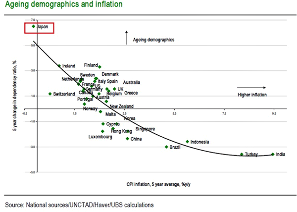
Let’s first look at the evidence. In the chart below we show average inflation levels over the last 5 years plotted against the 5-year change in the dependency ratio. The latter is the ratio of the very old and the very young to the population of working age. A shift down in that ratio implies that the population in a given country is getting younger (and vice versa). The chart therefore shows that those countries that have been getting older in recent years have typically faced very low inflation rates and, in the case of Japan, deflation. In the meantime those countries that have been getting younger in recent years, such as India, Turkey, Indonesia and Brazil, have faced relatively high inflation rates.

Cates looks not just at Japan but takes a more global view. However, Japan does stand out in this chart. (I do not have a link, as this work is just available from UBS for now.) I added the red box to highlight Japan:

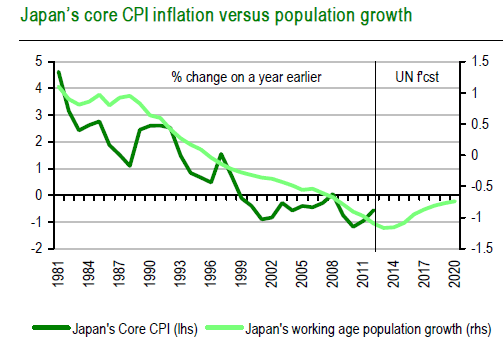
And while correlation is not causation, the following graph of inflation vs. population growth in Japan does make you think.

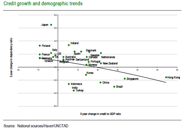
And let's throw in one more chart from Mr. Cates. He notes that textbook economics suggests that a falling workforce tends to put upward pressure on wages (labor is just an input resource on the supply side), and thus one ends up with cost-push inflation:

This, though, ignores other factors that are arguably of some relevance in the domestic inflation-generating process. Demographic influences for example will influence an economy’s natural demand for consumer durables, its housing stock and broader credit aggregates. The latter is certainly borne out by the reasonably close correlation that exists between credit and ageing in the chart below.

Finding Japanese Optimists

As negative as all of the above sounds, you can find those who think the Japanese economy can turn itself around, that inflation can be drummed up, and that Japanese interest rates – even given the amount of monetization they are contemplating – will not rise. Seriously.

Bloomberg News did a survey of five former Bank of Japan officials, all of whom believe that “any gains in government bond yields will be contained over the next two years.” Four of the five also don’t think 2% inflation is possible. Even with a wide-open printing press.

You can decide for yourself whether Abenomics can accomplish 3 or 4% nominal growth. Just go to this story with an interactive graph from Reuters Breakingviews). (The screen shot included below is just intended to tantalize you to head over there.) Play with variables in the graph and decide what you think is possible. If you start with today’s trends, potential GDP growth is much less than 1%.

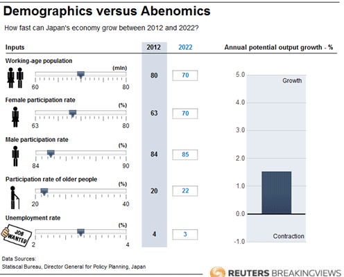
But what if, like Andy Mukherjee at Breakingviews, you get more optimistic? Japanese women participate in the labor force at just 63%, about the lowest female participation rate among developed nations. What if the participation rate of women rises dramatically because of the 250,000 new daycare jobs Abe has promised? And what if older people decide to work longer? And maybe men will do more (even though they have one of the highest participation rates now). And the unemployment rate could drop by, say, 40%.

If you make such assumptions then you can get to a 1.5% growth rate (which, as I showed last week, is not anywhere near enough!). Abe has bet big that creating inflation will encourage people to no longer postpone spending in hopes that things will get even cheaper. Never mind that that is not how older people think. And those are the people in Japan with money to spend. Abe's program is yet another case of operating on the basis of textbook economic theory rather than the reality that is staring you in the face.

An aging population means that someone has to take care of parents as they get older. And in Japan (as in many other places) that responsibility usually falls to the women, which lowers the female participation rate. And where will they get those 250,000 daycare workers? And who is going to pay for them? Abe also promises that by 2020 the Japanese government will be running a surplus and that deficits will be down to the rate of nominal GDP growth within a few years. Which programs will get cut to pay for those daycare workers? And what about the serious need for nursing-home workers? There are far more old people in Japan than there are toddlers.

While we are on the matter of promises, Abe also says he will enter into free-trade agreement talks with the rest of Asia and the US and open up the Japanese economy. All this while his currency is plummeting 15% a year, upsetting his neighbors and drastically changing the terms of trade? Now he wants to play nice in the global-trade sandbox? I was on Bloomberg with Tom Keene this morning. One of the other guests, talking about Japan’s opening up free-trade talks with the US, mentioned rice, which Japan famously protects, as a potential bargaining chip. “So,” I responded, “Japan decides it wants to drop the value of the yen by 50% and then open up its rice trade?” I was not impressed. I am a fairly big proponent of free trade, but Japan’s getting religion on free trade now, when they are on the brink of crisis, seems a tad disingenuous.

I Shot an Arrow… into My Foot

Abe has proposed an economic reform package comprising “three arrows”: aggressive monetary easing, labor and other structural reforms (which will be politically very difficult to achieve) intended to induce private-sector growth-promoting investment, and a flexible fiscal policy (whatever that means – I guess, since it's "flexible," it means whatever he decides it means).  He gave a speech this week on those reforms, and the market promptly threw up. The “reforms” he touted were more of the same old same old. At dinner on Wednesday night, Art Cashin modified the opening line from the old Longfellow poem: “I shot an arrow into the air… and it landed in my foot.”

Not that I think Abe had much choice. He has a critical election next month. Touting a policy that allows employers a freer hand in firing workers is not likely to win over many voters, but he must get serious about reform if he is to have any hope of limiting the disaster he faces.

I truly do feel sorry for retirees in Japan. I am reminded of that wonderful Japanese movie from the '50s, The Ballad of Narayama. It depicted ubasute (姥捨, "abandoning an old woman"), a custom allegedly practiced in Japan in the distant past, whereby an infirm or elderly relative was carried up a mountain or to some other remote, desolate place and left there to die.

While not as straightforward, the last 20 years of policy choices are producing results that are going to feel to the elderly as if they have been abandoned. It's just a much more protracted approach and one that is not so personally intimate as that depicted in the movie.

Gentlemen, They Offer Us Their Flank

My friend the serious raconteur Bill Bonner tells the story of the Battle of the Marne in   WWI, relating it to inflation. Quoting (with a few edits):

What's remarkable about inflation is that there is so little of it. It makes us think this [inflation/deflation] story may have a twist. You remember the famous German general von Kluck, from whom we get the expression, "You dumb kluck"?
Von Kluck was chasing the French down the Marne in 1914. Victory appeared close at hand; the French were pulling back. Von Kluck, who had orders to attack Paris, decided instead to pursue the French army. He was convinced they were beaten.
All he had to do was keep the pressure on ... and they would surrender.
Some of his field commanders, however, noted that they were picking up very few prisoners. Normally, an army that is beaten throws off many discouraged and confused soldiers. Since there were so few, the commanders reasoned that the French army was still intact; it was merely retreating in good order and could turn and surprise the Germans at any time.
The commanders were right. France's aging general, Gallieni, who was in charge of the Paris garrison, realized that the Germans were making a fatal mistake. By pursuing the troops down the Marne, rather than attacking Paris, they exposed themselves to a counterattack from the city itself.
"Gentlemen," he is said to have remarked to his staff, "They offer us their flank."
The French accepted the offer: they attacked. Using thousands of taxicabs, they quickly moved troops to the Marne Valley and caught the Germans unprepared. The Battle of the Marne turned the German army around and ultimately cost them the war.

Banzai! Banzai! Banzai!

The Japanese are charging the deflationary battle lines, crying "Banzai!" This attack is all or nothing. I think the Japanese are offering us investors their flank. This week’s action in the markets showed us that this battle will not be one-sided. It will often get ugly. But I want to keep reiterating what I have been saying for a long time: shorting the Japanese government is the trade of the decade. That is the largest position in my personal portfolio, and it is going to get larger, as I intend to fully swap the mortgage I just took out this week into yen. As I said to Tom Keene this morning, it is my intention (more accurately styled as hope) to let Abe-san and Kuroda-san pay for a large chunk of my new apartment through their policy of destroying the yen. I have to admit to feeling good when the yen backs up like it has this week, since that gives me a chance to get my trade on at a better entry.

Will I succeed? Time will tell, but I am joined by Japanese public pension funds that have announced they will reduce their holdings of local bonds while increasing their share of both domestic and, in particular, foreign equities. No time frame was provided in the data I saw, although indications are that they have already started. (Hat tip Kiron Sarkar.)      

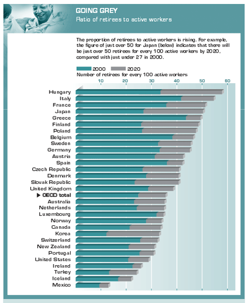
It is time to close this week’s letter, but these are topics we'll need to return to. But before we go, I want to include one more table I came across while researching this topic. It is a comparison of the dependency ratio among developed countries. This is the ratio of retired and people under 16 compared to the work force. As it turns out, Japan is not in last place. France, Italy, and Hungary have worse demographics. This chart fairly screams for an entire future letter.

The Strategic Investment Conference Videos

The first group of videos from the 2013 Strategic Investment Conference is now available! These videos feature some of our most popular speakers, including Kyle Bass, Mohamed El-Erian, Lacy Hunt, and more. If you a Mauldin Circle member, you can access the videos by going to www.altegris.com to log in to your “members only” area of the Altegris website. Upon login, click on the “SIC 2013” link in the upper left corner to view the videos and more. If you have forgotten your login information, simply click “Forgot Login?” and your information will be sent to you.

If you are not already a Mauldin Circle member, the good news is that this program is completely free. In order to join, you must, however, be an accredited investor.  Please register here to be qualified by my partners at Altegris and added to the subscriber roster. Once you register, an Altegris representative will call you to provide access to the videos, transcripts, and summaries from selected speakers at our 2013 conference. (Note: for those members outside of the US, I will work on getting the videos up for you within a few weeks.)

Monaco, Cyprus, Belgrade(?), Croatia, and Switzerland

I am home for a week. I finally closed on my mortgage on the new apartments, and construction to turn them into one apartment begins Monday. I will at last move out of the hotel and into a temporary place next week, although given my schedule for the next few weeks, I will not be home until July to enjoy it.

I go to Monaco in about ten days for a speech at GAIM, then I have a few days off before I go to Nicosia, Cyprus, where I am beginning to schedule meetings and may deliver a public speech at the university there. Then I will overnight in some spot on my way to the coast of Croatia, where I will spend the weekend with that brilliant and wicked-funny Irish economist David McWilliams and his family before dashing off to Geneva and then returning home.

It is time to hit the send button. I had to get up at 3:30 AM Texas time to be with Tom Keene (I am not sure there is another man I would do that for), and it is now officially a very, very, very long day. It has been a good week, although having to have make-up applied every morning for four straight days has given me additional sympathy for the distaff side of the human race. When was the last time you talked to strangers (or your daughters) about toner color and blending a base foundation? The world has taken me through far different turns than I once imagined it ever would. But it is all fun.

Your proud new father of a bouncing baby (yen?) mortgage analyst,

See the original article >>

Follow Us