by Tom McClellan
I love price pattern analogs, because I
love just about anything that can tell me in advance what is going to happen to
stock prices. If the current price behavior is similar to that of another
period in history, then sometimes it can give us insights about what lies
ahead.
Subscribers to our Daily Edition and our twice monthly McClellan Market Report newsletter have enjoyed getting to
see this week’s chart on a regular basis. It compares the ugly decline of the
summer of 2011 to a very similar decline in the summer of 1946.
We first took a look at this comparison
back in August 2011 because of a common factor in each period: there was no
divergence in the A-D Line. Most of the time when there is a price decline as
big as we have just seen, the A-D Line gives us warning of liquidity problems by
making a divergent lower high as prices make a higher high. We did not get that
A-D Line signal in the summer of 2011, although other divergences did tell us
(and thus our subscribers) that there was trouble brewing.

1946 similarly did not have an A-D Line
divergence, and so that made it worth taking a look at as a comparison model.
When lining up the price patterns in a single chart, the correlation of price
movements then and now became obvious.
1946 also shares other similarities with
the current time frame. The U.S. was in the midst of dismantling the
stimulative effects of a war-time economy, and unemployment shot up in a big
way. There were also concerns about rebuilding post-war Europe, and whether or
not loans would be repaid like the Lend-Lease Program. Now we have an economy
with high unemployment, and the expiration of stimulative efforts like TARP and
QE1 & 2. There was great labor union unrest in 1946, which led to the 1947
passage of restrictions on union activity in the Taft-Hartley Act, which passed
over President Truman’s veto. 2011 saw a big push back against unions in states
like Wisconsin and New Jersey.
Zooming in closer, we can see that even the
manner in which each of the steep declines unfolded was very similar. There was
a rapid one-day drop, a slight hesitation, and then the final plunge in both
cases.
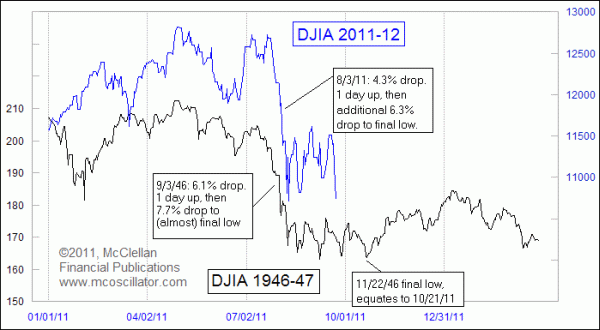
Rather than continuing the decline after
the steep plunge, the 1946 market saw a long series of retests, with the DJIA
seemingly bouncing along against a price floor for several months. The last of
those came on Nov. 22, 1946, and with the price pattern alignment shown in these
charts, that equates to a bottom due Oct. 21, 2011.
One point to understand about using price
pattern analogs is that eventually the correlation breaks up and stops working.
Often that point will arrive at the moment when one is most counting on the
correlation to continue working. So one should never give these pattern analogs
complete trust, no matter how good they look. But for the moment, the 1946
pattern does seem to be telling us the correct answers about how the current
market’s corrective period will play out.
No comments:
Post a Comment