by Doug Short
The first chart features an overlay of the S&P 500 index and the CBOE Volatility Index (VIX) since 2007. Yesterday the VIX rose to 48.00, a gain of 50% over the previous close.
Follow up:
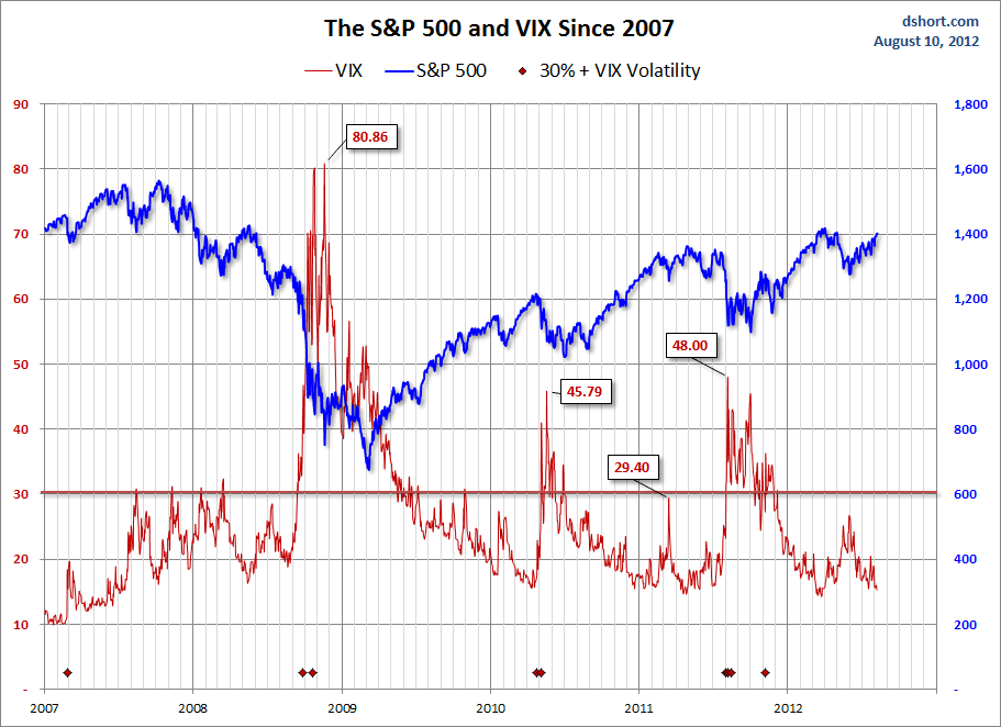
As the chart above illustrates, the correlation between the S&P 500 and the VIX is inverse but imperfectly so. The lower low in the summer of 2008, when the index nearly dipped to 1200, came with a lower VIX in the upper 20s. More significantly, the unprecedented surges in the VIX above 80 in late 2008 predated the actual index low by over three months.
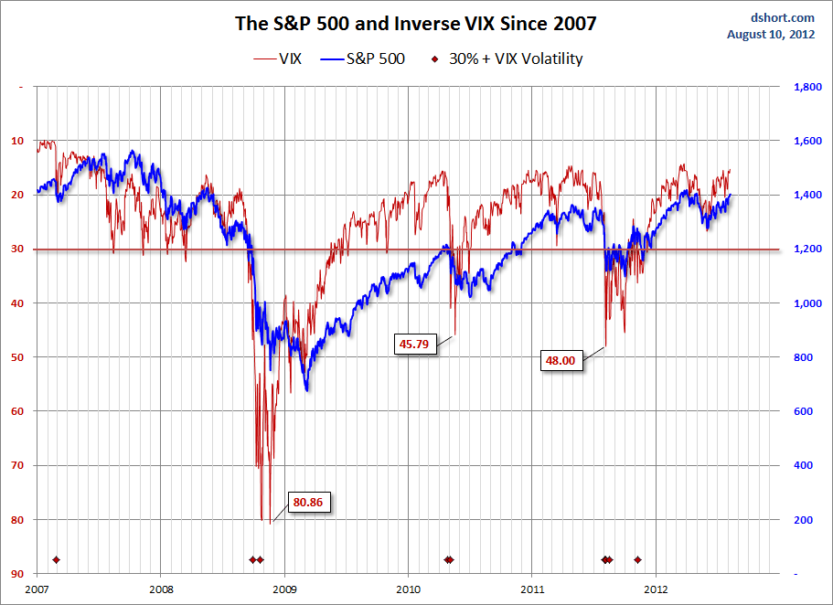
A key to understanding the VIX is to realize that it can be far more volatile than the index to which it is attached. The next chart inverts the VIX values, which helps us see more clearly the greater degree volatility and the fact that the VIX tends to lead the S&P 500.
The spike in the VIX of late is a bit worrisome, especially because it has exceeded 30 level associated with high volatility. See also the markers at the bottom of both charts, which identify days on which the VIX spiked by more than 30%, something that's happened four times since the March 2009 low. In particular, we can see the increase in volatility associated with the 16% correction that began in April 2010 and ended in early July. The immediate question is whether the spike in volatility during the past few days, which included two 30% plus spikes, is a leading indicator of additional market decline.
For a look at the VIX and S&P 500 since 1990, click here for some additional illustrations.
No comments:
Post a Comment